
Dark Beige Kitchen Cabinet Ideas: 15 Elegant Designs to Inspire You
Dark beige kitchen cabinet ideas occupy the warm, grounded center of the neutral palette — deeper than cream, warmer than grey, and richer than standard beige. Dark beige cabinets carry undertones of caramel, mushroom, taupe, or sand that read as warm and organic in a way that cooler neutrals (grey, white, greige) cannot match. Paint colors in this range include Benjamin Moore Alexandria Beige (HC-77), Sherwin-Williams Accessible Beige (SW 7036), and Farrow & Ball London Stone (No.6), each with slightly different warm-cool balance.
The 15 dark beige kitchen cabinet ideas below show how to pair this warm neutral with wood, marble, metal, textile, and color accents that bring out the best in the beige tone. Each idea names specific products, materials, and brands so you can build a complete dark beige kitchen palette with confidence.
1. Wood Combinations from Nature

Natural wood accents — butcher block countertops, floating shelves, exposed ceiling beams, or a wood-paneled island — pair with dark beige cabinets to create a kitchen that feels like it grew out of the landscape rather than being assembled from manufactured parts. The warm undertones in dark beige (caramel, honey, sand) echo the natural tones found in white oak, hickory, and walnut, producing a material pairing that feels inherently harmonious.
White oak (either natural finish or light honey stain) is the strongest wood partner for dark beige cabinets because its pale, warm grain sits in the same tonal family without competing for visual dominance. A white oak butcher block island top (from John Boos, Lumber Liquidators, or a local mill) adds a large surface of organic warmth. Walnut floating shelves (from Shelfology or a local woodworker) provide a darker wood accent that creates depth and contrast against the lighter beige cabinets. Avoid very dark stains (espresso, ebony) that create too much contrast with the soft beige tone.
2. Cozy Lighting Highlights
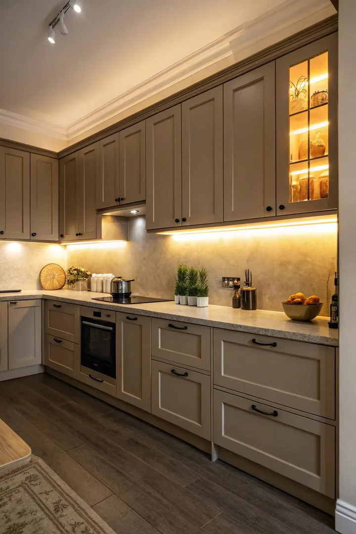
Warm-toned lighting (2700K to 3000K color temperature) brings out the amber and caramel undertones in dark beige cabinets, making them look richer and more golden. Cool-white lighting (4000K and above) strips the warmth from beige and makes the cabinets look flat, grey, and institutional. Choosing the right light temperature is one of the most impactful decisions in a dark beige kitchen — it determines whether the space reads as cozy or clinical.
Install 2700K LED recessed ceiling lights (from Halo, Juno, or WAC Lighting) for a warm ambient glow. Add 3000K under-cabinet LED strip lights (from WAC Lighting, Philips Hue, or GE) that wash warm light down the backsplash and across the countertop. Choose pendant fixtures with warm-toned shades (brass, amber glass, linen, or rattan) that filter the light into a golden tone. For a full guide on kitchen lighting strategies, see our dedicated article. Wire all lighting layers to Lutron Caseta dimmer switches so you can lower the brightness in the evening for an even warmer, more intimate glow.
3. Textiles with a Cozy Woven Feel
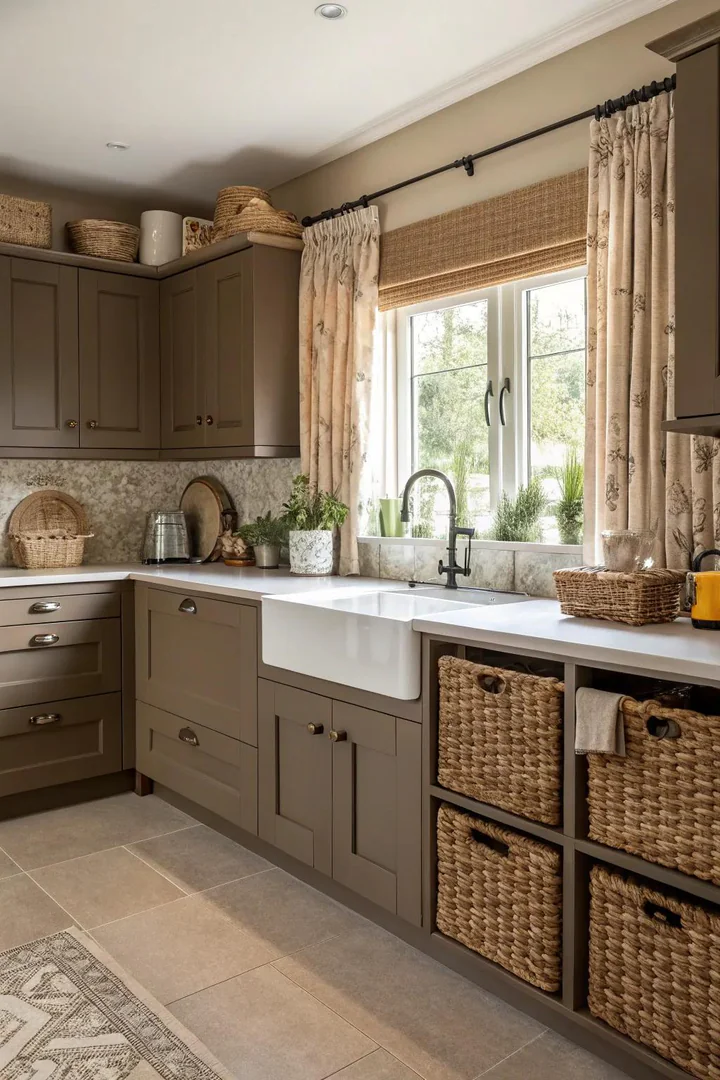
Woven textiles — a jute area rug, a linen Roman shade, rattan pendant light shades, wicker baskets, or a handwoven cotton runner — introduce soft, tactile texture that complements the matte, painted surface of beige cabinets. Textiles add a layer of warmth and domesticity that hard surfaces (stone, tile, metal) cannot provide, making the kitchen feel lived-in and comfortable rather than showroom-pristine.
A flat-weave jute or sisal rug (from Pottery Barn, Serena & Lily, or Rugs USA) in a natural tan or warm grey anchors the kitchen floor and echoes the earthy tones of the dark beige cabinets. Linen Roman shades (from The Shade Store or Pottery Barn) in ivory, flax, or oatmeal soften the window openings without blocking light. Rattan or woven pendant shades (from Serena & Lily, IKEA, or World Market) filter overhead light into a warm, patterned glow that reinforces the natural, handcrafted character of the beige palette.
4. Elegance of Marble Countertops
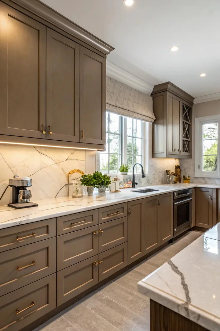
Marble countertops — with their white or cream base and grey, gold, or taupe veining — create a classic, refined surface that pairs effortlessly with dark beige cabinets. The warm veining in marble varieties like Calacatta Gold, Calacatta Borghini, and Crema Marfil picks up the warm undertones in the beige cabinetry, creating a coordinated warmth across the horizontal and vertical surfaces of the kitchen.
Choose warm-veined marble varieties (Calacatta Gold with gold veining, or Taj Mahal quartzite with soft taupe movement) over cool-veined varieties (Statuario with stark grey veining) to maintain the warm atmosphere that dark beige cabinets create. For a more budget-friendly or lower-maintenance option, warm-toned quartz (Caesarstone Calacatta Nuvo, Cambria Brittanicca Warm, or Silestone Calacatta Gold) reproduces the warm marble look with zero sealing requirements. A marble or quartz backsplash that matches the countertop creates a unified stone surface that frames the dark beige cabinets with continuous warmth.
5. Bicolored Cabinetry
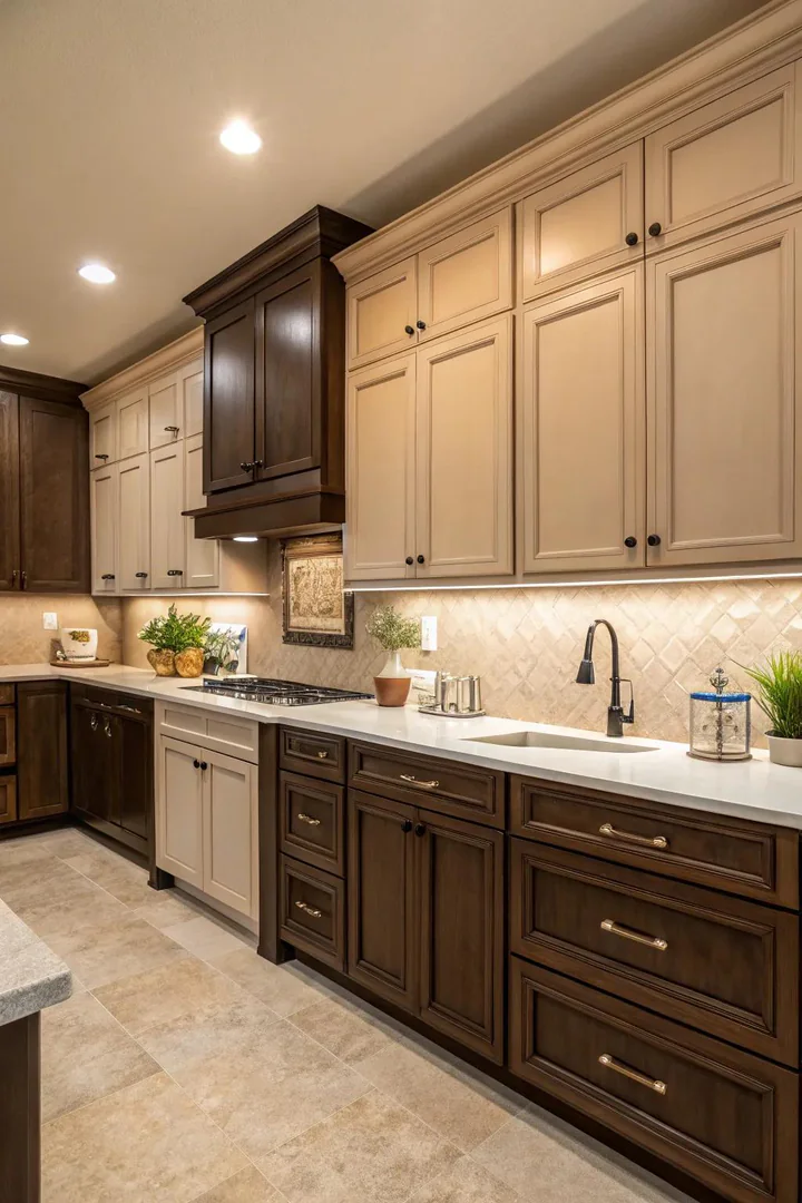
Two-tone cabinetry pairs dark beige cabinets on one section (typically the lower cabinets or the island) with a contrasting color on the other section (white, cream, soft grey, or natural wood on the uppers). This approach adds visual depth and architectural definition that a single-color kitchen cannot achieve — the eye reads the two tones as distinct horizontal bands, creating a layered, designed look.
The most common two-tone configuration is dark beige lowers with white or cream uppers, which grounds the room with the darker tone at base level while keeping the upper zone bright and airy. A dark beige island with cream perimeter cabinets creates a furniture-like focal point. For kitchen cabinet color pairing ideas, see our dedicated guide. Use the same hardware finish (brass, polished nickel, or oil-rubbed bronze) on both tones to unify the two-tone scheme.
6. Coordinating Colors for Walls
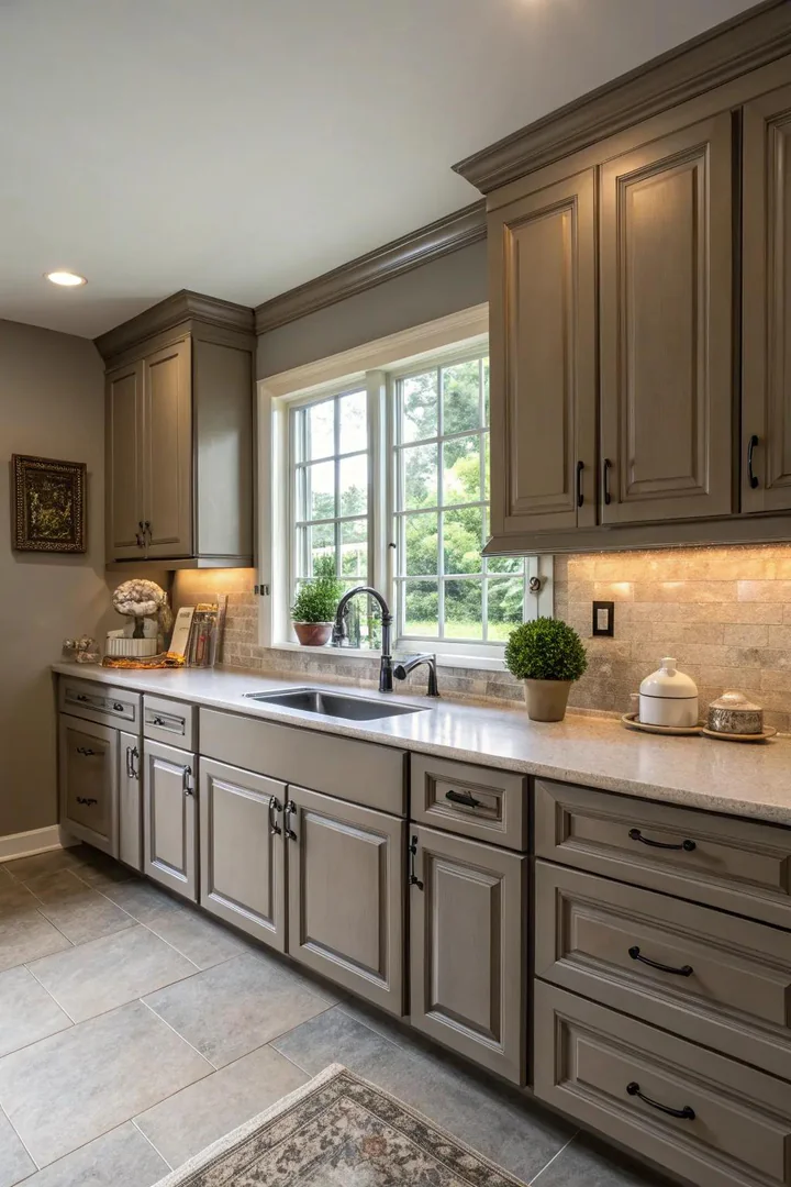
Wall color in a dark beige kitchen must complement the cabinet tone without blending into it — walls that are too similar in value to the cabinets create a washed-out, monotone effect where the cabinetry disappears into the background. The goal is enough contrast to define the cabinets against the wall while maintaining a harmonious warm palette throughout the room.
White walls (Benjamin Moore Simply White OC-117, Sherwin-Williams Alabaster SW 7008) provide the cleanest contrast and make the dark beige cabinets the focal point. Light warm grey walls (Benjamin Moore Revere Pewter HC-172, Sherwin-Williams Agreeable Gray SW 7029) create a softer, more enveloping contrast. For a bolder approach, deep green walls (Benjamin Moore Hunter Green, Sherwin-Williams Pewter Green) create a rich, moody backdrop that makes the warm beige cabinets pop. For more wall and cabinet pairings, see our kitchen color ideas article.
7. Discreet Glass Panel Doors
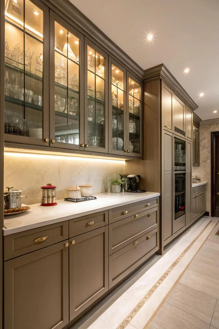
Glass-panel cabinet doors introduce transparency and visual lightness into the upper cabinet zone, breaking the solid wall of painted beige doors with glimpses of the lighter contents inside (white dishes, clear glassware, ceramic pieces). The glass panels make the upper cabinets feel less heavy and monolithic while adding a layer of decorative interest through the curated display of kitchen items behind the glass.
Choose clear glass for cabinets with organized, attractive contents. Seeded glass (with small air bubbles) creates a partially obscured, vintage-inspired look. Reeded or ribbed glass (with vertical fluting) provides a contemporary texture that diffuses the view while still allowing light and color to show through. Paint the cabinet interiors a shade or two lighter than the exterior (cream or warm white) so the lighter interior glows through the glass and adds depth to the dark beige facade.
8. Contrast Through Open Shelving
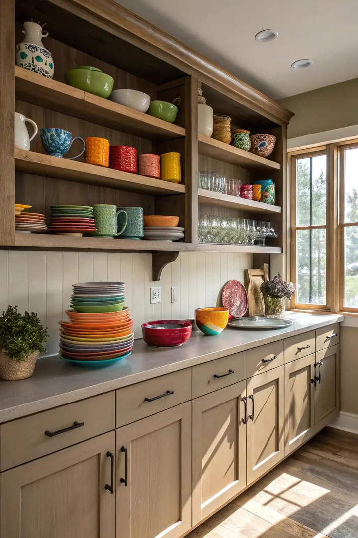
Replacing one or two upper cabinet sections with floating open shelves introduces visual breathing room and creates an opportunity to display colorful objects, plants, and curated kitchen items that contrast with the neutral beige cabinetry. Open shelves prevent the upper wall from reading as a continuous block of dark beige and add a collected, personalized quality that closed cabinets cannot provide.
Natural wood shelves (white oak or walnut, 2 inches thick, from Shelfology or a local lumber yard) mounted with concealed brackets create a warm, organic contrast against the painted beige cabinets. Arrange displayed items using the “rule of three” — three items of varying height per vignette — and include at least one colorful element per shelf (a green plant, a blue ceramic, a copper canister) to break the neutral palette. Keep the display edited and intentional; overcrowded shelves look cluttered rather than designed.
9. Creative Illumination Devices
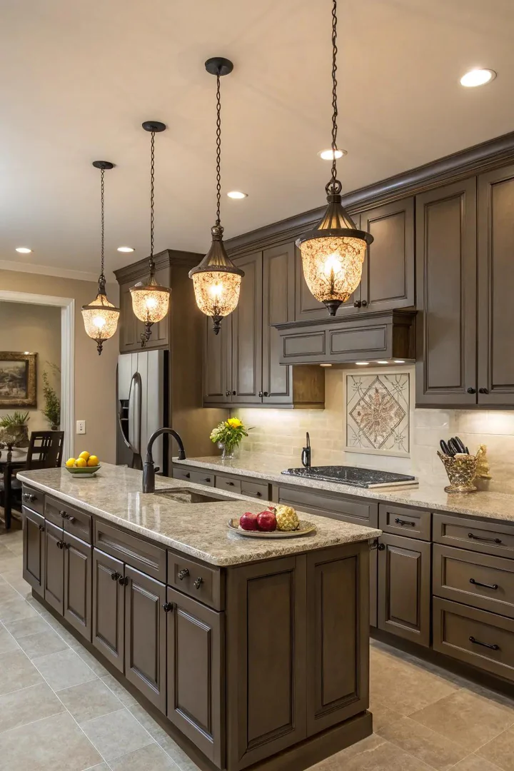
Statement light fixtures — sculptural pendants, oversized lanterns, linear chandeliers, or artisan-crafted sconces — serve as focal-point artwork in a dark beige kitchen where the neutral cabinetry provides a quiet backdrop that lets bold lighting designs take center stage. In a kitchen without dramatic cabinet colors or patterns, the light fixtures become the primary decorative statement.
Brass and gold-toned fixtures (from Visual Comfort, Hudson Valley Lighting, or Arteriors) complement the warm undertones of dark beige and add a luminous metallic accent against the matte painted surface. A linear chandelier or a row of three matching pendants over an island creates a strong horizontal focal point. Woven or rattan pendant shades (from Serena & Lily or World Market) reinforce the natural, organic mood of the beige palette. Choose fixtures with warm-toned bulbs (2700K) to maintain the cozy atmosphere.
10. Striking Black Highlights
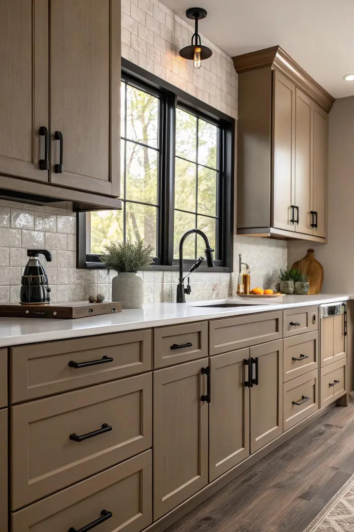
Black accents — a matte black faucet, black cabinet hardware, black window frames, black pendant lights, or a black range hood — provide the strongest possible contrast against dark beige cabinets, adding graphic definition and visual weight that prevents the warm neutral palette from feeling soft or unfocused. Black grounds a beige kitchen the way a black picture frame anchors a light-colored print.
Start with black hardware (bar pulls or knobs from Top Knobs, Amerock, or Emtek in matte black) as the easiest and most impactful upgrade. Add a matte black faucet (Moen Align, Delta Trinsic, or Kohler Purist in matte black) to reinforce the accent. Black window mullions (either real or adhesive-applied) create an industrial-chic frame for natural light. Limit black to accent-level presence (hardware, fixtures, trim) rather than large surfaces — too much black overpowers the soft warmth that makes dark beige appealing.
11. Retro-Style Lighting Fixtures
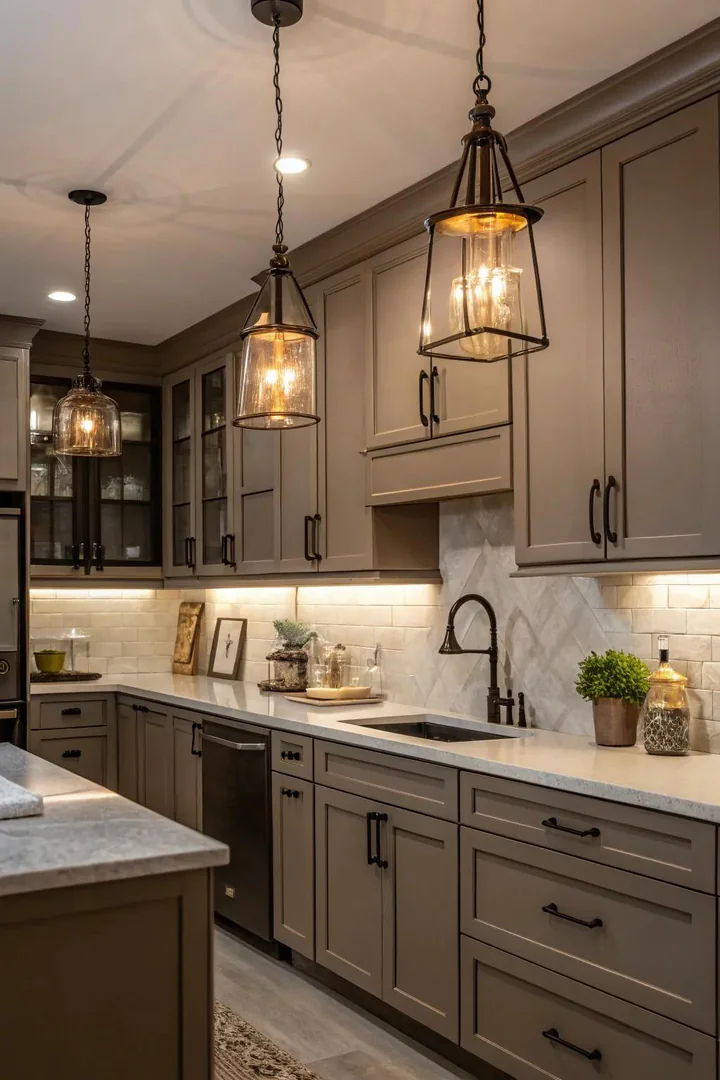
Vintage-inspired light fixtures — schoolhouse pendants, industrial cage lights, milk glass globes, or art deco chandeliers — add historical character and personality to a dark beige kitchen that might otherwise read as generically neutral. The vintage forms reference a specific era and mood that gives the kitchen a story and identity beyond its color palette.
Schoolhouse Electric, Rejuvenation, and Barn Light Electric specialize in period-authentic reproduction fixtures in a range of metals (brass, brushed nickel, oil-rubbed bronze, matte black) that coordinate with dark beige cabinetry. A pair of schoolhouse pendant lights with brass fittings and opal glass shades over a peninsula creates a classic, timeless overhead fixture. Edison-style filament bulbs (2200K amber tone) add an extra layer of vintage warmth in fixtures with exposed bulbs. Choose fixtures in brass or oil-rubbed bronze — both metals complement the warm undertones of dark beige.
12. Comparing Colors of Islands
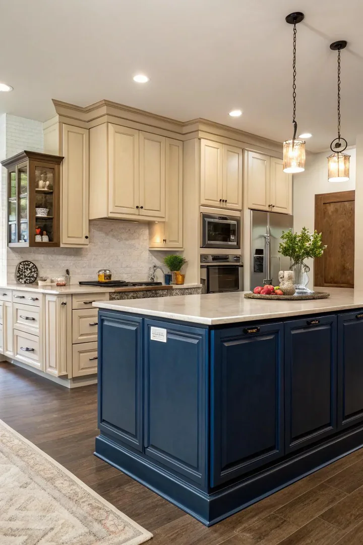
A contrasting island color in a dark beige kitchen — navy blue, forest green, charcoal grey, or black — creates a furniture-like focal point that anchors the center of the room and gives the eye a destination distinct from the surrounding beige perimeter cabinets. The island reads as a standalone piece (like a dining table or a sideboard) placed within the kitchen rather than as a built-in extension of the cabinetry.
Navy blue (Benjamin Moore Hale Navy HC-154 or Sherwin-Williams Naval SW 6244) is the most popular contrasting island color with dark beige perimeter cabinets — the deep blue creates warmth-on-warmth contrast without the starkness of black. Forest green (Benjamin Moore Essex Green HC-188) creates a nature-inspired, earthy contrast. Charcoal grey (Sherwin-Williams Iron Ore SW 7069) provides a softer alternative to black. Top the contrasting island with a white marble or white quartz countertop to create a bright horizontal surface that ties back to the lighter upper elements of the kitchen.
13. Adopt Natural Earth Colors
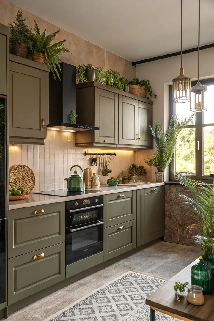
An earthy color palette — terracotta, rust, olive, sienna, ochre, and clay — surrounds dark beige cabinets with warm, naturally occurring colors that create a kitchen grounded in the tones of the earth, stone, and sky. This palette suits organic modern, Mediterranean, and desert-inspired kitchen styles where the goal is a warm, sun-baked atmosphere.
Introduce earthy tones through the backsplash (terracotta or olive zellige tile from Clé or Fireclay Tile), the countertop (warm-toned granite or travertine), the floor (terracotta saltillo tile or warm-toned natural stone), and small accessories (rust-colored linen towels, olive-green pottery, a sienna ceramic fruit bowl). Keep the earthy tones in the warm range — avoid cool earth tones (blue-grey, cool sage) that clash with the warm beige. For more on earthy kitchen schemes, see our grey and beige kitchen guide.
14. Combining Textures for Added Depth
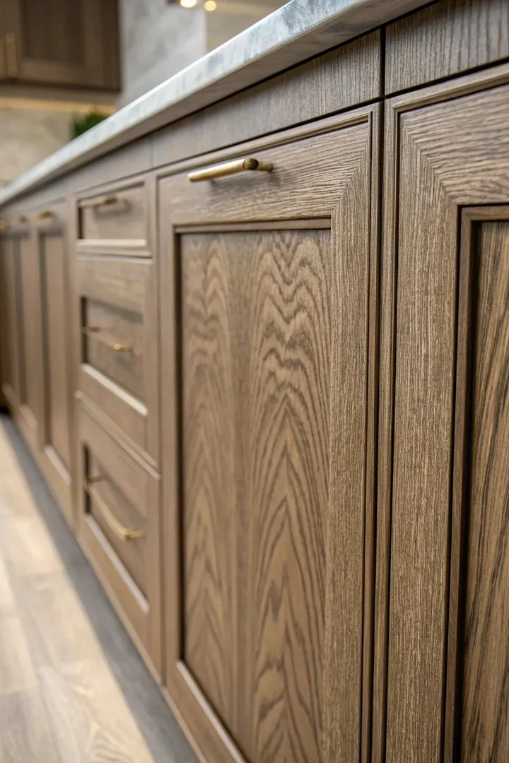
Texture mixing — combining smooth painted cabinets with rough stone, woven textiles, grained wood, hammered metal, and glazed tile — adds visual depth and tactile interest that prevents a monochromatic beige kitchen from feeling flat or one-dimensional. In a kitchen without bold colors, texture becomes the primary vehicle for visual variety and sensory richness.
Layer at least four distinct textures: smooth matte cabinet fronts (painted beige), a textured backsplash (handmade zellige tile, natural stone, or tumbled travertine), a countertop with visible grain or veining (marble, quartzite, or butcher block), and metal hardware with a tactile finish (hammered brass, brushed nickel, or knurled bronze). Add a fifth texture through a floor material that contrasts with the smooth cabinets — natural stone tile, wide-plank hardwood, or patterned encaustic cement tile. Each texture should be distinct enough to read as its own element while staying within the warm, natural color family.
15. Stylish Metallic Components
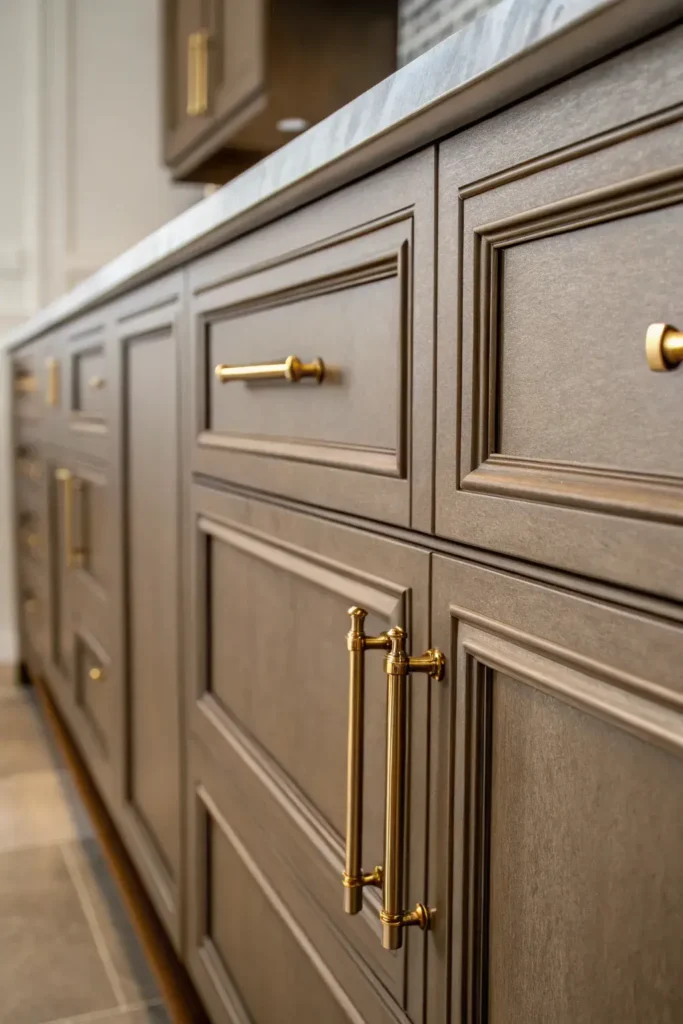
Metallic elements — brass hardware, a copper range hood, gold-toned pendant lights, a stainless steel professional range, or an antiqued mirror backsplash — introduce reflective, light-catching surfaces that add sparkle and polish to the matte warmth of dark beige cabinets. Metals serve as the “jewelry” of the kitchen, providing the brightness and shine that the soft, matte beige surface absorbs.
Brass and unlacquered brass are the most natural metallic partners for dark beige because both materials share warm, golden undertones — the pairing feels harmonious and intentional rather than contrasting. Brushed gold hardware (from Rejuvenation, Emtek, or Top Knobs) on dark beige Shaker doors is one of the most consistently admired hardware-cabinet combinations in current kitchen design. Polished nickel provides a brighter, cooler metallic accent for kitchens that lean more greige than warm beige. Copper accents (a copper pot rack, copper pendant lights, or a hammered copper sink) add an extra dimension of warmth and artisanal character.
How to Style Dark Beige Kitchen Cabinets
Choosing the Right Beige Shade
Not all dark beiges are the same — some lean warm (more caramel, more gold), some lean cool (more mushroom, more taupe), and some sit in the middle (greige, which blends grey and beige). Test three to five paint samples on a cabinet door under the kitchen’s actual lighting at different times of day. Benjamin Moore Shaker Beige (HC-45) is a true warm beige. Sherwin-Williams Tony Taupe (SW 7038) is a cool-leaning beige with grey undertones. Benjamin Moore Alexandria Beige (HC-77) sits in the warm middle ground that works in most kitchens.
Selecting Hardware Metal Finish
The hardware metal finish is the single most visible accent detail on dark beige cabinets. Brushed brass and satin gold create the warmest pairing. Polished nickel creates a bright, classic contrast. Matte black creates a graphic, modern accent. Oil-rubbed bronze creates a traditional, antique-inspired look. Avoid chrome — its cool, blue-toned sheen conflicts with the warm beige undertones. Install one or two sample pulls before committing to a full set to verify the metal reads the way you want under the kitchen’s lighting.
Balancing Warm and Cool Elements
A fully warm kitchen (warm beige cabinets, warm wood, warm brass, warm stone) can feel one-note and lacking in visual tension. Add one or two cool elements — a grey-veined marble countertop, a blue-grey backsplash accent, or polished nickel hardware — to create the warm-cool tension that makes a room feel layered and designed. The ratio should be approximately 80 percent warm to 20 percent cool for the most balanced result.
Dark Beige Cabinet Pairing Options Comparison
| Accent Element | Best Metal Pairing | Style Effect | Best For |
|---|---|---|---|
| White marble countertop | Brushed brass | Classic, refined | Transitional kitchens |
| Butcher block countertop | Oil-rubbed bronze | Warm, organic | Farmhouse, rustic |
| Navy island | Polished nickel | Bold, nautical | Coastal, traditional |
| Black accents | Matte black | Modern, graphic | Contemporary kitchens |
| Terracotta backsplash | Aged brass | Earthy, Mediterranean | Organic modern |
Common Dark Beige Cabinet Mistakes to Avoid
Using cool-white lighting. Cool-white LED bulbs (4000K and above) strip the warmth from dark beige cabinets and make them look grey, muddy, and institutional. Always use warm-white bulbs (2700K-3000K) in every lighting layer — ceiling, under-cabinet, and pendant — to maintain the golden warmth that makes dark beige appealing.
Matching walls too closely to cabinet color. Walls painted the same value as the dark beige cabinets create a washed-out, monochromatic effect where the cabinetry loses definition and blends into the background. Choose walls that are noticeably lighter (white, cream) or darker (deep green, charcoal) than the cabinets to create enough contrast for the cabinet profiles to read clearly.
Choosing cool-toned countertops. A blue-grey quartz or a stark white Statuario marble with cool grey veining clashes with the warm beige cabinet undertones, creating a visual temperature conflict. Select warm-toned countertops — Calacatta Gold marble, warm beige quartz, or butcher block — that share the cabinet’s warm temperature.
Overcrowding open shelves. Open shelves in a beige kitchen should display a curated selection of attractive items, not serve as overflow storage for mismatched mugs and cereal boxes. Edit the display to three to five items per shelf, varying height and material, and include at least one colorful accent per shelf. Visit The Designers Company for more cabinet color guides and kitchen styling inspiration.
Frequently Asked Questions
Is dark beige a good color for kitchen cabinets?
Dark beige is one of the most versatile and timeless cabinet colors because it works with virtually every countertop material, hardware finish, and kitchen style. It is warmer than grey, less stark than white, and more current than traditional golden oak. Dark beige pairs naturally with warm metals (brass, gold, bronze), warm woods (oak, walnut), and warm stones (marble, travertine, quartzite).
What countertop looks best with dark beige cabinets?
White marble with warm veining (Calacatta Gold) and warm-toned quartz (Caesarstone Calacatta Nuvo) are the most popular choices. Butcher block adds organic warmth for rustic or farmhouse kitchens. Dark soapstone or honed black granite creates a dramatic contrast for moody, contemporary kitchens. Avoid cool-grey quartz and stark white solid surface that clash with the warm beige undertones.
What wall color goes with dark beige cabinets?
White (Benjamin Moore Simply White) provides the cleanest, most versatile backdrop. Warm grey (Revere Pewter) creates a softer, more enveloping contrast. Deep green (Hunter Green, Pewter Green) creates a rich, moody atmosphere. Cream or ivory creates a tonal, monochromatic effect for a quiet, subtle kitchen. Avoid bright, saturated accent walls (bright red, electric blue) that compete with the soft neutrality of beige.
What hardware finish pairs best with dark beige?
Brushed brass and satin gold are the most harmonious matches because both metals share the warm, golden undertones found in dark beige. Polished nickel provides a brighter, slightly cooler contrast. Oil-rubbed bronze adds an antique, traditional accent. Matte black provides modern graphic definition. Avoid chrome — its cool, blue-toned shine conflicts with the warm beige palette.
Will dark beige cabinets go out of style?
Dark beige and warm neutrals have been gaining popularity since the early 2020s as homeowners move away from the all-white and cool-grey kitchens that dominated the 2010s. Warm tones are a cyclical design trend with long staying power — beige, taupe, and caramel tones appear in every major design cycle because they are fundamentally comfortable and inviting. A well-executed dark beige kitchen will feel current for 15 to 20 years.
Can I paint existing cabinets dark beige?
Yes — painting cabinets dark beige is one of the most popular DIY and professional kitchen updates. Sand the existing finish, apply a high-adhesion primer (Zinsser BIN or KILZ Adhesion), and topcoat with two coats of cabinet-grade paint (Benjamin Moore Advance or Sherwin-Williams Emerald Urethane) in your chosen beige. Professional cabinet painting costs $3,000-7,000 for a full kitchen. DIY costs $200-500 for paint and supplies. Allow two to three weeks for full cure before subjecting the painted cabinets to heavy daily use.
Conclusion
Dark beige kitchen cabinets offer the warmth and approachability that cooler neutrals lack, creating a kitchen that feels inviting, grounded, and connected to the natural world. The warm undertones in dark beige (caramel, sand, mushroom, taupe) harmonize with wood, stone, metal, and textile accents to produce a palette that is rich without being busy and neutral without being cold.
Start by choosing the right beige shade for your kitchen’s lighting — test multiple samples at different times of day. Pair the cabinets with warm-toned countertops (marble with gold veining, warm quartz, or butcher block) and warm metal hardware (brass, gold, or bronze). Add texture through natural materials (wood shelves, woven textiles, handmade tile) and depth through one or two contrast elements (a black faucet, a navy island, a deep green accent wall). The result is a kitchen that feels like home from the first moment you walk in.