
Ideas for Kitchen Colors: 24 Beautiful Combinations You’ll Love Now
Color sets the mood of a kitchen faster than any other design decision. The cabinets, walls, backsplash, and countertop together create a palette that determines whether the room feels warm or cool, bright or moody, classic or contemporary. Getting the color right matters more than getting the hardware or the light fixtures right, because color is the first thing anyone notices when they walk through the door.
The challenge is that kitchens contain more surface area than most rooms — cabinet fronts alone can cover thirty to forty square feet of visual space — so a color that looks perfect on a two-inch paint chip can feel overwhelming at full scale. Testing matters here more than in any other room, and understanding how undertones interact with your countertop, flooring, and lighting saves you from a repaint six months later.
Below you will find 24 ideas for kitchen colors organized from bold saturated hues through mid-tone naturals to soft neutrals, with specific paint names, pairing recommendations, and material suggestions for each palette. Whether you want a kitchen that makes a statement or one that feels quietly polished, you will find a combination here that fits.
1. Be Daring with Sapphire Blue Cabinets
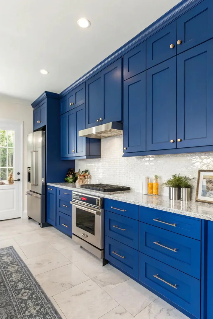
Sapphire blue cabinets bring a depth and richness that neutral kitchens cannot match. Benjamin Moore Gentleman’s Gray and Farrow and Ball Stiffkey Blue are two of the most popular sapphire shades for cabinetry — both have enough grey in the undertone to read as sophisticated rather than childlike. Pair sapphire cabinets with brass or unlacquered-copper hardware to warm the blue and prevent the kitchen from feeling cold, and choose a white quartz countertop like Caesarstone Calacatta Nuvo to keep the work surface bright against the dark base.
Sapphire blue works best on lower cabinets with white or light-wood uppers, which keeps the room from feeling like a cave. If you commit to full sapphire on both upper and lower cabinets, balance the saturation with open shelving in natural wood and a white or light-grey backsplash. The color pairs naturally with white marble, brass fixtures, and warm-toned wood flooring — a combination that reads as classic but not dated.
2. Adopt Pure White Sophistication
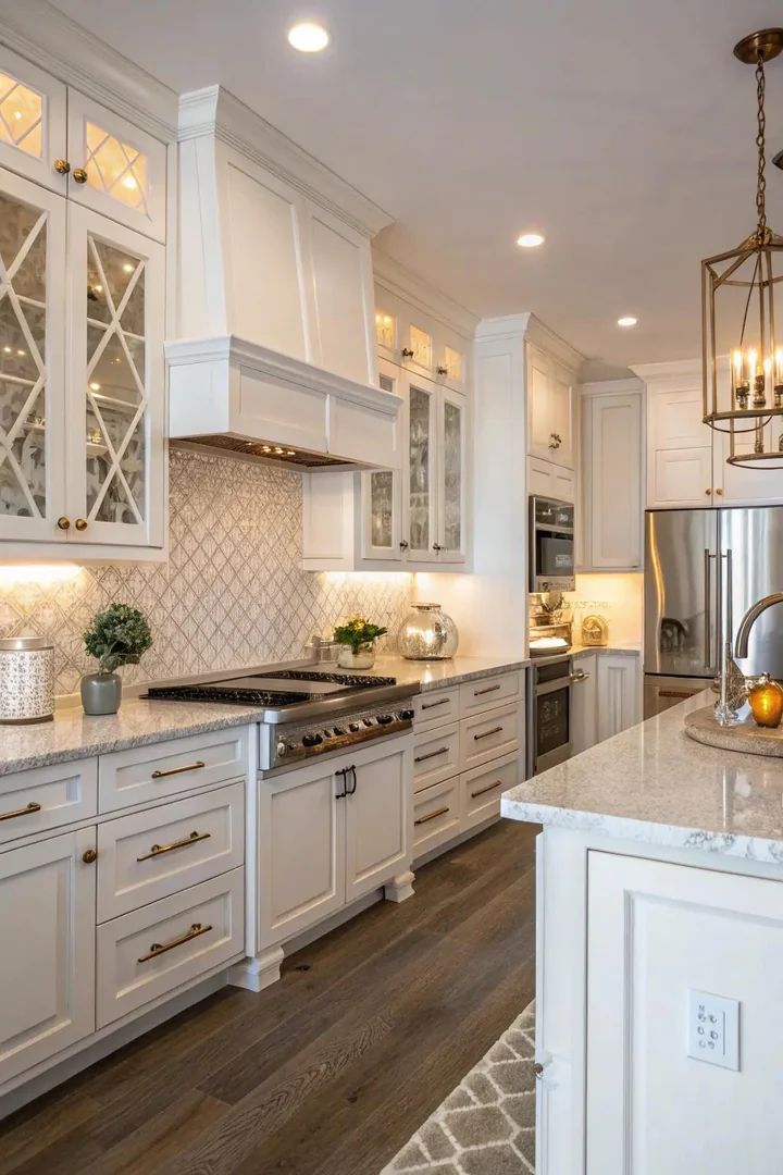
An all-white kitchen maximizes light and makes even a small room feel open and airy. The secret to pulling off white without the room looking sterile is layering different whites with different undertones — a warm white like Benjamin Moore White Dove on the cabinets, a cooler white like Chantilly Lace on the walls, and a veined white quartz or marble countertop that introduces grey and gold tones into the otherwise monochrome palette. The subtle variation between these whites keeps the eye moving and prevents the flat, shadowless look that a single white creates.
Add warmth through texture and natural materials rather than color. A medium-toned oak or walnut floor, woven rattan pendant lights, and linen Roman shades in an oatmeal tone all introduce warmth without breaking the white palette. Hardware in brushed brass or satin gold adds a metallic accent that catches light and prevents the cabinets from reading as flat panels. White kitchens are the most photographed and the most resold style in real estate listings, which makes them a safe long-term investment if you plan to sell within ten years.
3. Incorporate Drama with Deep Teal Highlights
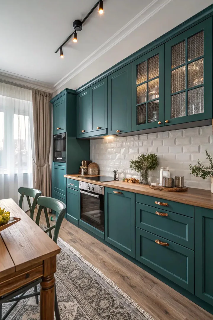
Deep teal sits at the intersection of blue and green, which means it pairs with both warm and cool color families — a flexibility that few saturated colors offer. Sherwin-Williams Cascades and Benjamin Moore Salamander are both strong teal options that hold their color in both natural and artificial light. Use teal as an accent rather than a full-room color: paint the island, a single accent wall, or the lower cabinets in teal while keeping the remaining surfaces in white, cream, or light grey.
Teal reads as moody and enveloping, which makes it especially effective in kitchens with high ceilings or large windows where the room can absorb a dark color without feeling closed in. Pair teal cabinets or walls with a warm-toned countertop — butcher block, honey-toned granite, or a quartz with gold veining — to keep the palette from tipping too cool. Brass and gold hardware amplify the warmth, while matte black hardware sharpens the contrast for a more modern edge.
4. Generate Coziness with Deep Wood Hues
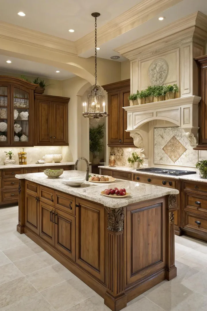
Natural wood cabinets in walnut, cherry, or stained white oak bring warmth and grain texture that no painted surface can replicate. Walnut runs the darkest with chocolate-brown tones, cherry warms to a reddish-amber over time, and white oak stained in a medium “honey” or “provincial” finish sits in the middle. All three species accept a clear matte finish that lets the wood grain show through — avoid high-gloss lacquer, which makes wood cabinets look like plastic.
Balance wood-tone cabinets with lighter surfaces elsewhere: white or light-grey quartz countertops, a white subway-tile backsplash, and walls painted in a warm neutral like Benjamin Moore Simply White or Swiss Coffee. The contrast between dark wood and light stone keeps the kitchen from feeling like the inside of a log cabin. If you want to explore how paint on kitchen walls can complement natural wood cabinetry, our dedicated guide covers wall-color pairings tested against walnut, oak, and cherry tones.
5. Add a Splash of Color with Bright Citrus Yellow
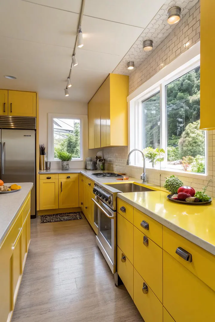
A shot of citrus yellow brings instant energy to a kitchen without requiring a full repaint. Use yellow in controlled doses — a painted island, a row of open shelves, the interior of glass-front cabinets, or a yellow backsplash tile — rather than painting every cabinet in the room. Sherwin-Williams Decisive Yellow and Benjamin Moore Hawthorne Yellow are both saturated enough to read as intentional but not so bright that they tire the eye after a few months.
Yellow pairs best with white, charcoal, and natural wood. A white kitchen with a single yellow island and brass hardware reads as cheerful and modern. A charcoal kitchen with yellow open shelving reads as bold and editorial. Avoid pairing yellow with red or orange, which pushes the palette into fast-food territory. Yellow is the most light-dependent kitchen color — it looks vibrant in a sunny kitchen and muddy in a north-facing room with limited natural light, so test your chosen shade in the actual space before committing.
6. Choose Calming Sage Green
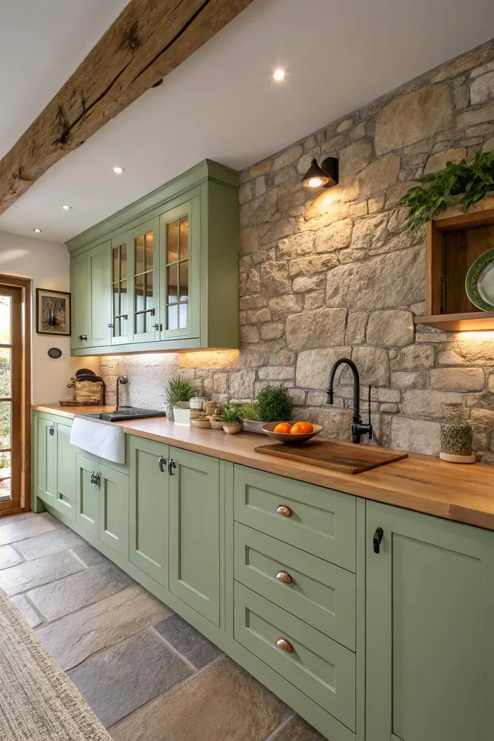
Sage green has become one of the most requested kitchen cabinet colors because it reads as a neutral — soft enough to live with daily but distinctive enough to set the kitchen apart from the all-white default. Benjamin Moore Cushing Green, Sherwin-Williams Evergreen Fog, and Farrow and Ball Vert De Terre are all popular sage tones that work across farmhouse, transitional, and modern styles. Sage cabinets pair naturally with warm metals like brass and copper, white marble or quartz countertops, and light wood flooring.
Use sage on all cabinets for a fully committed look, or limit it to the lowers with white uppers for a two-tone palette that keeps the room feeling light. Sage green absorbs and reflects light differently depending on the undertone — yellow-based sages feel warm and earthy, while grey-based sages feel cooler and more modern. Test at least three sage samples on your cabinet doors at different times of day before choosing, because the difference between a warm sage and a cool sage is dramatic in natural versus artificial light.
7. Emphasize with Charcoal Gray
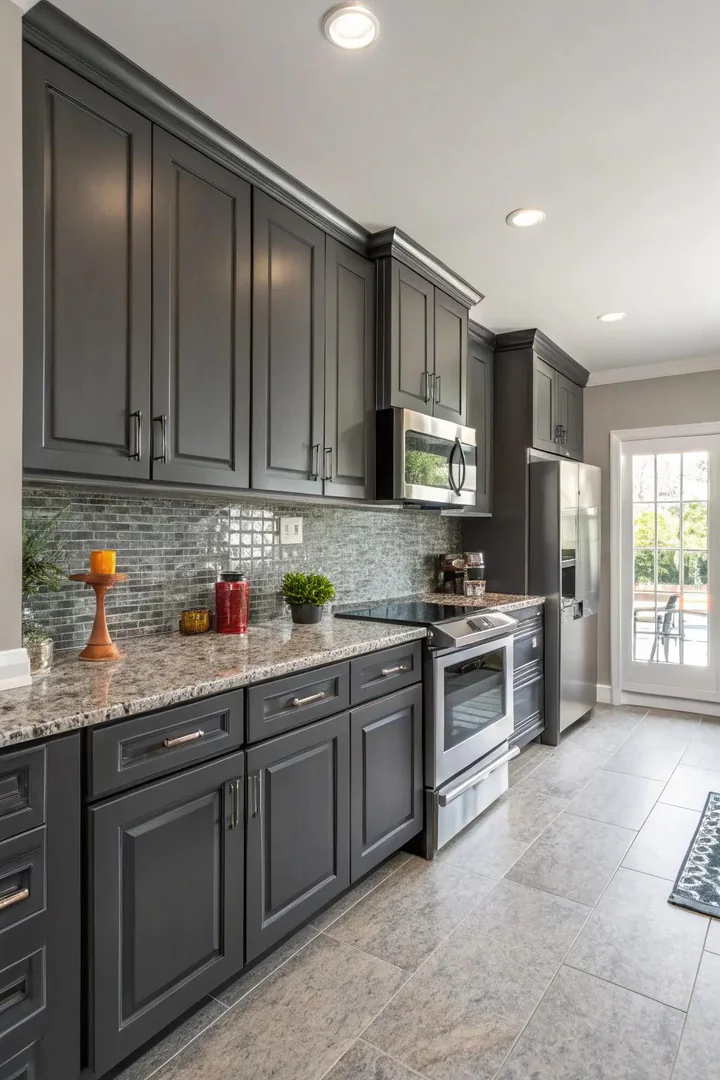
Charcoal grey cabinets deliver the visual weight of black without the harshness, making them the preferred dark neutral for kitchens that want drama without committing to full black. Benjamin Moore Wrought Iron, Sherwin-Williams Iron Ore, and Farrow and Ball Railings are all charcoal tones that shift subtly between warm and cool depending on your lighting. Charcoal reads as modern and grounding, and it hides fingerprints and cooking splatters better than white or light-colored cabinets.
Pair charcoal lowers with white or light-grey uppers to prevent the kitchen from feeling heavy, and add a white countertop with bold veining — Calacatta Laza quartz or Calacatta Gold marble — to introduce movement and brightness at the work surface. Charcoal and brass is one of the most reliable hardware pairings in kitchen design because the warm gold tone lifts the grey and prevents it from reading as flat or industrial. In small kitchens, limit charcoal to the island or a single run of base cabinets to avoid shrinking the perceived size of the room.
8. Add Softness with Powder Blue
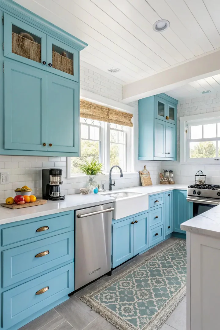
Powder blue lands in the narrow zone between “color” and “neutral” — strong enough to register as blue but pale enough to function as a background tone that does not compete with food, flowers, or the view through the window. Benjamin Moore Gossamer Blue and Sherwin-Williams Sleepy Blue are both powder-blue tones with warm grey undertones that prevent the color from reading as nursery-like. Use powder blue on cabinets, walls, or both for a monochrome effect that feels calm and clean.
White countertops, white trim, and polished nickel or chrome hardware keep the palette light and airy. Powder blue also pairs well with natural wood — a set of walnut open shelves or a butcher-block island top introduces enough warmth to prevent the room from feeling cold. Avoid combining powder blue with stainless steel appliances in a small kitchen — both are cool tones, and without a warm counterbalance, the room can feel clinical rather than serene.
9. Embrace Nature with Earthy Taupe
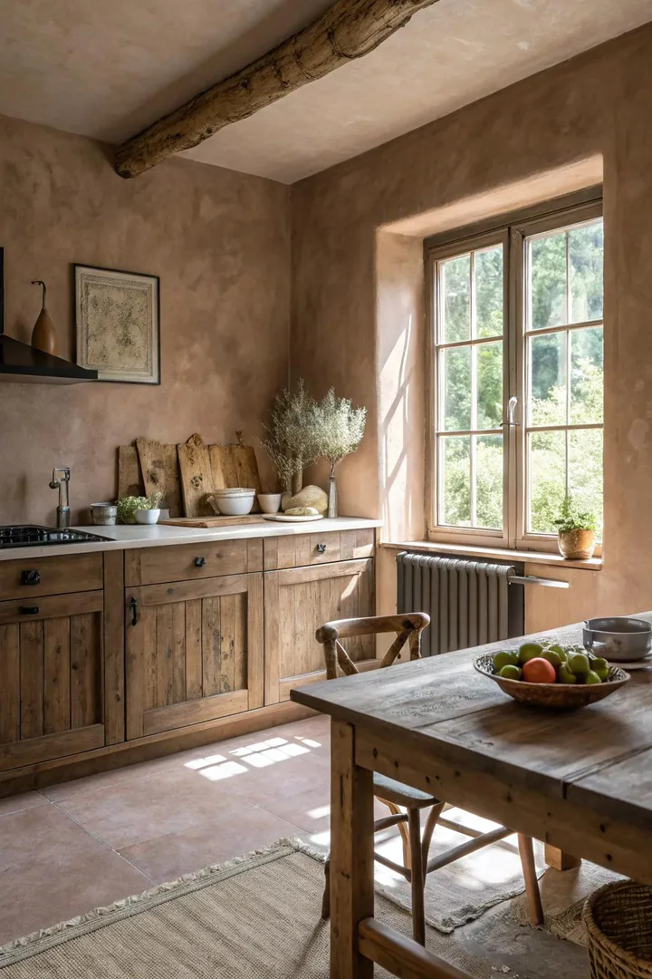
Taupe blends brown and grey into a warm neutral that sits between beige and greige on the color spectrum. It reads as grounded and organic without the yellowish cast that traditional beige carries. Benjamin Moore Revere Pewter and Sherwin-Williams Accessible Beige are two of the most widely used taupe tones in kitchens — both have balanced undertones that work with warm and cool countertop materials. Taupe cabinets pair well with white quartz, soapstone, and concrete countertops.
The advantage of taupe over white is that it hides daily wear — fingerprints, water spots, and minor scuffs disappear into the mid-tone surface instead of showing against a bright white background. Taupe also warms a north-facing kitchen that natural light never fully brightens, giving the room a sense of coziness that cool greys and whites struggle to deliver. Hardware in oil-rubbed bronze, antique brass, or satin gold all coordinate with taupe’s warm base without clashing.
10. Enhance Your Space with Fresh White and Navy
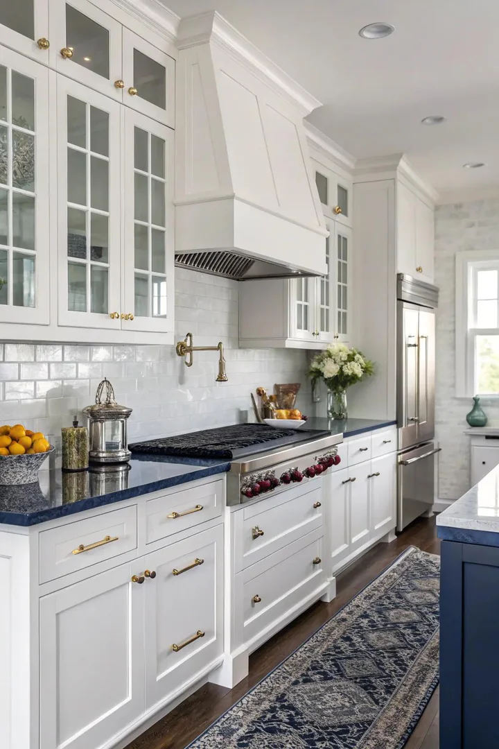
White and navy is one of the most enduring two-tone palettes in kitchen design because it carries the same visual logic as a classic navy blazer over a white shirt — clean, confident, and appropriate in any context. Paint the uppers in white and the lowers in navy — Benjamin Moore Hale Navy or Sherwin-Williams Naval — for a grounded, balanced look that keeps the upper half of the room light while anchoring the base with a strong dark tone.
A white countertop with grey or gold veining bridges the two colors at the transition point, and brass hardware ties the warm elements together. For an even more polished version, add a white subway-tile backsplash with dark navy grout that echoes the lower cabinet color and creates a subtle grid pattern on the wall. The white-and-navy palette works in every kitchen style from coastal to traditional to modern — its versatility is the reason designers return to it decade after decade.
11. Add Soft Pastel Pink
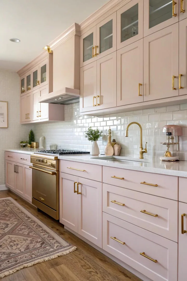
Pastel pink in a kitchen sounds risky, but the right shade reads as a warm neutral rather than a candy color. Benjamin Moore Pale Pink and Farrow and Ball Setting Plaster both carry enough brown and grey in the undertone to sit comfortably alongside white cabinets, marble countertops, and brass hardware. Use pastel pink on walls while keeping cabinets white, or paint the island in a muted blush to introduce the color as a focal accent rather than a full commitment.
Pink walls warm the light in a kitchen the way a sunset warms the sky — skin tones look healthier, food looks more appetizing, and the room feels inviting without any obvious color statement. Pair pastel pink with dark accents — a black range hood, matte-black hardware, or a dark marble countertop — to prevent the palette from feeling sweet or juvenile. The pink-and-black combination reads as sophisticated and grown-up, which is why it shows up in high-end kitchens from designers like Studio McGee and Jean Stoffer.
12. Enhance Contrast Using Black and White
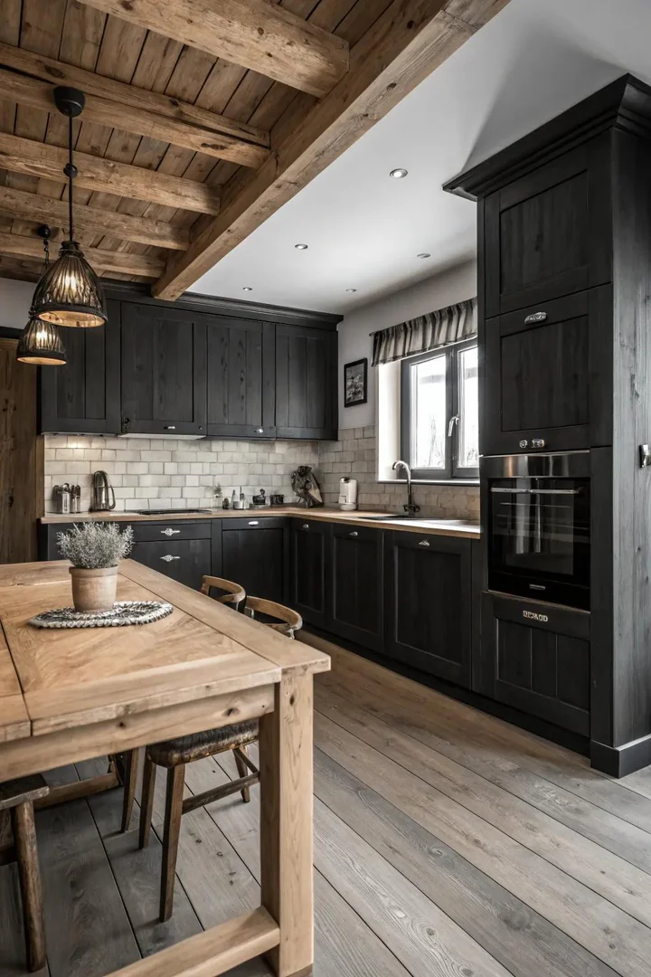
A black-and-white kitchen is the highest-contrast palette you can build, and it works because the two colors define each other — white surfaces feel brighter next to black, and black surfaces feel deeper next to white. The classic approach puts white on the cabinets and black on the countertops, but reversing the formula — black cabinets with white countertops — creates a moodier, more contemporary effect. Soapstone, honed black granite, and black quartz are all strong dark-countertop options that resist staining and fingerprints.
Soften the binary contrast with natural materials: a medium-toned wood floor, a woven pendant light, or a terracotta pot on the counter introduces organic warmth that prevents the kitchen from feeling like a chess board. Hardware in brass or brushed gold adds a third metallic tone that mediates between the two extremes. Avoid adding a third color through paint or tile — the strength of a black-and-white kitchen is its discipline, and introducing a third color dilutes the graphic impact.
13. Olive Green Experiment
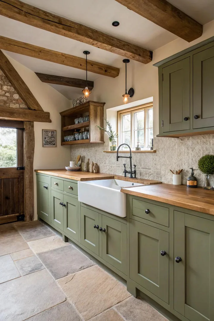
Olive green is darker and warmer than sage, with a brown undertone that makes it feel earthy and grounded rather than fresh and herbal. Benjamin Moore Rosemary Sprig and Sherwin-Williams Basil are both olive tones that sit in the sweet spot between green and brown — dark enough to feel substantial but not so dark that they swallow light. Olive cabinets pair well with brass hardware, butcher-block countertops, and terracotta tile floors for a palette that feels like a Mediterranean kitchen.
Use olive green on all cabinets for maximum impact, or limit it to the island in a kitchen with white or cream perimeter cabinets. Olive green reads differently depending on the light source — warm incandescent light brings out the brown and makes it feel richer, while cool LED light brings out the green and makes it feel more modern. Choose your under-cabinet and overhead lighting to match the mood you want, and test the paint under that specific lighting before committing to the full kitchen.
14. Revitalize with Mint Green
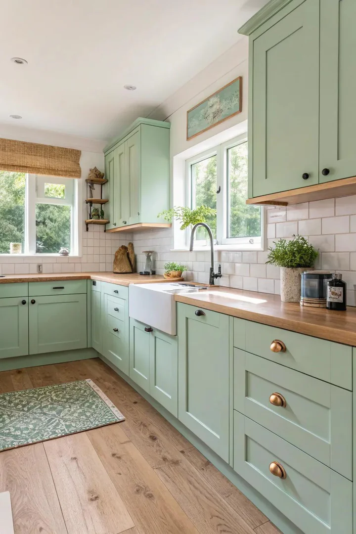
Mint green brings a retro, mid-century freshness that channels the best of 1950s kitchen design without the avocado-and-harvest-gold baggage. Benjamin Moore Spring Mint and Sherwin-Williams Breaktime are both clean mint tones with a blue undertone that keeps the green from reading as lime or chartreuse. Use mint on cabinets, a backsplash, or as a wall color paired with white cabinetry — mint works best as the dominant color in a kitchen rather than a small accent, because small doses of mint can look like a mistake rather than a choice.
Pair mint green with white countertops, white tile, and chrome or polished-nickel hardware for a true mid-century look. Adding warm wood — a walnut cutting board, oak shelving, or a teak table — prevents the mint-and-white combination from feeling too cool. Mint green kitchens photograph exceptionally well and tend to generate strong reactions — people either love them or find them too bold, so this is a color to live with for at least a week via large painted samples before committing to a full kitchen repaint.
15. Choose Classic Gray
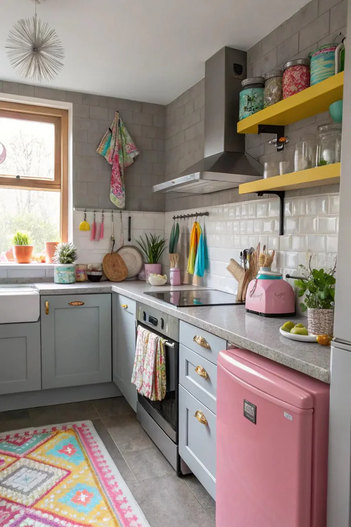
Medium grey is the most versatile cabinet color in kitchen design because it works with every countertop material, every hardware finish, and every flooring type without clashing. Benjamin Moore Chelsea Gray and Sherwin-Williams Dorian Gray are both balanced mid-tone greys that avoid the blue, green, or purple undertones that plague cheaper grey paints. Grey cabinets let the countertop and backsplash be the stars — a dramatic veined marble or a colorful cement tile can take center stage without competing with the cabinetry.
Grey also ages well. Unlike trendy colors that date a kitchen to the year it was installed, a well-chosen grey holds its relevance across shifting design trends. Pair grey cabinets with a white quartz countertop and brushed-nickel hardware for a clean, modern look, or combine grey with a warm-toned butcher block and brass pulls for a more traditional feel. For a deeper exploration of cabinet hues, our kitchen cabinet color ideas guide covers two-tone combinations and undertone matching in detail.
16. Infuse Warmth with Terracotta
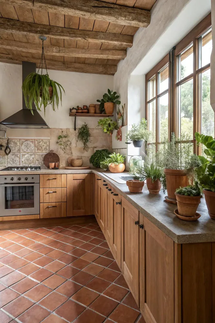
Terracotta introduces a baked-earth warmth that no grey, white, or blue can replicate. Use terracotta as a tile — floor tile, backsplash tile, or both — rather than a cabinet paint color, because the natural variation in fired clay tile gives terracotta its character. Fireclay Tile, Cle Tile, and Riad Tile all offer handmade terracotta in a range of shapes from square to hexagonal to zellige. Seal terracotta tile with a penetrating sealer like Miracle Sealants 511 to protect against staining from cooking oils and sauces.
Pair terracotta tile with white or cream cabinets and warm-metal hardware — brass, copper, or unlacquered bronze — for a Mediterranean or Spanish-Colonial palette. Wood ceiling beams, open shelving in reclaimed pine, and linen Roman shades in a natural oatmeal tone complete the warm, organic feel. Avoid pairing terracotta with cool greys or stainless steel, which fight the warmth rather than supporting it. Terracotta is a color that demands commitment — it works best when the whole kitchen leans into warmth rather than mixing warm and cool elements.
17. Use Pale Pink as a Neutral Shade
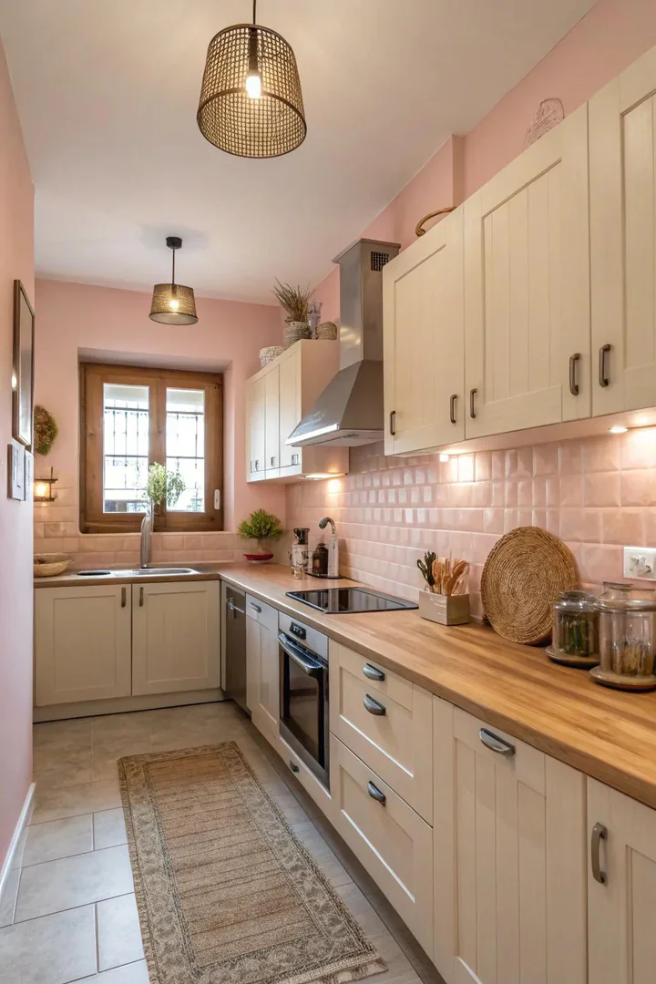
Pale pink functions as a warm alternative to white when you want a kitchen that feels soft without reading as explicitly pink. Farrow and Ball Pink Ground and Benjamin Moore Tissue Pink are both so pale that they register as “warm white” until compared side by side with a true white — at which point the pink undertone becomes visible and gives the room a glow that white alone cannot produce. Use pale pink on walls with white cabinets, or reverse the formula and paint cabinets in pale pink with white walls.
The advantage of pale pink over traditional warm whites is that it warms incandescent and LED light in a way that flatters skin tones, food, and natural materials. A kitchen painted in pale pink feels inviting at any time of day — sunny mornings and dim evenings both look good in the warm reflected light. Pair pale pink walls with marble countertops, brass hardware, and white trim for a palette that looks expensive and considered without any single element calling attention to itself.
18. Combine and Coordinate with Colorful Tiles
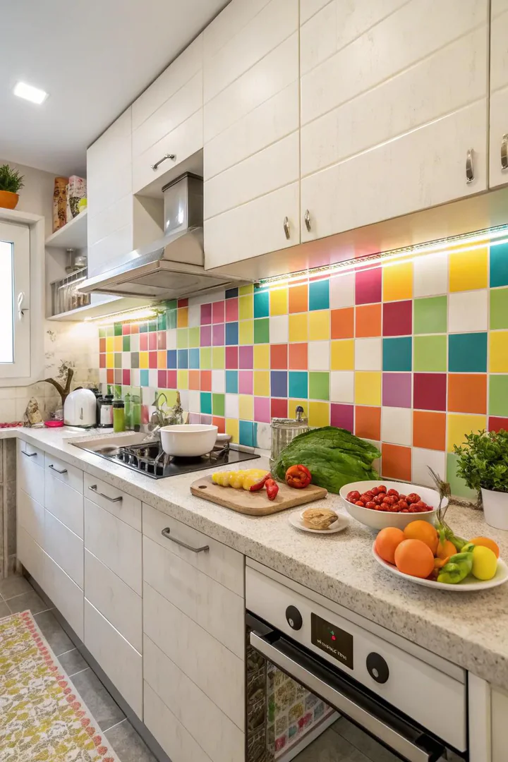
A multicolored tile backsplash lets you introduce three, four, or five colors into a kitchen without painting a single cabinet. Handmade zellige tiles from Cle Tile, Mercury Mosaics, and Fireclay come in curated color blends — you pick a palette of four to six colors and the manufacturer mixes them in a random or semi-random pattern on mesh-backed sheets for easy installation. A multicolored backsplash works best against simple, single-color cabinets — white, grey, or black — so the tile pattern is the visual focus rather than competing with cabinet color.
Choose a grout color that matches the dominant tile tone for a blended look, or use white grout for a grid effect that makes each tile stand out individually. Multicolored tile adds the most personality per square foot of any surface in the kitchen, which makes it a good investment for renters or homeowners who want to make a strong impression in a small area. A six-square-foot backsplash behind the stove costs between two-hundred and six-hundred dollars in handmade tile and creates more visual impact than a full cabinet repaint.
19. Trial with Frosty Blue
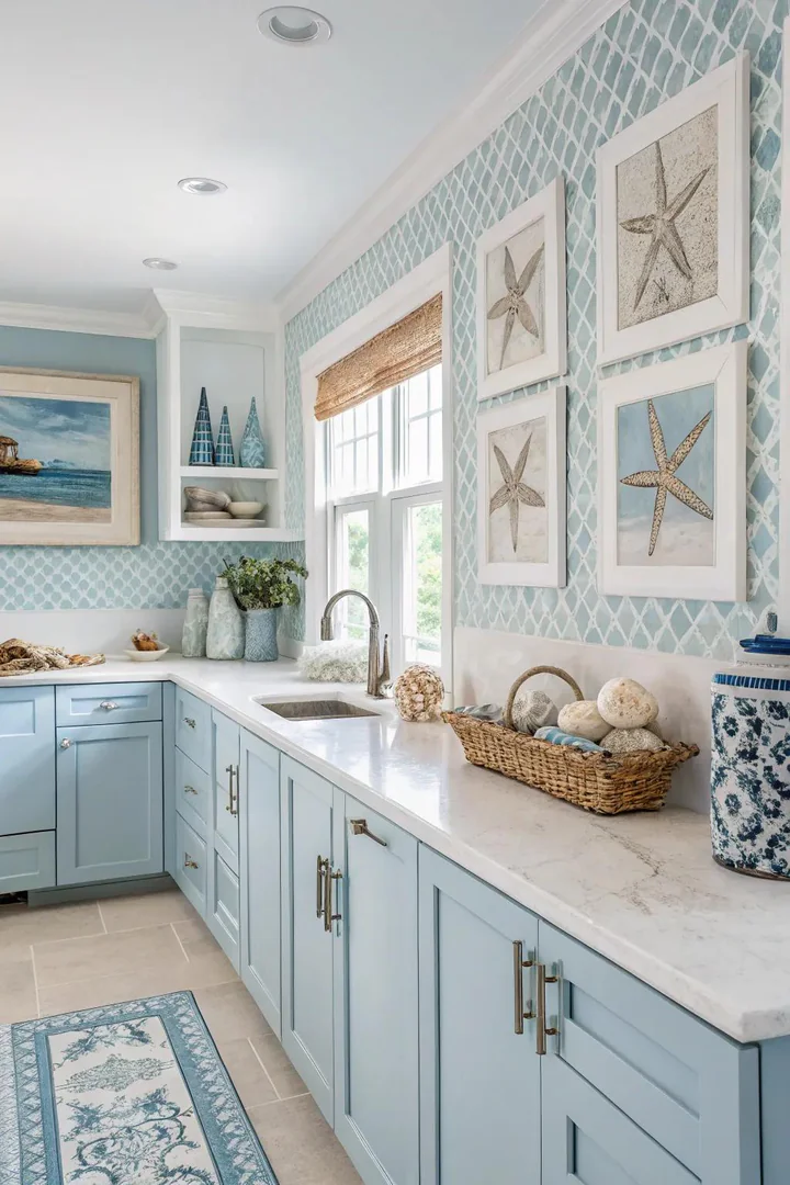
Icy blue lands between powder blue and white on the color spectrum — it carries just enough blue pigment to register as a color but stays pale enough to function as a near-neutral background. Benjamin Moore Iceberg and Sherwin-Williams Atmospheric are both icy-blue tones that look almost white in bright daylight but reveal their blue cast in evening light. This chameleon quality makes icy blue an interesting alternative to white for homeowners who want subtle color without committing to a bold hue.
Icy blue reads as clean and modern, which makes it a natural fit for contemporary and Scandinavian-inspired kitchens. Pair it with white countertops, light wood, and matte-black or polished-chrome hardware for a palette that feels intentional without being loud. Avoid combining icy blue with warm metals like brass or copper — the warmth fights the cool blue undertone and creates a visual tension that neither color wins. Stick to cool metals and cool whites for a coherent palette that lets the icy blue do its job as a quiet, calming backdrop.
20. Incorporate a Touch of Elegance with Gold Details
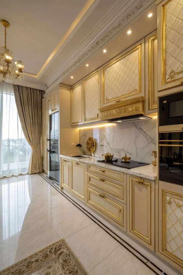
Gold is not a wall or cabinet color — it is a metallic accent that runs through hardware, fixtures, lighting, and trim to create a warm thread that ties the entire kitchen palette together. Brushed gold, satin brass, and unlacquered brass are the three most common gold finishes, and each reads differently: brushed gold is the most modern and matte, satin brass has a subtle sheen, and unlacquered brass develops a living patina that darkens over time. Pick one finish and use it on all hardware, faucets, and light fixtures for a coordinated look.
Gold accents work with every kitchen color — white and gold reads as clean and luxurious, navy and gold reads as classic and nautical, sage green and gold reads as organic and collected. The key is consistency: mixing gold knobs with chrome faucets and oil-rubbed-bronze light fixtures creates a cluttered, undecided look. Commit to gold across every metallic surface in the kitchen, and the color palette — whatever it is — gains a warm cohesion that makes the room feel finished. Explore our guide to white and copper kitchen pairings for a close cousin of the gold-accented look with a slightly more rustic character.
21. Add Dimension Using Various Finishes
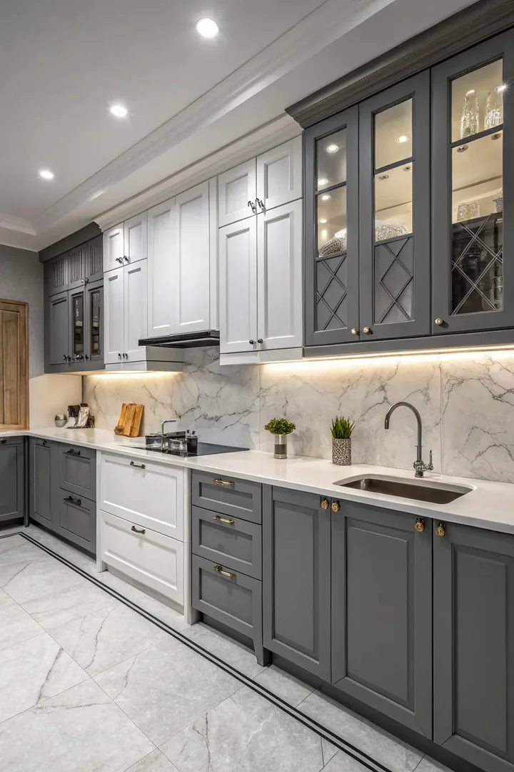
A single color applied in multiple finishes creates depth that a flat painted surface cannot achieve on its own. Matte cabinet fronts, a semi-gloss backsplash tile, and a polished stone countertop can all sit within the same color family — grey, white, or green — but the difference in sheen makes each surface catch light differently. The matte cabinets absorb light and feel soft, the semi-gloss tile reflects it at angles and adds movement, and the polished countertop creates mirror-like highlights that draw the eye.
This approach works especially well in monochromatic kitchens where you want visual interest without introducing additional colors. A grey kitchen with matte-grey cabinets, glossy grey subway tile, and a polished grey quartz countertop reads as sophisticated and layered even though the entire room is technically one color. Mixing matte and gloss finishes also works across different materials — a honed marble countertop next to a glossy ceramic backsplash creates contrast through texture rather than color, which is a subtler and more timeless approach to kitchen design.
22. Use Jewel Tones for a Striking Impact
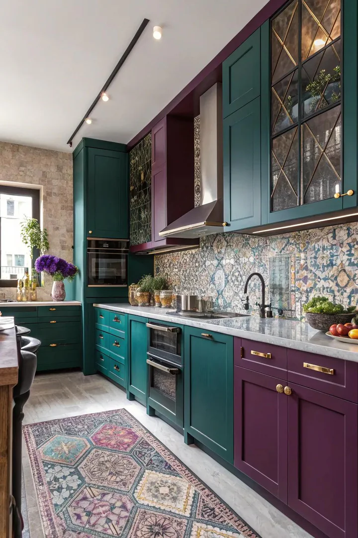
Jewel tones — emerald, ruby, amethyst, sapphire — are the boldest colors you can bring into a kitchen, and they work because their depth and saturation make them feel rich rather than loud. Benjamin Moore Hunter Green, Farrow and Ball Rectory Red, and Sherwin-Williams Majestic Purple are all jewel-tone paints that hold their intensity without feeling garish. Use a single jewel tone rather than combining multiple ones — one strong color per kitchen prevents the palette from looking like a jewelry box.
Jewel tones work best in kitchens with high ceilings, large windows, and generous square footage, where the dark, saturated color can breathe without shrinking the space. Pair jewel-tone cabinets or walls with white marble, polished brass, and warm wood for a palette that reads as luxurious and intentional. In smaller kitchens, introduce a jewel tone through a painted island or a single accent wall rather than full-room coverage — the concentrated dose delivers the color’s impact without overwhelming the space.
23. Ease with Smooth Neutral Tones
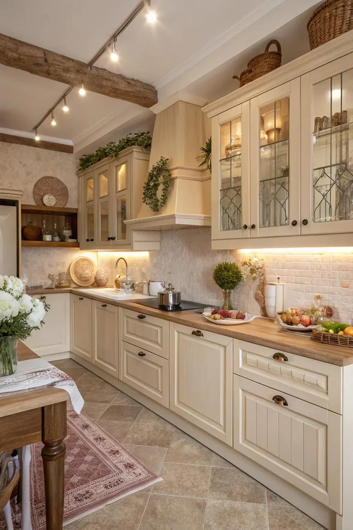
Creamy neutrals — ivory, vanilla, linen, and parchment — deliver the brightness of white with a warm softness that makes a kitchen feel lived-in from the day it is finished. Benjamin Moore White Sand, Sherwin-Williams Creamy, and Farrow and Ball Dimity are all creamy neutrals with yellow or peach undertones that glow in warm light. Use creamy neutrals on cabinets and walls for a tone-on-tone effect, varying the shade slightly between surfaces so the room reads as layered rather than flat.
Creamy kitchens pair beautifully with natural stone countertops — the warm veining in Calacatta Gold marble or the amber tones in quartzite echo the warmth in the cream paint without introducing a competing color. Hardware in antique brass, warm bronze, or satin gold reinforces the warm palette, while polished nickel or chrome would fight it. If your kitchen has warm-toned hardwood flooring, creamy cabinets create a continuous warm flow from floor to wall that makes the room feel seamless and welcoming.
24. Enhance Your Space with a Vibrant Backsplash
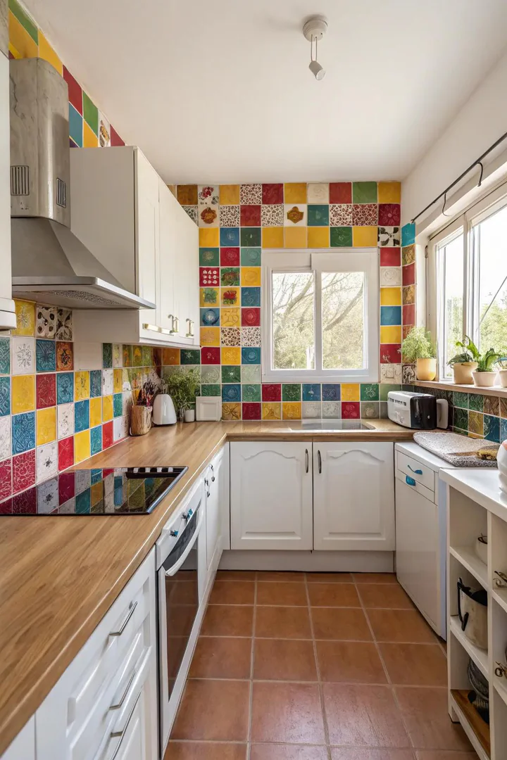
A colorful backsplash is the fastest way to introduce strong color into a kitchen without touching the cabinets. A single field of bold-colored tile — cobalt blue, forest green, burnt orange, or deep red — behind the range or across the full countertop wall creates a visual anchor that defines the kitchen’s personality. Subway tile from Fireclay, hexagonal tile from Bedrosians, and zellige tile from Cle all come in saturated colors that hold up to kitchen heat and moisture.
Keep the cabinets and countertops neutral — white, grey, or natural wood — so the backsplash has room to be the star. A cobalt-blue backsplash against white shaker cabinets and a white quartz countertop reads as confident and collected, while the same backsplash against colorful cabinets looks busy and unfocused. For more about how tile color and material choices affect the look of your kitchen, browse our glass backsplash kitchen ideas guide for options that add color and reflective depth at the same time.
How to Choose the Right Color Palette for Your Kitchen
Understanding Warm vs Cool Undertones
Every paint color and material has a warm or cool undertone that determines whether it leans yellow-brown or blue-grey. Two greys that look identical on a paint chip can look completely different on a cabinet door when one has a blue undertone and the other has a green undertone. The easiest way to identify undertone is to hold the sample next to a pure white sheet of paper — the undertone reveals itself immediately against the neutral reference. Match warm-undertone cabinets with warm-undertone countertops and flooring, and do the same with cool undertones, to avoid the subtle discord that comes from mixing the two families on large surfaces.
Testing Colors Before You Commit
Never choose a kitchen color from a paint chip alone. Buy sample pots of your top three choices and paint each one on a two-by-two-foot section of primed foam board or directly on the cabinet face. Move the sample around the kitchen over three to five days, observing how it looks in morning sun, overcast afternoon light, and under your evening lighting. Colors shift dramatically depending on the light source — a sage green that looks perfect at noon can turn muddy under warm LED bulbs at dinner time. The twenty-dollar investment in sample pots saves the five-hundred-dollar cost of a repaint.
Coordinating Cabinets, Walls, and Countertops
The safest coordination strategy is to choose one bold surface and keep the other two neutral. Bold cabinets plus neutral walls plus neutral countertops. Or neutral cabinets plus neutral walls plus a bold countertop. When two or more large surfaces compete for attention — blue cabinets with a green countertop on orange walls — the eye has no place to rest and the kitchen feels chaotic. Decide which surface gets the color, make it the best version of that color you can find, and let the other surfaces support it quietly.
Kitchen Color Palettes at a Glance
| Color Family | Best For | Pairs With | Mood |
|---|---|---|---|
| Sapphire / Navy blue | Lower cabinets, islands | White, brass, marble | Confident and classic |
| All white | Full kitchen | Wood, brass, texture | Bright and airy |
| Sage / Olive green | Cabinets, walls | Brass, warm wood, white | Calm and organic |
| Charcoal grey | Lowers, island | White uppers, brass | Modern and grounding |
| Terracotta | Tile (floor / backsplash) | Cream, copper, wood beams | Warm and Mediterranean |
| Black and white | High-contrast palettes | Wood, brass, minimal accents | Graphic and bold |
| Pastel pink / blush | Walls, island accent | White, marble, dark accents | Soft and flattering |
| Creamy neutrals | Full kitchen | Warm stone, antique brass | Welcoming and seamless |
Common Kitchen Color Mistakes to Avoid
Choosing color from a small chip. A one-inch paint chip at the store looks nothing like that same color covering forty square feet of cabinet fronts. Always test with large samples in your actual kitchen under your actual lighting before ordering paint or committing to a finish.
Mixing warm and cool undertones on large surfaces. A warm-toned cream cabinet next to a cool-toned grey countertop creates a subtle but persistent clash that makes the kitchen feel unresolved. Match undertone families across cabinets, countertops, and flooring — warm with warm, cool with cool.
Painting everything the same color. Monochromatic is good; monotonous is not. Even an all-white kitchen needs variation in sheen, texture, and material to prevent the room from feeling flat. Vary the finish — matte cabinets, semi-gloss backsplash, polished countertop — to create depth within a single-color palette.
Following trends without testing them. A color that looks beautiful on a designer’s Instagram feed may look wrong in your specific kitchen because of differences in lighting, ceiling height, flooring, and surrounding room colors. Trends provide inspiration, but your kitchen’s physical characteristics should drive the final color decision.
Frequently Asked Questions
What is the most popular kitchen color right now?
Sage green and warm white are the two most specified kitchen colors by interior designers as of the last two years. Sage green has overtaken grey as the preferred “colored neutral” because it pairs well with both warm and cool materials, and warm whites like Benjamin Moore White Dove have replaced pure whites because they feel less sterile and more inviting. Navy blue and charcoal grey remain strong choices for islands and lower cabinets in two-tone palettes.
What kitchen color has the best resale value?
White kitchens consistently deliver the strongest resale performance because buyers can project their own style onto a neutral space. Off-white tones like Benjamin Moore Simply White and Sherwin-Williams Alabaster photograph well in listings and appeal to the widest range of buyers. Grey and light wood-toned cabinets also perform well at resale. Bold colors like teal, pink, and jewel tones can either attract or repel buyers, so save those choices for kitchens you plan to enjoy long-term rather than flip.
Should kitchen cabinets be lighter or darker than walls?
Neither rule is absolute, but lighter cabinets with slightly darker walls is the most common and safest combination because it lets the cabinets stand out as architectural elements while the walls recede. Darker cabinets against lighter walls creates a more dramatic, grounded look but can make a small kitchen feel closed in. In open-plan kitchens, match the cabinet color to the trim and the wall color to the adjacent living area for a cohesive flow between rooms.
How do I choose between warm and cool kitchen colors?
Look at the fixed elements you cannot change — flooring, countertops, and appliance finishes. If your floor has warm undertones (honey oak, warm brown tile), choose warm cabinet and wall colors to match. If your floor and countertops lean cool (grey-toned wood, blue-grey stone), choose cool colors. Fighting the undertone of your existing surfaces creates a visual tension that no amount of styling can resolve.
Can I paint my kitchen cabinets myself?
Yes, with proper preparation. Sand the cabinet faces with 150-grit sandpaper, clean with TSP or a degreaser, apply a bonding primer like Zinsser BIN or Stix, and finish with two coats of a high-quality cabinet paint in satin or semi-gloss — Benjamin Moore Advance or Sherwin-Williams Emerald Urethane Trim Enamel both self-level well and cure to a hard, washable finish. Allow three to four weeks for the paint to fully cure before placing heavy objects on shelves. The project takes a full weekend with drying time spread across the following week.
What color backsplash goes with every cabinet color?
White subway tile goes with every cabinet color because it is visually neutral and does not compete for attention. If you want a backsplash with more character, choose a tile in a color that matches the lightest tone in your countertop veining — this creates a subtle connection between the two surfaces without introducing a competing color. A backsplash that matches the cabinet color creates a seamless, monolithic look that works well in modern kitchens where clean lines and minimal contrast are the goal.
Conclusion
The right kitchen color is the one that makes you want to spend time in the room — not the one that trends best on social media or sells best in a listing. White, sage, navy, charcoal, and cream all have decades of proven staying power, while bolder choices like terracotta, jewel tones, and citrus yellow give you a kitchen with genuine personality and presence. Visit The Designers Company for more kitchen color combinations, material pairings, and tested palettes that work in real homes.
Start with the fixed elements you already have — flooring, countertops, appliances — and choose a color that complements their undertone rather than fighting it. Test at least three samples in your actual kitchen at different times of day. And remember that a kitchen you love looking at while you cook, eat, and gather is worth more than a kitchen that follows every current rule but leaves you feeling nothing when you walk through the door.