
Kitchen Island Colors with White Cabinet Ideas: 17 Chic Ideas That Wow
A colored kitchen island paired with white cabinetry creates an instant focal point that gives the room depth without shrinking the space. White cabinets reflect light and keep the perimeter feeling open, while the island’s contrasting tone anchors the center and draws the eye.
Choosing the right island color depends on your countertop material, flooring undertone, and the mood you want the kitchen to set. Bold hues like navy and emerald make a statement, warm metallics add texture, and soft pastels keep the palette relaxed. Browse more kitchen inspiration at The Designers Company to find a combination that fits your style.
1. Warmth of Copper
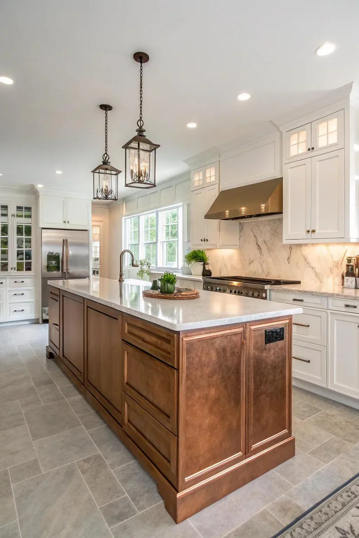
A copper-finished island brings a burnished metallic glow that shifts in tone throughout the day as natural light moves across the room. Pair the warm finish with a honed Carrara marble top and brushed brass pulls to keep every surface within the same warm-metal family.
Copper works especially well in kitchens with exposed brick or reclaimed-wood open shelves. The finish bridges rustic and modern without committing fully to either direction, making it a strong pick for transitional designs.
2. Gentle Pastel Blues
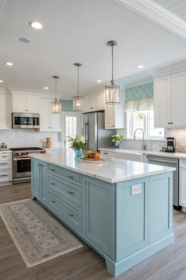
A soft pastel blue island, around the shade of Farrow and Ball’s Lulworth Blue or Benjamin Moore’s Breath of Fresh Air, introduces calm without overpowering the white backdrop. The hue reads best under natural daylight, where its gray undertone prevents it from looking childish.
Complement the blue with a white quartz top featuring subtle gray veining and nickel cup pulls. Wicker baskets tucked into the island’s lower shelf add texture and reinforce the coastal or cottage feel that pastel blue naturally suggests.
3. Glossy Black Finish
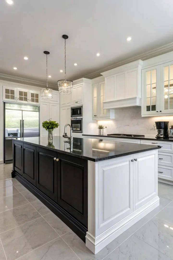
A high-gloss lacquer finish in Sherwin-Williams Tricorn Black bounces light like a mirror and makes a compact island feel more substantial. The reflective surface pairs well with polished chrome hardware and a waterfall-edge quartz countertop in Calacatta Laza.
Keep the rest of the kitchen matte, flat-panel white doors, honed stone backsplash, to let the gloss carry the visual weight. Wipe the surface with a microfiber cloth daily, because fingerprints show more on high-gloss paint than on any other finish.
4. Graceful Emerald Green
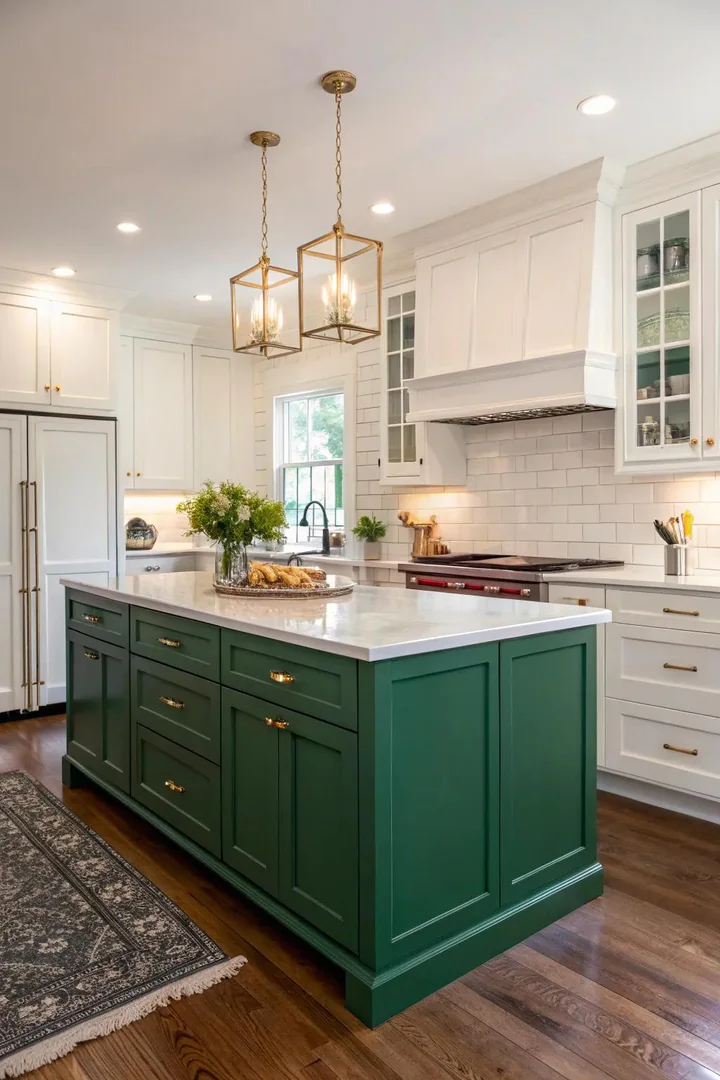
Benjamin Moore’s Forest Green or Sherwin-Williams Shamrock deliver a rich emerald that reads sophisticated rather than trendy. The deep green pairs with unlacquered brass hardware that develops a natural patina over months, adding character without extra effort.
Emerald green works best when the island sits on medium-tone hardwood flooring, white oak or hickory, so the base doesn’t disappear into a dark floor. Top the island with a light-veined marble or a white concrete countertop to keep the contrast sharp.
5. Whimsical Coral
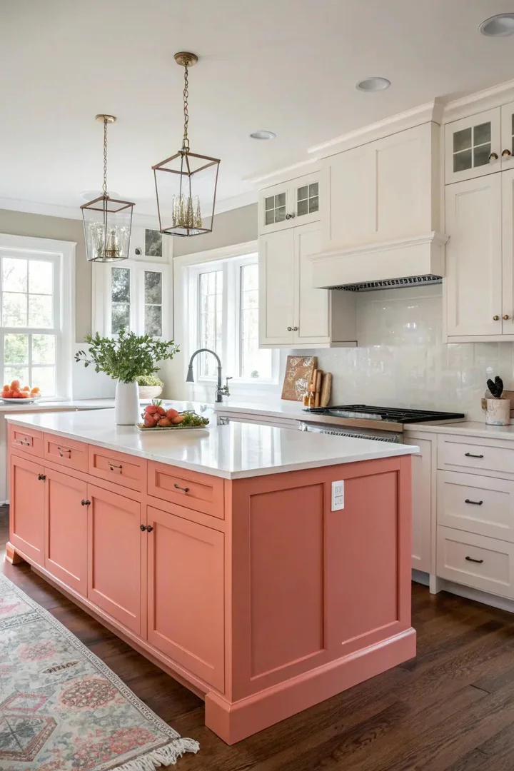
Coral sits between pink and orange on the spectrum and brings energy to a white kitchen without the intensity of red. A matte finish in Benjamin Moore’s Coral Gables or Sherwin-Williams Ravishing Coral keeps the tone warm and grounded.
Balance the boldness with neutral accessories: a gray-veined quartz top, matte black bar stools, and a simple pendant light in spun brass. Coral islands photograph well for real-estate listings and social-media content, making them a practical choice for homeowners who plan to stage or sell later.
6. Timeless White on White
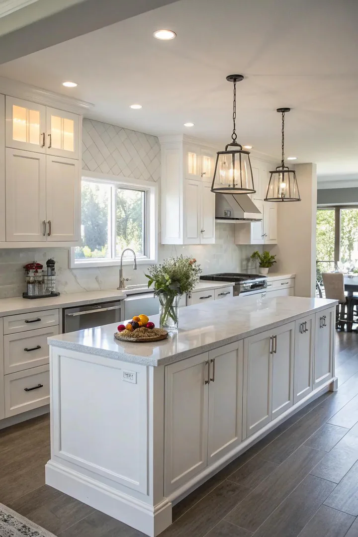
A white-on-white kitchen relies on texture differences rather than color contrast. Pair shaker-style white perimeter cabinets with a flat-panel island in a slightly warmer white, such as Benjamin Moore’s White Dove against Simply White, to create separation that reads as intentional.
Layer in brushed nickel hardware, a thick Caesarstone countertop with light veining, and open shelves in natural maple to prevent the room from feeling flat. Homeowners exploring ideas for staging a kitchen often lean on this monochrome approach because it appeals to the broadest range of buyers.
7. Opulent Lavender
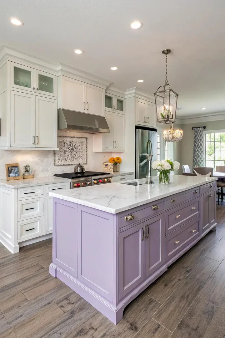
A muted lavender island in Farrow and Ball’s Brassica or Benjamin Moore’s French Lilac softens a stark white kitchen and adds a layer of personality that neutral tones alone cannot deliver. Lavender reads best in kitchens with ample natural light, where the purple undertone stays cool rather than muddy.
Pair lavender with polished-chrome pulls and a white-marble countertop. Avoid mixing warm metals like brass with lavender; the cool undertone clashes with yellow-leaning finishes and pulls the palette in two directions at once.
8. Strong Black Contrast
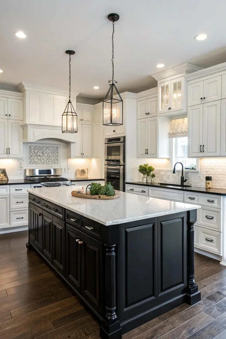
A matte-black island delivers the same drama as high-gloss without the upkeep. Use a cabinet-grade paint like Benjamin Moore Advance in Black and apply two coats with a foam roller for a factory-smooth finish. Matte black hides smudges far better than its glossy counterpart.
Coordinate the island finish with matte-black light fixtures and a matte-black faucet from Delta or Moen. The all-black hardware package makes the island feel like a custom piece rather than a repainted afterthought.
9. Deep Red Wine
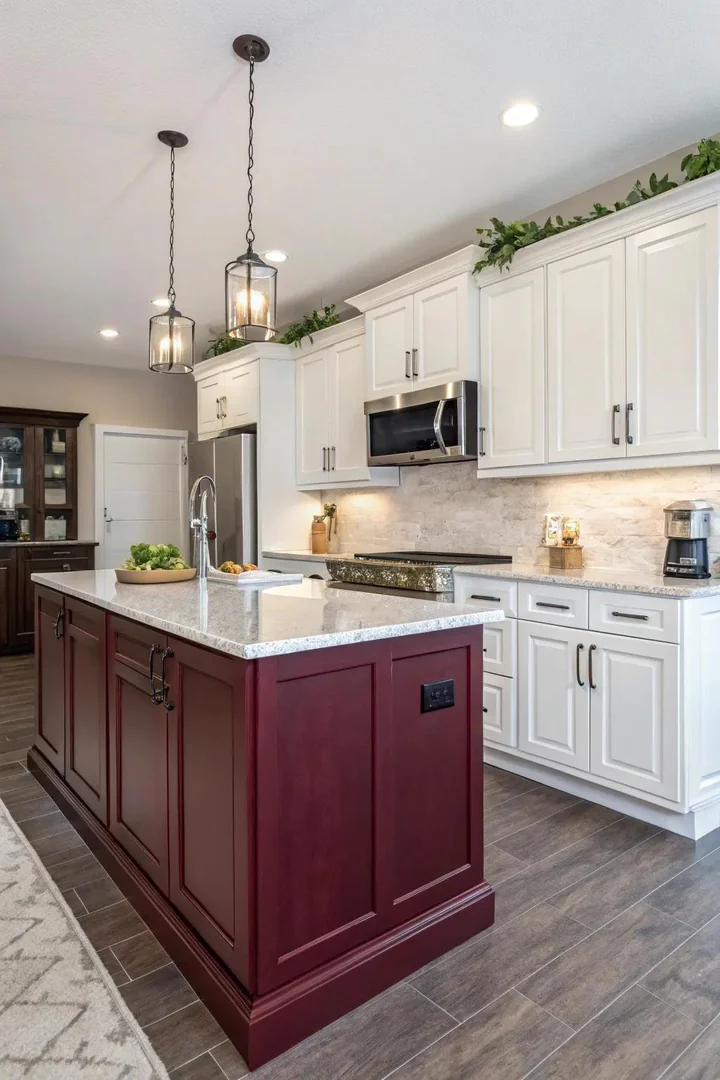
A burgundy island painted in Sherwin-Williams Burgundy or Benjamin Moore’s Dinner Party introduces old-world warmth that pairs naturally with Carrara marble and oil-rubbed bronze hardware. The dark red reads well against both light and dark wood floors.
Burgundy works in traditional, farmhouse, and French-country kitchens where warmth and richness take priority over minimalism. Keep the walls and backsplash white or pale cream so the island commands attention without the room feeling heavy.
10. Profound Azure Sophistication
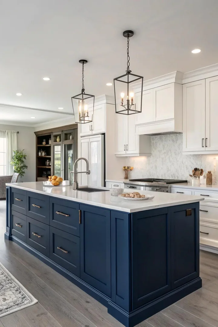
Navy blue ranks among the most requested island colors for white-cabinet kitchens, and Benjamin Moore’s Hale Navy and Farrow and Ball’s Stiffkey Blue remain the two most popular formulas. The dark blue reads rich in daylight and dramatic under evening pendants, giving the kitchen two distinct personalities throughout the day.
Top a navy island with a thick slab of Calacatta Gold marble and add brass-knob hardware for a nautical-meets-classic look that ages well. Designers exploring kitchen layout ideas often use a navy island to anchor the center of an open floor plan.
11. Subdued Natural Hues
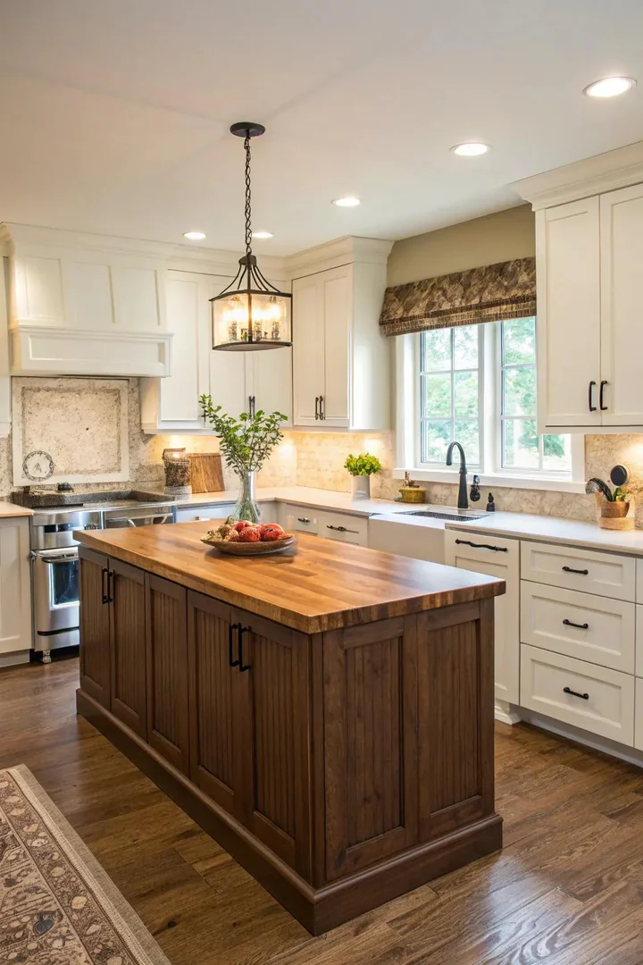
Muted earth tones such as Benjamin Moore’s Weimaraner or Sherwin-Williams Urbane Bronze ground a white kitchen in organic warmth. Earth tones pair naturally with stone countertops, terracotta floor tile, and linen-textured cabinet inserts.
An earthy island works as a neutral itself, pairing easily with both warm and cool metals. Use it as a foundation color when you want the island to blend rather than pop, letting the countertop or a statement pendant light carry the room’s visual interest instead.
12. Sunny Yellow Accents
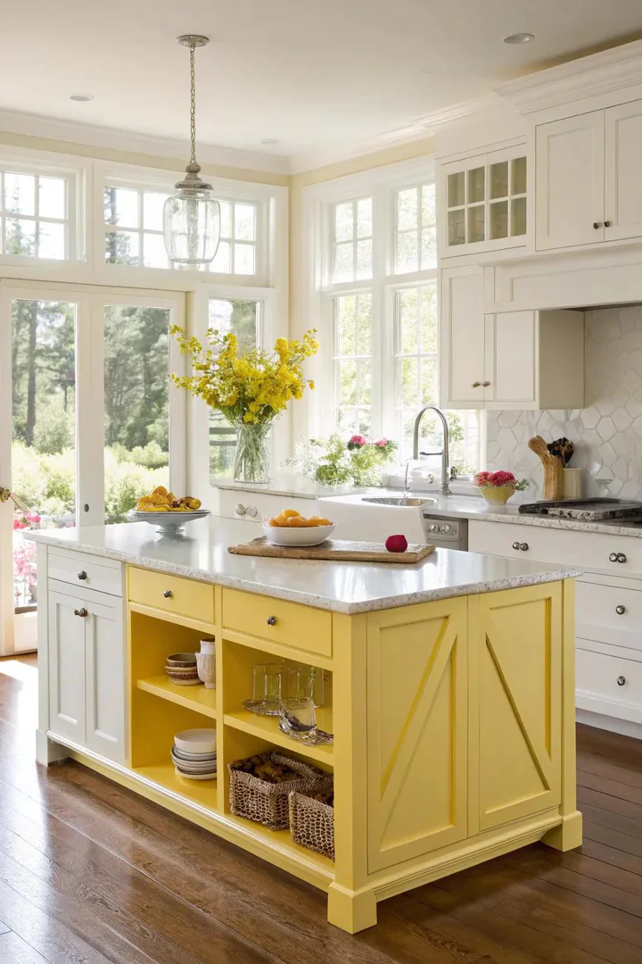
A sunny yellow island in Farrow and Ball’s Dayroom Yellow or Benjamin Moore’s Hawthorne Yellow injects instant cheer into a white kitchen, especially in north-facing rooms that receive limited direct sunlight. Yellow bounces warm light across the space and makes the white cabinets appear even brighter.
Balance yellow with matte-black hardware and a warm gray quartz top to prevent the palette from skewing too sweet. A single open shelf on the island stocked with dark-spined cookbooks adds visual weight and keeps the yellow grounded.
13. Aqua Accents
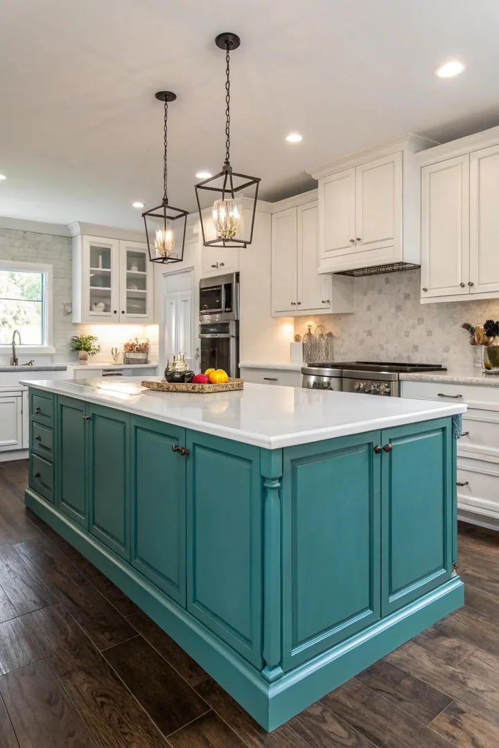
Teal sits between blue and green and reads differently depending on the surrounding finishes. Benjamin Moore’s Teal Ocean or Sherwin-Williams Really Teal lean blue under cool LED light and shift greener in warm incandescent glow, giving the kitchen a subtle chameleon quality.
Pair teal with gold or warm-brass hardware; the yellow metal complements teal’s blue undertone in the same way a complementary color wheel predicts. A butcher-block countertop in end-grain walnut rounds out the palette with a third natural layer.
14. Tranquility of Sage Green
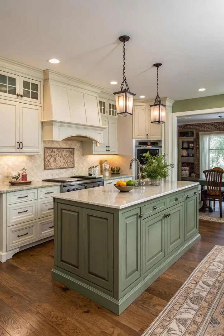
Sage green remains one of the top kitchen color trends, and Benjamin Moore’s Sage or Farrow and Ball’s Vert De Terre deliver the right balance of gray and green. Sage pairs effortlessly with white shaker cabinets, warm oak flooring, and brass or polished-nickel pulls.
Homeowners drawn to clay kitchen magnet ideas and other handmade accents often gravitate toward sage because the muted, organic tone complements artisan finishes. A Danby marble or honed-limestone top reinforces the natural character of the color.
15. Sophistication in Charcoal Gray
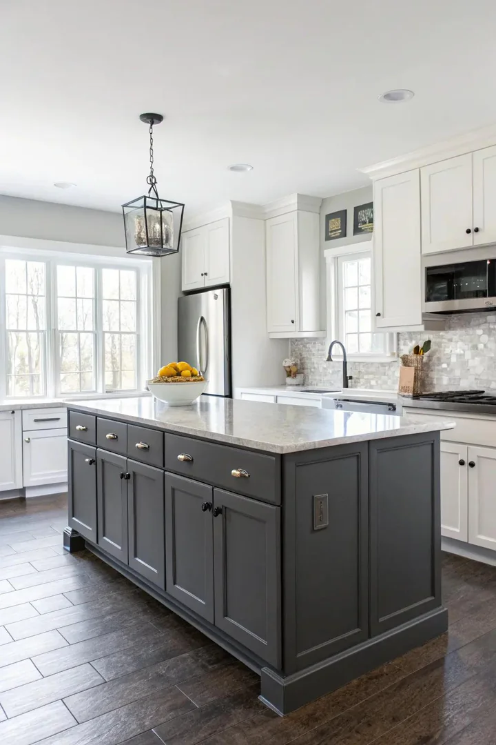
Charcoal gray offers the depth of black with more subtlety and less visual weight. Benjamin Moore’s Kendall Charcoal or Sherwin-Williams Iron Ore are reliable picks that read true under both warm and cool lighting without shifting toward blue or brown.
A charcoal island topped with white quartz and fitted with brushed-stainless bar pulls creates a contemporary, gender-neutral kitchen that appeals to a wide audience. The color hides cooking splatters better than light finishes and ages gracefully as hardware and accessories evolve around it.
16. Weathered Rustic Finishes
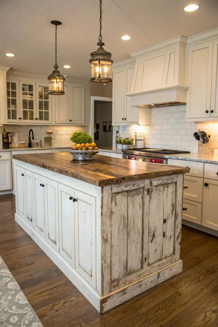
A distressed painted finish, achieved with a base coat of Annie Sloan Chalk Paint in Graphite followed by light sanding on the edges, gives a new island the look of a reclaimed piece. Layer a clear wax topcoat for protection and a soft sheen that catches sidelight.
Rustic distressed islands pair with farmhouse sinks, open iron shelving, and wide-plank pine flooring. Anyone exploring mobile home kitchen island ideas on a budget can replicate this finish with a weekend of work, a quart of chalk paint, and a sanding block.
17. Cozy Timber Hues
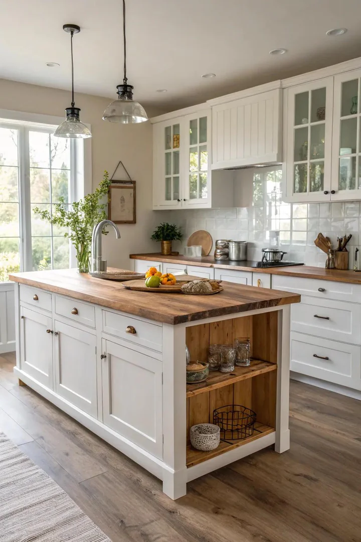
A warm wood island, built from rift-sawn white oak, walnut, or reclaimed Douglas fir, introduces grain patterns and organic texture that no paint color can match. Seal the wood with Rubio Monocoat in a natural or light-smoke tone to preserve the grain while protecting against water and heat.
Wood-tone islands soften the crisp geometry of white Shaker cabinets and create a Scandinavian or mid-century modern feel. Match the island’s wood species to the flooring for continuity or contrast it deliberately, pairing walnut against white-oak floors, for a curated two-tone effect.
Kitchen Island Color Comparison
| Island Color | Best Cabinet White | Recommended Hardware | Style Match |
|---|---|---|---|
| Navy Blue | Simply White | Brushed brass | Coastal, Traditional |
| Sage Green | White Dove | Polished nickel | Farmhouse, Cottage |
| Charcoal Gray | Chantilly Lace | Brushed stainless | Modern, Contemporary |
| Emerald Green | Decorator’s White | Unlacquered brass | Glam, Transitional |
| Matte Black | Simply White | Matte black | Industrial, Modern |
| Warm Wood | White Dove | Black iron | Scandinavian, Mid-Century |
| Copper | Alabaster | Brushed brass | Rustic, Transitional |
| Pastel Blue | Chantilly Lace | Chrome | Coastal, Cottage |
Frequently Asked Questions
What kitchen island color pairs best with white cabinets for resale value?
Navy blue and charcoal gray consistently test highest in buyer-preference surveys. Both colors read as intentional upgrades rather than personal taste, making the kitchen appeal to a broader audience. Pair either shade with neutral countertops and standard hardware finishes so the next owner can adapt the accessories without repainting.
Should the island color match the countertop or the backsplash?
Pull the island color from neither. Choose a shade that contrasts with both so the island stands on its own as a focal point. A sage-green island, white-quartz countertop, and white-subway-tile backsplash each occupy a separate tonal lane, keeping the eye moving rather than blending everything into one plane.
Can I paint my existing kitchen island a new color without replacing the cabinets?
Yes. Sand the surface with 150-grit sandpaper, apply a bonding primer such as Zinsser BIN Shellac-Based Primer, and roll two coats of Benjamin Moore Advance or Sherwin-Williams Emerald Urethane Trim Enamel. Allow 30 days of cure time before placing heavy objects on the painted surface.
How do I prevent a dark island from making my kitchen feel smaller?
Keep the perimeter cabinets and walls white, install under-cabinet LED strip lights, and choose a light-colored countertop for the island. The surrounding brightness offsets the visual weight of the dark island, and the reflected light from the countertop prevents the center mass from feeling like a hole in the room.
Do wood-tone islands go out of style?
Natural wood tones have cycled in and out of trend for decades, but warm-toned species like white oak and walnut have held strong since the mid-2010s. A wood island sealed with a clear matte finish ages gracefully and can be refinished later if trends shift, making it a lower-risk choice than a bold paint color.
Conclusion
A single island color can redefine the personality of an entire white-cabinet kitchen. Start by sampling three or four shades on a large poster board, propping each against the cabinets under morning and evening light before committing to a gallon.
Match the island’s finish to your hardware and countertop material for a cohesive result, and remember that matte finishes hide daily wear better than gloss. Whichever direction you choose, the contrast between a colored island and white cabinetry ensures the kitchen feels layered, intentional, and uniquely yours.