
Cream Colored Kitchen Cabinets Ideas: 16 Elegant Designs to Try Now
Cream colored kitchen cabinets ideas offer the warmth that white cabinets lack and the brightness that dark cabinets cannot provide. Pure white cabinets can feel sterile and institutional under certain lighting — especially in north-facing kitchens or kitchens with limited natural light — while cream introduces a yellow or beige undertone that softens the space and makes it feel lived-in, warm, and inviting without sacrificing the light-reflective properties that keep a kitchen feeling open.
The 16 cream colored kitchen cabinets ideas below show how to pair cream cabinetry with countertops, backsplashes, flooring, hardware, and wall colors to create a kitchen that feels both timeless and current. Each idea names specific paint colors, materials, and product sources so you can build an exact material palette rather than guessing at combinations.
1. Distinctive Island Creations
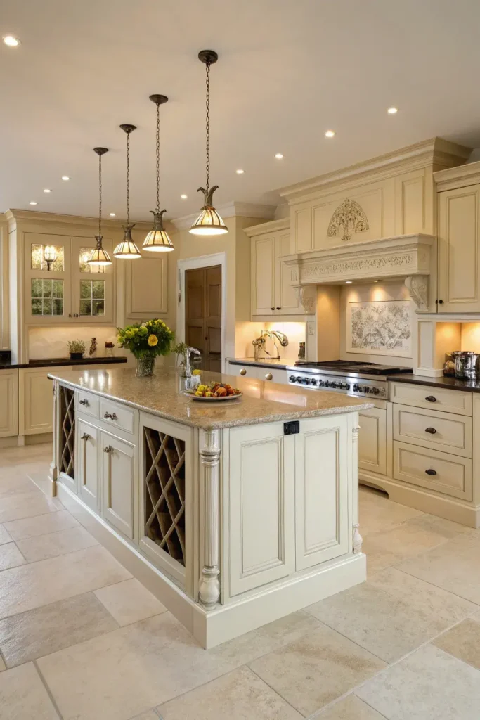
A cream kitchen island in a contrasting color or material from the perimeter cabinets creates a two-tone kitchen where the island stands out as a distinct piece of furniture rather than blending into the surrounding cabinetry. Painting the island a different shade of cream — or a complementary color like sage green, navy blue, or charcoal — while keeping the perimeter cabinets in cream establishes visual hierarchy and gives the kitchen a collected, evolved look rather than a uniform, built-all-at-once appearance.
For a subtle two-tone effect, paint the island one or two shades deeper than the perimeter cream — Benjamin Moore’s Niveous (OC-36) on the perimeters with Muslin (OC-12) on the island creates a tonal variation that reads as coordinated without being identical. For a bolder contrast, pair cream perimeter cabinets with a navy island (Benjamin Moore Hale Navy HC-154) or a sage green island (Sherwin-Williams Evergreen Fog SW 9130). Top the contrasting island with a different countertop material — butcher block on a painted island against marble or quartz on the cream perimeters — to reinforce the island’s identity as a separate element. For more two-tone inspiration, see our kitchen cabinet color ideas guide.
2. Wall Colors in Neutral Tones
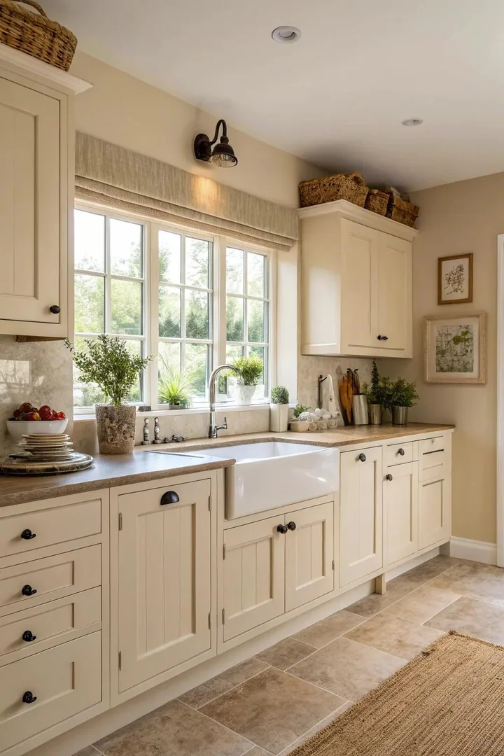
Neutral wall colors — warm whites, soft greys, pale taupes, and greige tones — provide a quiet background that lets cream cabinets take center stage without competing for visual attention. The wrong wall color can make cream cabinets look dingy (cool grey walls make cream look yellow) or invisible (cream walls matching cream cabinets create a washed-out, monotone effect).
The best neutral wall colors for cream cabinets share the same warm undertone family as the cabinet color (yellow, beige, or golden undertones) but sit one or two values lighter or darker on the color scale. Benjamin Moore White Dove (OC-17) is a warm white that sits slightly brighter than most creams, creating a clean background without cold contrast. Sherwin-Williams Accessible Beige (SW 7036) is a warm greige that coordinates with cream cabinets by sharing the same beige undertone at a slightly deeper value. For a subtle contrast, Farrow & Ball Skimming Stone (No.241) provides a warm grey with enough depth to make cream cabinets pop without creating a stark temperature clash. For more color pairing strategies, explore our kitchen color ideas guide.
3. Fun Designed Flooring
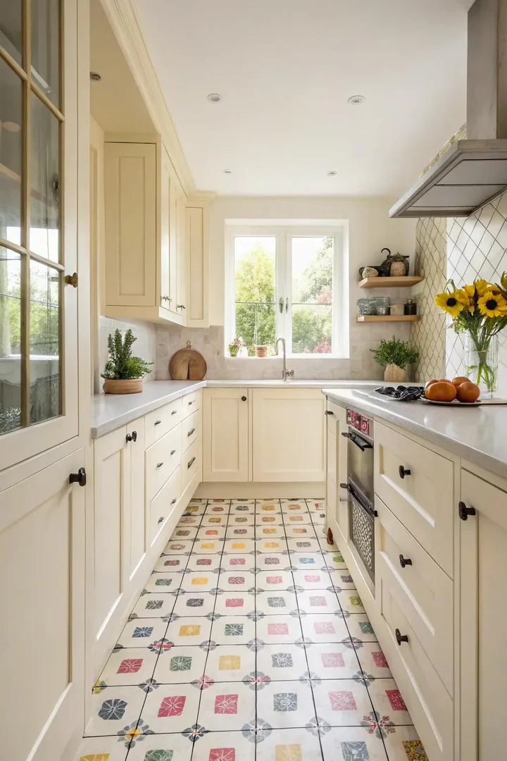
Patterned flooring — encaustic cement tiles, geometric porcelain tiles, herringbone wood, or checkerboard vinyl — adds personality and visual energy to a cream kitchen that might otherwise read as too quiet or predictable. Because cream cabinets are inherently neutral, they provide a calm upper-half that can absorb bold flooring patterns without the room feeling chaotic. The pattern draws the eye downward, balancing the visual weight of the kitchen between cabinets and floor.
Black-and-white checkerboard tile (from Daltile, Floor & Decor, or MSI) creates a classic retro look under cream cabinets that evokes 1920s-era kitchens and French bistros. Encaustic cement tiles in blue, green, or terracotta geometric patterns (from Cement Tile Shop, Clé, or Granada Tile) create a Mediterranean or Moroccan feel that pairs beautifully with cream’s warm undertones. Herringbone-pattern wood floors (white oak or hickory from Lumber Liquidators or LL Flooring) add texture and movement without introducing a strong color contrast. Choose patterns with at least one tone that relates to the cream cabinets — a pattern that includes cream, beige, or warm white will connect visually with the cabinetry above.
4. Showcasing Open Shelving
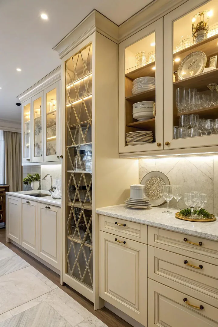
Replacing one or two sections of upper cream cabinets with open shelving breaks up the visual mass of a full wall of closed cabinets and introduces a display area for dishes, glassware, cookbooks, and decorative objects. In a cream kitchen, open shelving is particularly effective because the warm, neutral cabinet color creates a consistent background that makes the items on the shelves stand out as curated focal points.
Natural wood floating shelves (white oak, walnut, or reclaimed wood) against a cream-tiled or cream-painted backsplash wall create a warm-on-warm contrast that adds texture without introducing a competing color. Brass or gold shelf brackets (from Rejuvenation, Schoolhouse Electric, or Etsy metalworkers) complement the golden undertones in cream cabinets and tie into brass faucets and cabinet hardware. Arrange shelves with the three-zone method: everyday items (mugs, glasses, frequently used bowls) on the most accessible shelf at eye level; decorative objects (a small plant, a ceramic vase, a framed recipe) on the top shelf; and cookbooks or cutting boards leaning against the wall on the bottom shelf.
5. Opulent Marble Combination
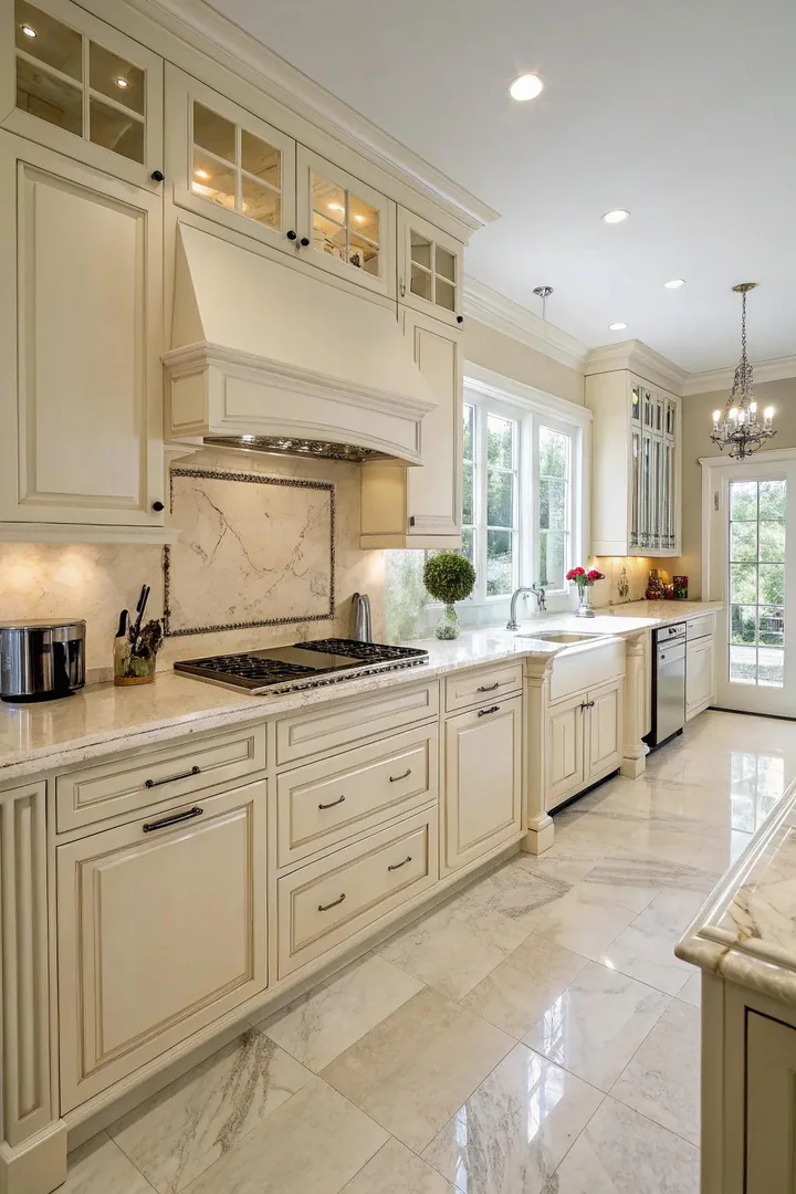
Marble countertops — particularly Calacatta, Carrara, and Statuario varieties — pair with cream cabinets to create one of the most traditionally luxurious kitchen palettes available. The warm cream of the cabinets prevents the marble from looking cold or sterile (a common problem when marble is paired with bright white cabinets), and the grey veining in the marble provides enough contrast to define the counter surface against the similarly toned cabinet fronts.
Calacatta marble (bold grey and gold veining on a warm white background) is the most dramatic pairing with cream cabinets because the gold tones in the veining pick up the golden undertone in the cream. Carrara marble (softer grey veining on a cool-white background) creates a more subtle, understated combination. For the marble-look at a lower price point and with less maintenance, engineered quartz in marble-look patterns (Caesarstone Calacatta Nuvo, Cambria Brittanicca, or Silestone Calacatta Gold) replicates marble’s appearance with non-porous, stain-resistant performance. Extend the marble or marble-look material to the backsplash (full-height slab or large-format tiles) for maximum visual impact.
6. Comparison with Dark Countertops
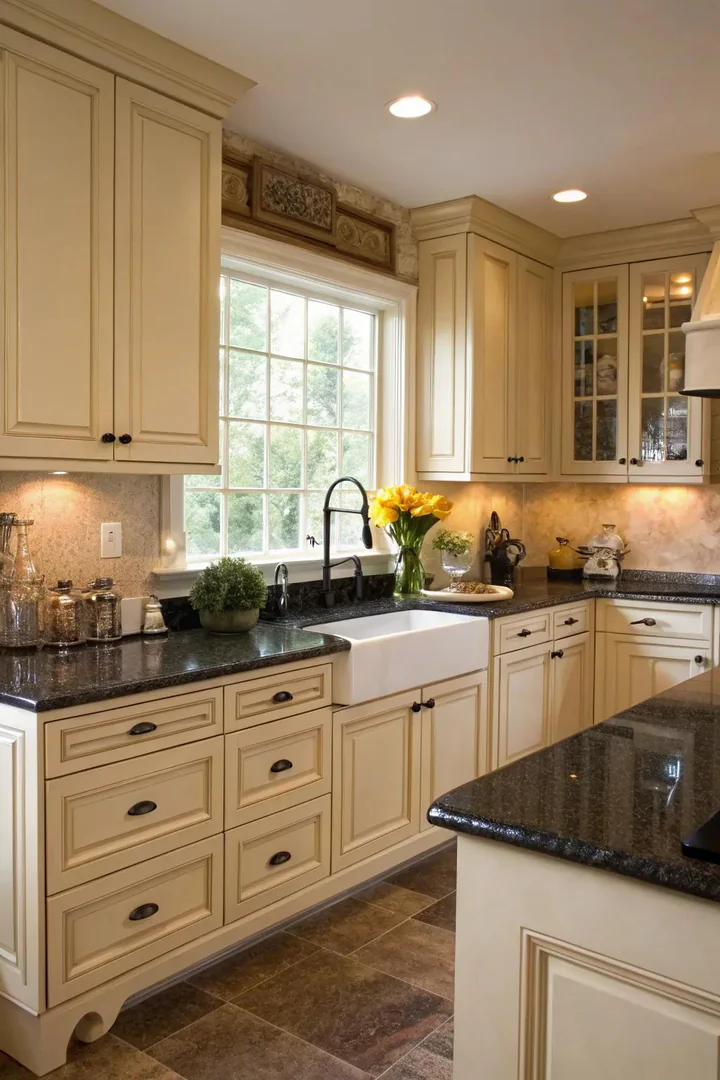
Dark countertops — black granite, dark grey soapstone, charcoal quartz, or espresso-stained butcher block — create a high-contrast pairing with cream cabinets that defines the counter edge sharply and adds visual weight and grounding to a kitchen that might otherwise feel too light and airy. The dark counter anchors the kitchen at the horizontal midpoint (countertop height, about 36 inches) and gives the eye a strong line to follow around the room.
Absolute Black granite (polished or honed from granite suppliers like Arizona Tile or MSI) creates the highest contrast against cream cabinets — the pure black surface makes the warm cream tones pop. Dark soapstone (from Vermont Soapstone or Bucks County Soapstone) provides a similar contrast in a matte, non-reflective surface that develops a natural patina over time. For a softer dark contrast, charcoal quartz (Caesarstone Piatra Grey, Silestone Charcoal Soapstone, or Cambria Blackpool Matte) provides depth without the starkness of pure black. Balance the dark counter with lighter elements above — a light-colored backsplash, light pendants, and the cream upper cabinets — to prevent the kitchen from feeling top-heavy or bottom-dark.
7. Elegant Illumination
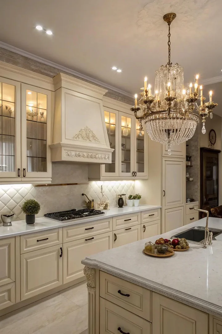
Elegant lighting — a crystal chandelier over the island, brass pendant lights above the sink, or a sculptural semi-flush mount at the kitchen entrance — adds a layer of refinement to cream cabinets that reinforces the warm, traditional character of the color. Cream kitchens lend themselves naturally to polished, sophisticated lighting because the cabinet color itself evokes traditional, refined spaces — French country kitchens, Georgian townhouse kitchens, and English cottage kitchens all traditionally used cream or off-white cabinetry with decorative light fixtures.
A crystal or glass chandelier (from Visual Comfort, Crystorama, or Savoy House) over a cream kitchen island creates a formal focal point that reads as collected and intentional. For a less formal approach, a pair of brass lantern pendants (from Visual Comfort’s E.F. Chapman collection or Ballard Designs) provides warm metallic light that complements cream’s golden undertones. Under-cabinet LED lighting (warm white, 2700K) installed beneath the upper cabinets washes the cream cabinet doors with a soft glow that enhances the color’s warmth and provides functional task lighting. For more on choosing kitchen lighting that coordinates with your cabinet color, see our guide.
8. Combining Metal Finishes
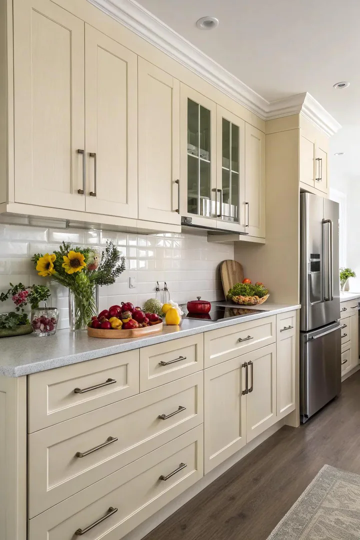
Mixing two or three metal finishes — brass cabinet pulls with a polished nickel faucet and black iron pendant lights, for example — adds visual depth and a collected, layered quality to a cream kitchen that single-metal schemes cannot achieve. Cream cabinets work particularly well with mixed metals because the neutral, warm cabinet color does not compete with any metal tone — it serves as a calm backdrop that lets the metallic accents interact with each other rather than with the cabinets.
The most successful mixed-metal combinations use one dominant metal (60-70% of the visible metal in the kitchen) and one or two accent metals (30-40% combined). Brass pulls on all cabinets (dominant) with a polished nickel faucet and matte black pendant lights (accents) is a classic three-metal mix. Satin brass pulls (from Rejuvenation, Emtek, or Top Knobs) pair with cream cabinets because the warm gold tone of brass harmonizes with cream’s golden undertone. Add polished nickel or chrome as a cooler contrast on the faucet and light fixtures. Avoid matching every metal — identical brass on every surface looks flat and manufactured; the mix is what creates visual interest.
9. Warm Farmhouse Atmosphere
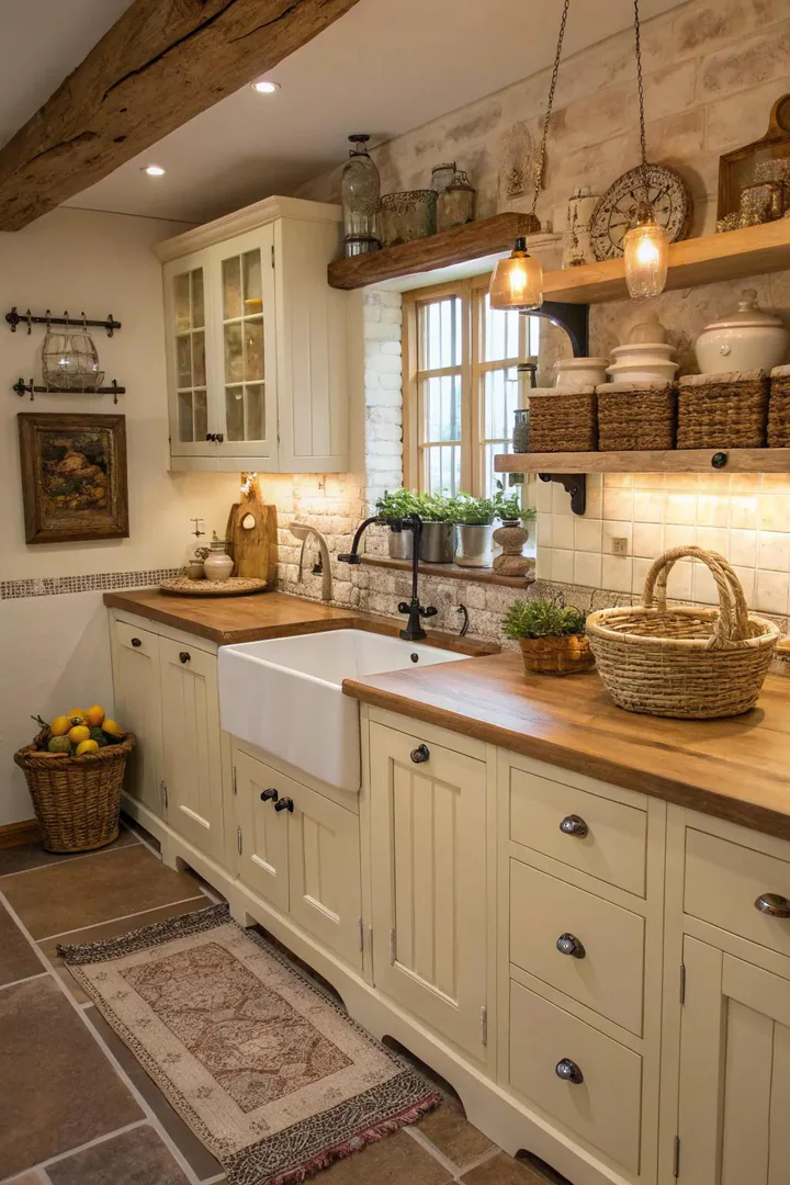
Cream cabinets are the natural foundation for a farmhouse kitchen because the color evokes aged, patinated paint — the look of old cabinet doors that were once white and have mellowed over decades into a warm, buttery tone. This inherent aged quality makes cream more convincing in a farmhouse setting than bright white, which reads as freshly painted and new rather than lived-in and storied.
Build the farmhouse look around the cream cabinets with the following elements: a farmhouse apron-front sink (from Kohler’s Whitehaven line, Rohl’s Shaws Original, or IKEA’s HAVSEN), open shelving in reclaimed or weathered wood, a butcher block countertop or island surface, cup-pull hardware in antique brass or oil-rubbed bronze (from Rejuvenation or Liberty Hardware), beadboard paneling on the island or as a backsplash, and a pendant light with a barn-light or warehouse shade (from Barn Light Electric or Rejuvenation). Each element reinforces the farmhouse character while the cream cabinets provide the warm, neutral canvas. For more on this style, see our farmhouse kitchen cabinet guide.
10. Enduring Shaker Design
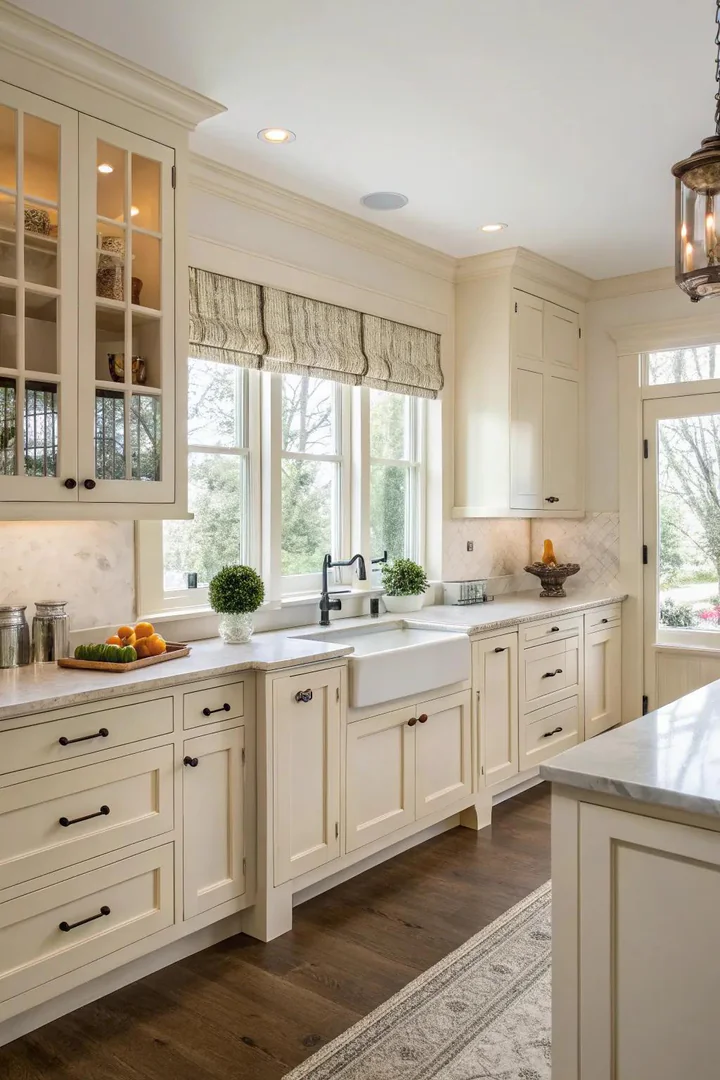
Shaker-style cabinet doors — a five-piece frame with a flat center panel, no ornamentation, and clean, rectilinear lines — are the most popular door style in American kitchens and look especially well-proportioned in cream. The Shaker profile’s simplicity lets the cream color speak without the distraction of raised panels, routed edges, or applied moldings that can look fussy or dated. Cream Shakers work in traditional, transitional, and modern-farmhouse kitchens because the door style itself crosses every design era.
Order cream Shaker cabinets from stock cabinet lines (IKEA BODBYN series in off-white, Hampton Bay at Home Depot, or Diamond NOW at Lowe’s) for budget projects, or from semi-custom lines (KraftMaid, Aristokraft, or Fabuwood) for more size, finish, and configuration options. The cream paint color varies between manufacturers — IKEA’s off-white leans slightly grey; KraftMaid’s Canvas leans slightly yellow — so order door samples before committing. Pair cream Shakers with simple bar pulls or knobs (3-to-5-inch center-to-center pulls in satin brass, polished nickel, or matte black) that complement the door’s clean lines without adding visual clutter.
11. Combining Nature
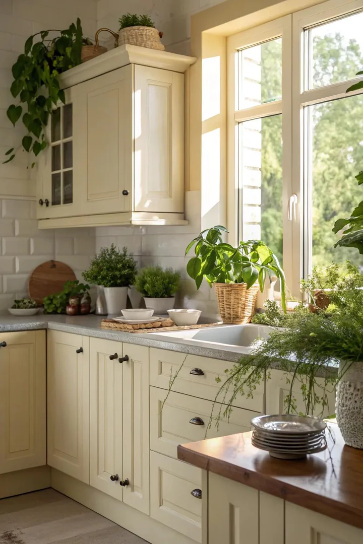
Plants and greenery add life, color, and organic texture to a cream kitchen that might otherwise feel too polished or monochromatic. The green of living plants is the natural complement to cream’s warm beige tones — cream and green sit on opposite sides of the color wheel when you consider cream as a warm yellow-beige, making green the most visually refreshing accent color for cream cabinetry.
Place plants where they receive adequate light and do not obstruct cooking or prep: on top of upper cabinets (trailing pothos, philodendron, or string of pearls), on open shelving (small herb pots of basil, rosemary, or thyme), on the windowsill above the sink (succulent arrangement in a ceramic planter), or in a large floor pot in a corner (fiddle leaf fig, rubber plant, or monstera). Use ceramic or terracotta pots that coordinate with the cream palette — white, cream, terracotta, or matte green pots blend with the kitchen’s color story. Avoid plastic pots and overly decorative or novelty planters that undermine the kitchen’s refined cream aesthetic.
12. Lighting Fixture Features
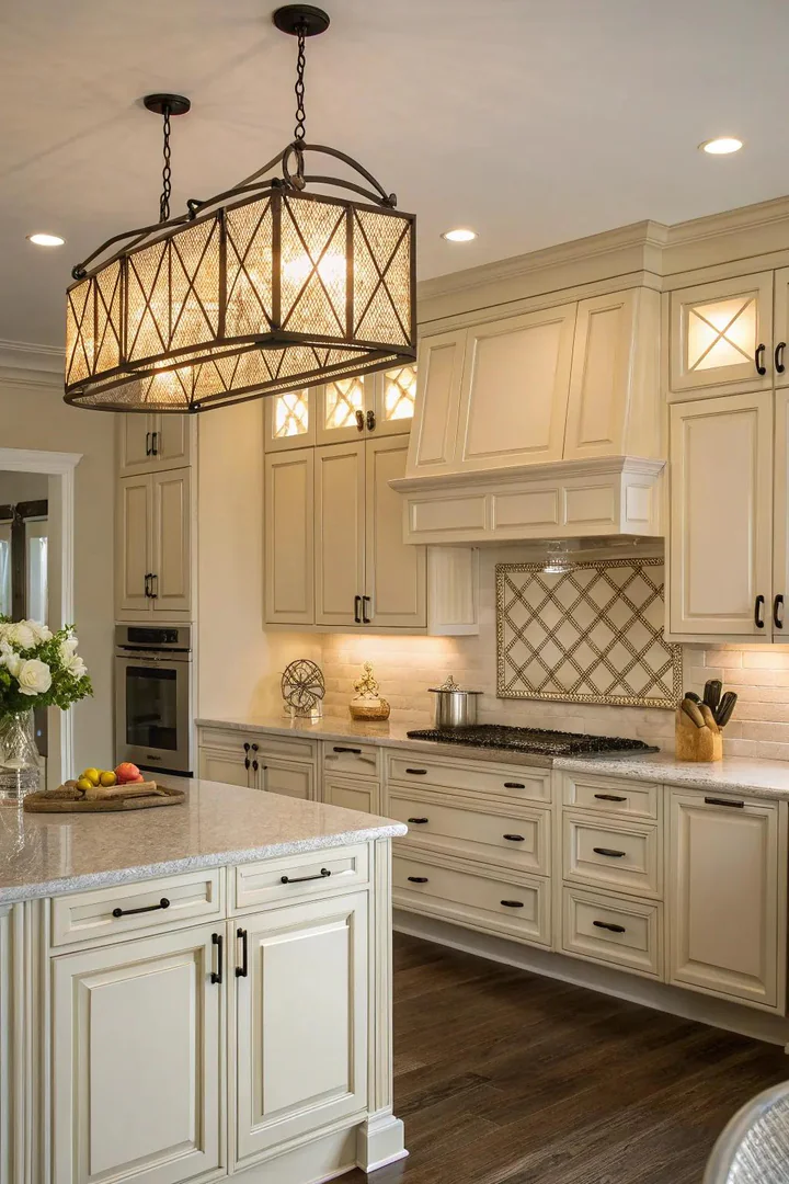
Statement lighting fixtures — oversized pendants, multi-arm chandeliers, sculptural sconces, or industrial cage lights — become the primary design element in a cream kitchen because the neutral cabinets and countertops provide a quiet canvas that lets the fixture command attention. In a kitchen with bold cabinet colors, the lighting competes with the cabinetry for visual focus; in a cream kitchen, the lighting wins by default.
Choose one statement fixture location — above the island, above the dining table, or above the sink — and invest in a fixture that expresses the kitchen’s personality. An oversized woven rattan pendant (from Serena & Lily or IKEA’s SINNERLIG) creates a coastal or Scandinavian feel. A multi-arm brass chandelier (from Visual Comfort or Hudson Valley Lighting) creates a traditional or transitional tone. A pair of industrial cone pendants in matte black (from Barn Light Electric or Schoolhouse Electric) creates a modern farmhouse aesthetic. Use warm-white bulbs (2700K) in all fixtures — warm light enhances cream’s golden undertones, while cool-white light (4000K+) makes cream look greenish-yellow.
13. Traditional Subway Tile
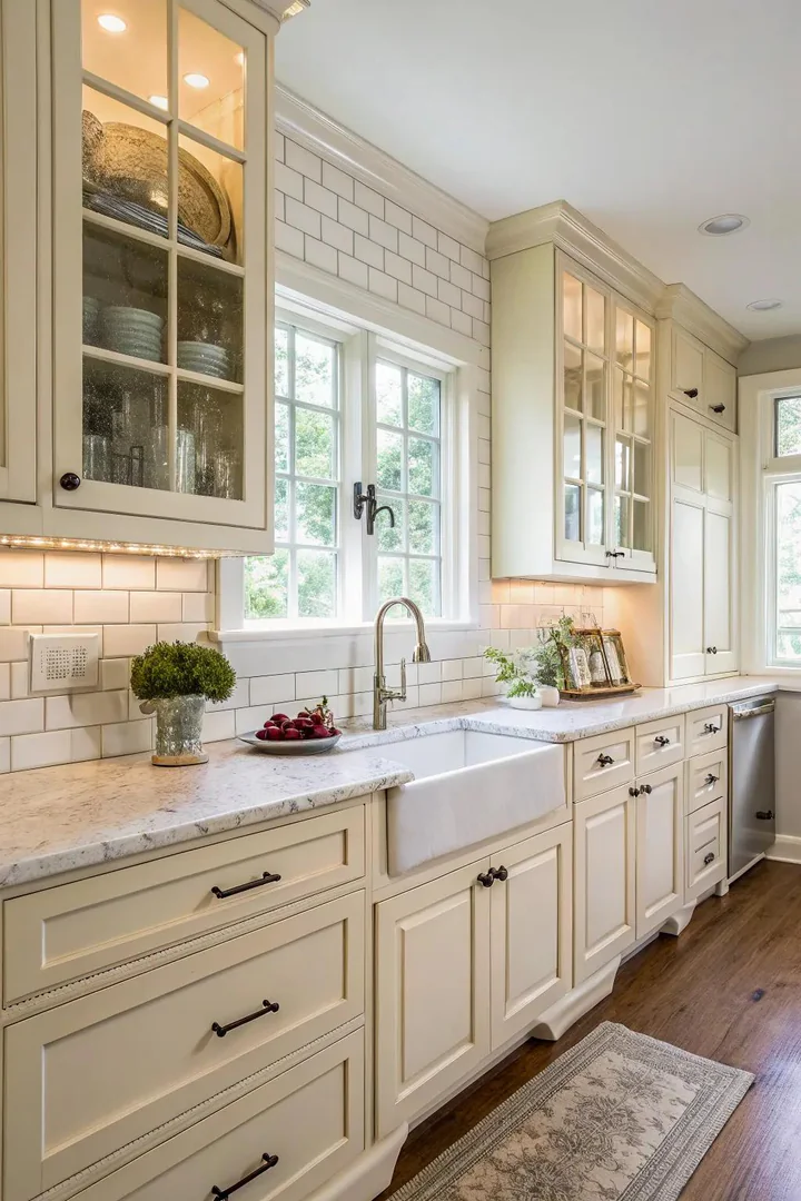
Subway tile — the standard 3×6-inch rectangular glazed ceramic tile installed in a running bond (brick) pattern — is the most timeless backsplash choice for cream kitchens because its simple geometry and glossy surface complement the Shaker and traditional cabinet styles that cream cabinets most commonly appear in. Subway tile has been used in kitchens since the early 1900s, and its association with classic design aligns with cream’s own timeless character.
For cream cabinets, choose a white or off-white subway tile with a glossy finish — the gloss reflects light and makes the backsplash area feel brighter and more open. A pure white tile (Daltile Rittenhouse Square in Arctic White or Merola Tile from Home Depot) creates a subtle light-to-warm contrast with cream cabinets. A cream or ivory tile (Ann Sacks or Fireclay Tile in warm tones) creates a tonal, monochromatic look. For more visual interest, consider larger subway formats (4×8 or 4×12), vertical stacking instead of horizontal running bond, or a handmade tile with slightly irregular edges and surface variation (from Fireclay Tile, Clé, or Heath Ceramics).
14. Stylish Glass Facades
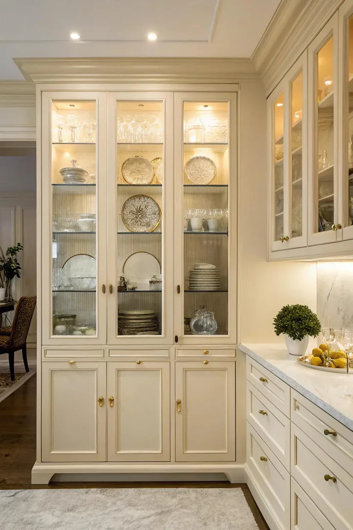
Glass-front cabinet doors — clear glass, seeded glass, frosted glass, or leaded glass set into the Shaker or raised-panel door frame — break up the solid expanse of cream cabinetry on the upper wall and create display opportunities for dishes, glassware, and decorative objects. The glass panels let you show the curated interior of the cabinet without the exposed, informal look of open shelving.
Clear glass is the most traditional and most demanding option — everything inside the cabinet is visible, so the contents must be organized and attractive. Use clear glass on upper cabinets that hold matching dish sets, stemware, or a curated collection. Seeded glass (glass with tiny embedded air bubbles) and ribbed/reeded glass provide partial obscurity — the contents are visible as shapes and colors rather than clearly detailed objects, which is more forgiving for cabinets with mixed contents. Frosted or etched glass provides the most privacy while still allowing light to pass through. Order glass-front doors from your cabinet manufacturer as an upgrade option, or retrofit existing cream doors by removing the center panel and having a glass shop cut tempered glass inserts to fit.
15. Cozy Wooden Highlights
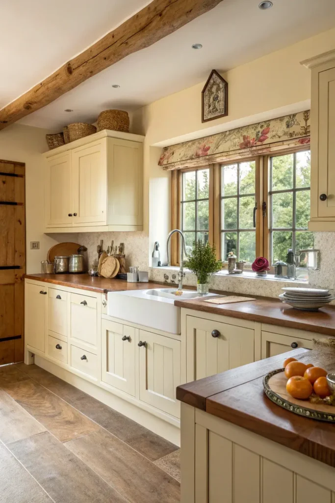
Wood accents — a butcher block island top, floating wood shelves, a wood range hood cover, or wood ceiling beams — add warmth, texture, and organic character to a cream kitchen that might otherwise feel too smooth, too even, or too monochromatic. Wood’s visible grain, knots, and tonal variations introduce the kind of natural imperfection that makes a kitchen feel comfortable and lived-in rather than staged.
The best wood species for cream kitchen accents are warm-toned medium woods: white oak (the most popular choice in current design, with a honey-golden tone), walnut (darker and richer, for more contrast), and rift-sawn red oak (straight grain, moderate warmth). Light woods like maple or birch can look too similar to cream cabinets and create a washed-out effect; very dark woods like wenge or ebony create too much contrast for most cream kitchens. A butcher block island top (John Boos, Lumber Liquidators, or a local millwork shop) in white oak provides the most impact for the least cost — it changes the entire feel of the kitchen by introducing a large surface of natural material amid the painted cream cabinetry.
16. Delightful Beadboard Features
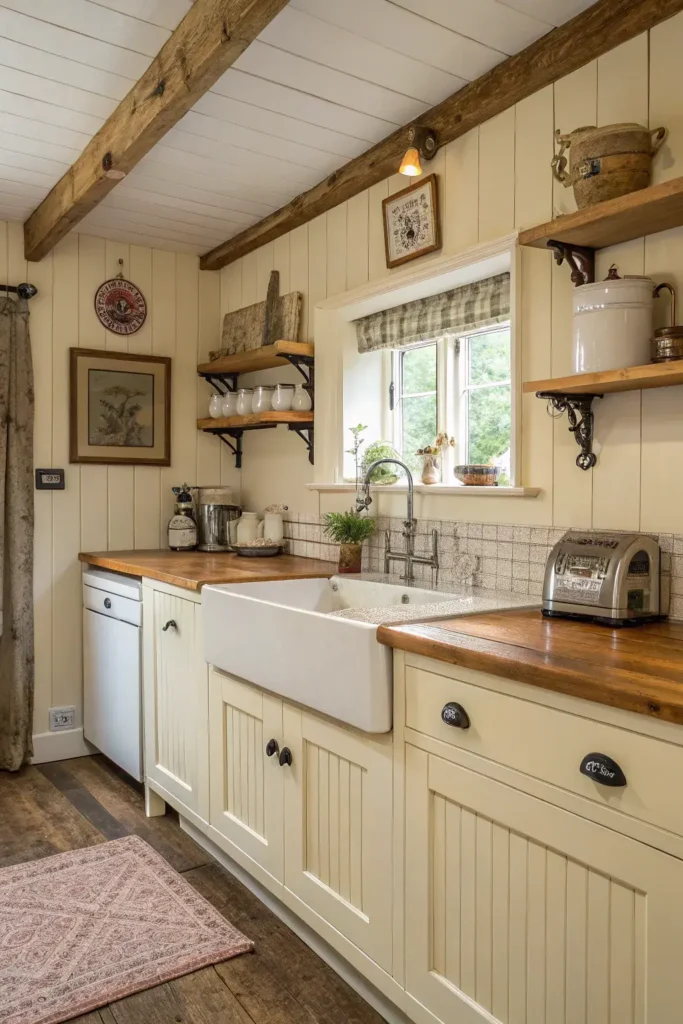
Beadboard — narrow tongue-and-groove planks with a characteristic bead (a small rounded profile) between each plank — adds cottage, farmhouse, and coastal charm to cream cabinets through texture and pattern. Beadboard can be applied as a backsplash, as an island face, as a ceiling treatment, or as inset panels within cabinet doors. When painted the same cream as the cabinets, beadboard creates a tonal texture — same color, different surface — that adds visual depth without introducing a competing material.
Beadboard backsplash panels (from Wainscoting Depot, Home Depot, or Lowe’s) install behind the sink and stove areas as a textured alternative to tile. Paint the beadboard the same cream as the cabinets for a seamless, textured wall, or paint it a contrasting white or light grey for subtle definition. On a kitchen island, apply beadboard to the exposed faces (the dining-room side and the two ends) to add architectural detail that transforms a plain cabinet box into a furniture-like piece. Beadboard ceiling panels painted cream overhead create a cottage-kitchen feeling that wraps the room in warm texture from floor to ceiling.
How to Style Cream Colored Kitchen Cabinets
Choosing the Right Cream Shade
Not all creams are the same — the undertone determines whether the color reads warm-yellow (like butter), warm-pink (like vanilla), or warm-grey (like linen). Test three to five cream paint samples on a cabinet door or large poster board held against your existing countertops, backsplash, and flooring under the kitchen’s actual lighting. Benjamin Moore White Down (OC-131) has a yellow undertone; Farrow & Ball White Tie (No.2002) has a pink undertone; Sherwin-Williams Shoji White (SW 7042) has a grey undertone. Choose the undertone that harmonizes with your countertop and flooring.
Selecting Hardware and Fixtures
Brass, antique brass, and champagne gold hardware harmonize naturally with cream cabinets because the warm metal tones echo cream’s golden undertone. Polished nickel and chrome provide a cooler contrast that adds modern crispness. Matte black creates the strongest graphic contrast and reads as contemporary. Choose one primary metal for cabinet hardware (pulls and knobs) and one accent metal for the faucet and light fixtures. Purchase hardware samples and hold them against the cabinet doors before ordering full sets — metal finishes that look warm online can read cooler in person.
Maintaining Cream Cabinets
Cream cabinets show grease, fingerprints, and cooking splatter less than white cabinets (the warm tone camouflages light marks) but more than dark cabinets. Clean cream cabinets monthly with a solution of warm water and mild dish soap (Dawn or Mrs. Meyer’s), wiping in the direction of the grain or paint stroke. Avoid bleach-based cleaners and abrasive sponges that can dull or strip the paint finish. Touch-up paint (keep a quart of the exact formula from the original paint order) handles nicks and scuffs that cleaning cannot address.
Cream Cabinet Pairings Comparison
| Pairing Element | Best Match | Style Result | Cost Impact |
|---|---|---|---|
| Countertop | Calacatta marble or marble-look quartz | Luxurious traditional | $$-$$$ |
| Countertop | Butcher block (white oak) | Warm farmhouse | $ |
| Backsplash | White glossy subway tile | Timeless classic | $ |
| Backsplash | Beadboard panels | Cottage charm | $ |
| Hardware | Satin brass pulls | Warm and refined | $$ |
| Hardware | Matte black bar pulls | Modern contrast | $ |
| Wall color | Benjamin Moore White Dove | Clean and bright | $ |
| Flooring | White oak hardwood | Warm and grounded | $$-$$$ |
Common Cream Cabinet Mistakes to Avoid
Choosing the wrong undertone for your lighting. A cream with a yellow undertone looks warm and buttery under warm-white lighting (2700K) but looks sickly yellow under cool-white or fluorescent lighting (4000K-5000K). Test paint samples under the kitchen’s actual light sources — both natural window light and artificial light — at different times of day before committing to a cream shade.
Matching the wall color too closely. Painting the walls the same cream as the cabinets creates a monotone effect where the cabinets disappear into the walls and the kitchen looks flat. The walls should be two to three values lighter or darker than the cabinets, or a different hue entirely (soft grey, pale green, warm white) to create enough contrast for the cabinets to read as distinct architectural elements.
Using cool-toned metals exclusively. Chrome, stainless steel, and polished nickel used exclusively in a cream kitchen (faucet, hardware, light fixtures, appliances) can create a cold, clinical feel that fights the warmth of the cream cabinets. Add at least one warm metal — brass, gold, or oil-rubbed bronze — to connect with cream’s warm undertone and balance the temperature of the room.
Ignoring the ceiling color. A bright white ceiling against cream cabinets makes the cabinets look yellow by comparison. Paint the ceiling a warm white (Benjamin Moore Simply White OC-117 or Chantilly Lace OC-65) rather than a stark cool white to prevent the ceiling from casting the cabinets in an unflattering light. Visit The Designers Company for more kitchen cabinet guides and material pairing inspiration.
Frequently Asked Questions
Is cream or white better for kitchen cabinets?
Cream is better for kitchens with warm-toned countertops (butcher block, warm marble, beige granite), limited natural light, or a traditional/farmhouse aesthetic. White is better for kitchens with cool-toned countertops (grey quartz, white marble), abundant natural light, or a modern/minimalist aesthetic. Cream feels warmer and more forgiving; white feels crisper and more contemporary. Neither is objectively better — the choice depends on the kitchen’s existing materials and lighting conditions.
What countertop goes best with cream cabinets?
White or warm-toned marble (Calacatta, with gold and grey veining) is the most classic pairing. Butcher block is the warmest and most affordable pairing. Dark countertops (black granite, charcoal quartz) create the strongest contrast. Avoid pure white quartz with no veining — the stark white surface makes cream cabinets look dirty or yellowed by comparison.
Do cream cabinets look dated?
No — cream cabinets are perennially in style because they fall within the neutral family and adapt to changing trends through accessory updates (hardware, backsplash, light fixtures). The cabinet style (door profile) matters more than the color for perceived datedness — a cream Shaker cabinet looks current; a cream raised-panel cathedral-arch cabinet looks dated. Keep the door style simple and update hardware and accessories as trends shift.
What wall color goes with cream kitchen cabinets?
Warm whites (Benjamin Moore White Dove, Sherwin-Williams Alabaster), light greiges (Sherwin-Williams Accessible Beige, Benjamin Moore Revere Pewter), and soft sage greens (Sherwin-Williams Evergreen Fog) are the most popular wall colors with cream cabinets. Avoid cool greys, bright whites, and bold colors that create a temperature clash with cream’s warm undertone.
Can I paint existing cabinets cream?
Yes — painting existing cabinets cream is a cost-effective alternative to replacing them ($3,000-7,000 for professional cabinet painting vs. $15,000-40,000 for new cabinets). Sand the existing finish, apply a high-adhesion primer (Zinsser BIN or KILZ Adhesion), and topcoat with a high-quality cabinet paint (Benjamin Moore Advance, Sherwin-Williams Emerald Urethane Trim Enamel, or Farrow & Ball Estate Eggshell). Professional results require proper preparation — skipping sanding or priming leads to peeling within months.
What hardware finish is best for cream cabinets?
Satin brass and antique brass are the most harmonious hardware finishes because their warm gold tones match cream’s golden undertone. Polished nickel provides a bright, cooler contrast that modernizes cream cabinets. Matte black provides the strongest contrast and reads as the most contemporary. Oil-rubbed bronze provides a dark warm alternative for rustic or farmhouse cream kitchens. Purchase a single test pull or knob before ordering full sets to confirm the finish looks right against your specific cream shade.
Conclusion
Cream colored kitchen cabinets occupy the sweet spot between white’s crispness and beige’s warmth, creating a neutral foundation that works with virtually any countertop material, backsplash choice, hardware finish, and flooring style. Whether you pair cream cabinets with marble for a luxurious traditional look, with butcher block for a warm farmhouse feel, or with dark countertops for a bold modern contrast, the warm undertone of the cabinets ties the palette together and makes the kitchen feel inviting at every hour of the day.
Start with the cream shade — test samples under your kitchen’s specific lighting — then build outward: choose a countertop that either blends (warm marble, butcher block) or contrasts (dark granite, charcoal quartz), select hardware in a metal finish that harmonizes with the cream’s undertone, and paint the walls a color that lets the cabinets stand out as the kitchen’s defining element. Cream is not a compromise between white and color — it is its own distinct, warm, and deeply versatile cabinet choice.