Modern Blue Kitchen Cabinet Ideas: 20 Chic Ways That Refresh Spaces
Modern blue kitchen cabinet ideas work because blue is the only primary color that functions as a neutral — it recedes rather than advancing, pairs naturally with warm and cool materials alike, and shifts personality depending on its shade: navy reads as formal and grounded, sky blue reads as airy and coastal, cobalt reads as bold and contemporary. A blue kitchen does not demand attention the way a red or yellow kitchen does; it creates a calm, confident atmosphere that lets other design elements (countertops, hardware, lighting) shine.
The 20 blue cabinet ideas below span the full spectrum — from the deepest navy to the softest powder blue — and show how each shade pairs with specific countertop materials, hardware finishes, and backsplash treatments. Each idea names specific paint colors and product brands so you can source the exact look rather than guessing at a shade.
1. Timeless Navy Sophistication
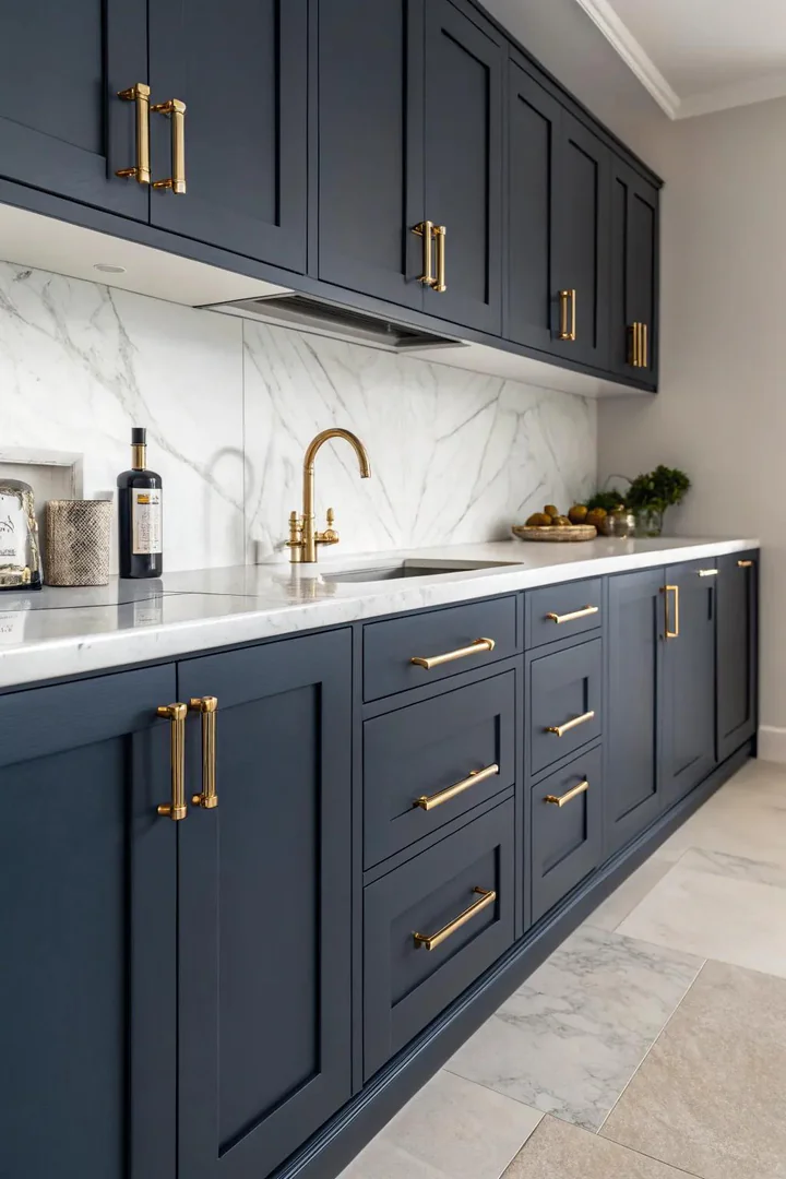
Navy blue — Benjamin Moore’s Hale Navy (HC-154), Sherwin-Williams’ Naval (SW 6244), or Farrow & Ball’s Stiffkey Blue (No. 281) — is the most popular and most versatile blue for kitchen cabinets because it reads as a dark neutral that grounds the room without the heaviness of black. Navy pairs naturally with white marble or quartz countertops, aged brass hardware, and white subway tile backsplashes — a combination that works in traditional, transitional, and modern kitchens alike.
Use a semi-gloss or satin sheen on navy cabinets to create subtle light reflection that prevents the dark color from absorbing all the room’s light. Navy cabinets show fingerprints and water spots more visibly than lighter colors, so a washable sheen is practical. Pair navy lower cabinets with white upper cabinets for a two-tone look that keeps the upper portion of the room bright, or commit to navy on all cabinets for a dramatic, enveloping effect. Brass bin pulls and knobs (Rejuvenation, Schoolhouse Electric) are the classic hardware pairing with navy — the warm gold tone of brass creates a complementary contrast against the cool blue.
2. Heavenly Blue Tranquility
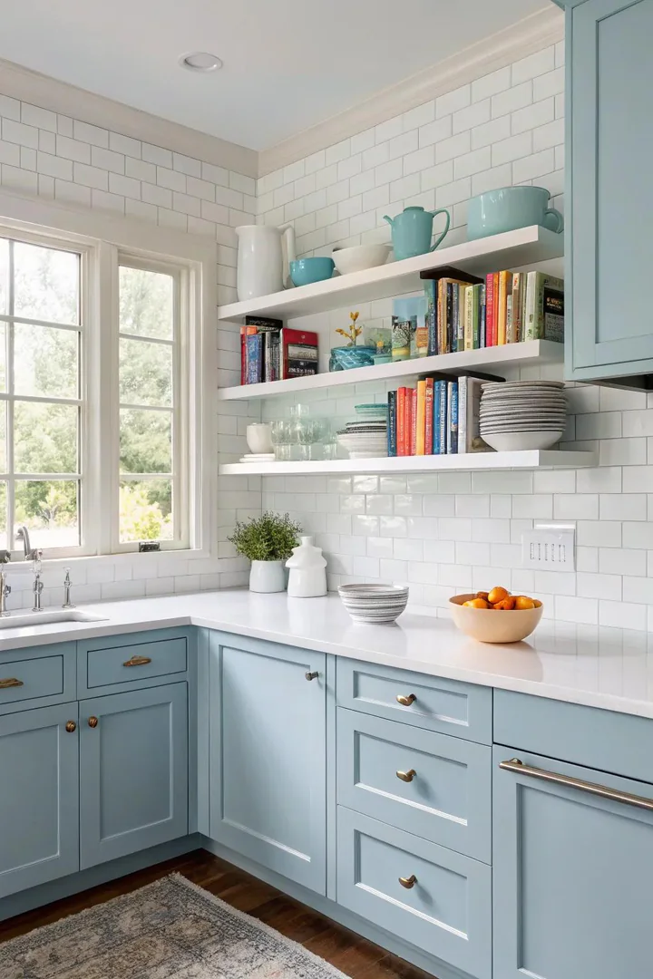
Sky blue — Benjamin Moore’s Breath of Fresh Air (806), Sherwin-Williams’ Atmospheric (SW 6505), or Farrow & Ball’s Lulworth Blue (No. 89) — creates a light, open kitchen atmosphere that feels like a clear day. Sky blue cabinets work best in kitchens with abundant natural light where the pale color reflects sunlight and amplifies the room’s brightness. In darker kitchens with limited windows, sky blue can read as washed-out or cold — test a large paint sample on the actual cabinet doors under your kitchen’s lighting before committing.
Pair sky blue cabinets with white or light grey countertops (Calacatta quartz, white Corian, or honed Carrara marble) and polished nickel or chrome hardware for a clean, monochromatic palette. Avoid brass hardware with sky blue — the warm gold tones can clash with the cool, high-key blue. Brushed nickel bar pulls (Top Knobs, Amerock) or polished chrome knobs match the cool tone of sky blue without introducing a competing warm metal. Sky blue cabinets suit coastal, Scandinavian, and contemporary kitchen styles.
3. Bicolor Charm
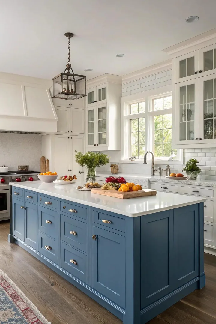
A two-tone blue kitchen — blue lower cabinets with white or light grey upper cabinets, or blue perimeter cabinets with a contrasting island — creates visual depth and prevents the blue from dominating the room. The two-tone approach is the safest way to introduce blue cabinets into a kitchen because you can limit the blue to the lower half of the room (where it grounds the space) and keep the upper half light (where brightness matters most for task lighting and visual openness).
The most popular two-tone blue combinations are navy lowers with white uppers, slate blue lowers with light grey uppers, and white perimeter cabinets with a blue island. When choosing the two colors, ensure they share the same undertone family — a warm-undertone blue (like Benjamin Moore’s Van Deusen Blue, HC-156) pairs best with a warm white (White Dove), while a cool-undertone blue (like Sherwin-Williams’ Cyberspace, SW 7076) pairs best with a cool white (Extra White). Mismatched undertones make both colors look off. For more two-tone combinations, our kitchen cabinet color ideas guide covers pairing strategies for every style.
4. Wood and Rustic Blue
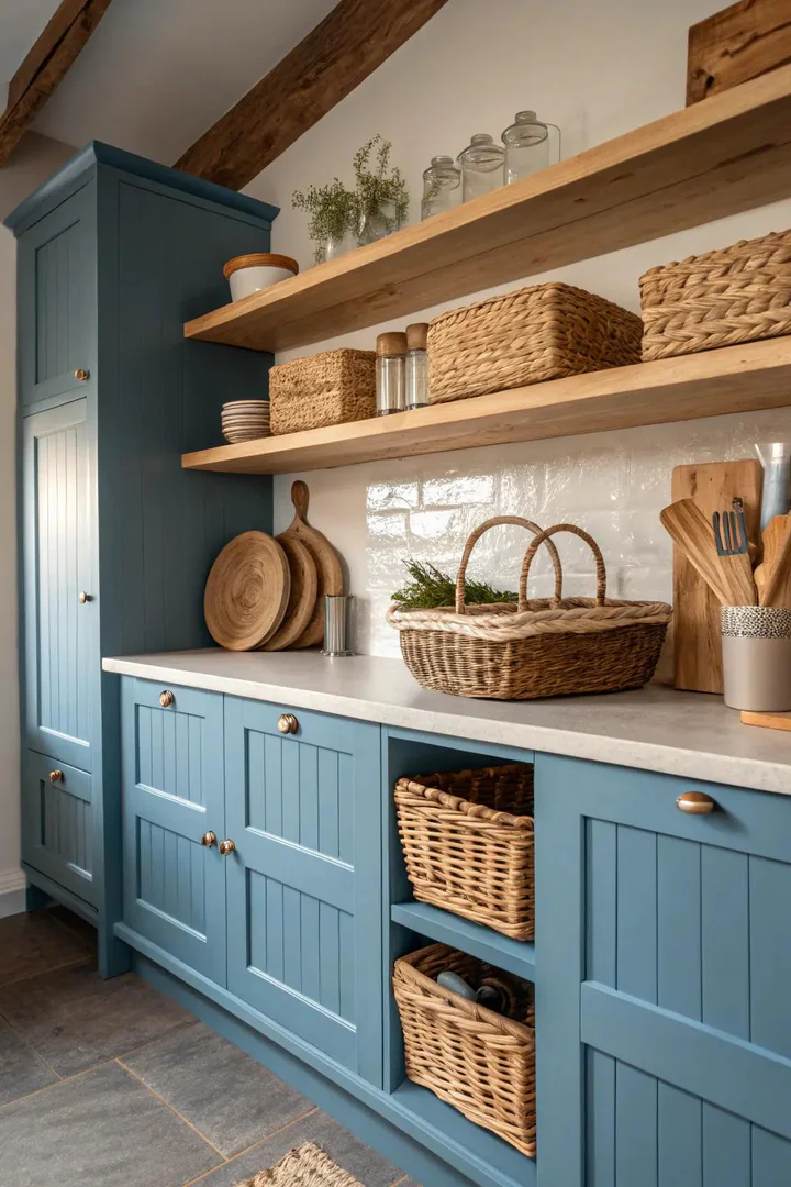
Blue cabinets paired with natural wood elements — a butcher block countertop, open wood shelving, a wood-clad range hood, or wood flooring — balance the coolness of blue with the warmth of organic wood grain. The wood acts as a visual thermostat: too much blue without wood reads cold; adding wood at the countertop level and the shelving level warms the room to a comfortable balance.
White oak, walnut, and reclaimed pine are the best wood pairings with blue cabinets because their warm-to-neutral tones complement blue without clashing. Avoid red-toned woods (cherry, red oak, mahogany) with blue cabinets — the red and blue create a competing warm-cool tension that makes both colors look less appealing. A matte or satin blue finish (Benjamin Moore Advance in Newburyport Blue) with a natural matte-finish butcher block countertop (John Boos maple or walnut) creates a farmhouse-inspired blue kitchen that feels warm, grounded, and authentically rustic.
5. Seaside Atmosphere
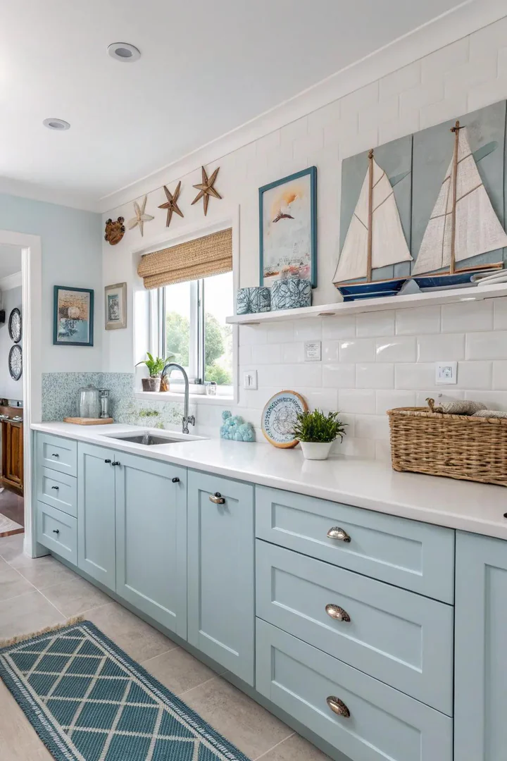
Coastal blue cabinets — muted, grey-toned blues that reference ocean water and weathered driftwood rather than bright or saturated primary blue — suit beach houses, lakefront homes, and any kitchen where the design intent is relaxed and ocean-inspired. Benjamin Moore’s Palladian Blue (HC-144), Sherwin-Williams’ Sea Salt (SW 6204), and Farrow & Ball’s Light Blue (No. 22) are the three most specified coastal blues, each with a grey or green undertone that prevents the blue from reading as childish or cartoonish.
Pair coastal blue cabinets with white beadboard backsplashes, white marble or quartzite countertops, and brushed nickel or polished chrome hardware for a classic coastal palette. Add natural-fiber accents (jute rugs, woven pendant lights, rattan bar stools) to reinforce the coastal theme. Coastal blue cabinets work in Shaker-style or beadboard-panel door profiles — both reference the cottage and boat-house architecture that the coastal aesthetic draws from.
6. Striking Cobalt Declaration
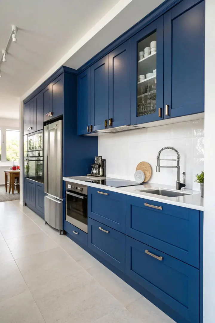
Cobalt blue — a bright, fully saturated blue with no grey or green undertone — is the boldest blue cabinet color and works as a statement piece in kitchens where the homeowner wants the cabinets to be the room’s primary visual event. Cobalt reads as energetic, confident, and unapologetically modern — it does not recede into the background the way navy or slate blue does.
Use cobalt sparingly: on the island only, on lower cabinets only, or on a single accent wall of cabinets. Pairing cobalt with white countertops and white walls gives the blue room to breathe and prevents the intensity from becoming overwhelming. Matte black hardware (Top Knobs or Emtek in flat black) provides a stark, contemporary contrast against cobalt that reinforces the modern intent. Avoid brass with cobalt — the warm metal and the bright blue create a busy, competing contrast that neither color benefits from. Benjamin Moore’s Blue Danube (2062-30) and Sherwin-Williams’ Honorable Blue (SW 6811) are both strong cobalt options.
7. Sophisticated Blue and Gray
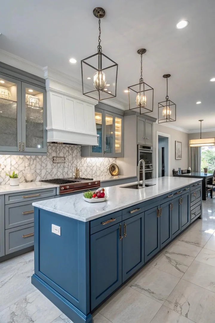
Blue-grey — a slate or storm-cloud shade that sits at the midpoint between pure blue and pure grey — is one of the most sophisticated cabinet colors because it reads differently depending on the light: bluer in natural daylight, greyer under incandescent bulbs, and almost charcoal in dim evening light. Benjamin Moore’s Wolf Gray (2127-40), Sherwin-Williams’ Needlepoint Navy (SW 0032), and Farrow & Ball’s De Nimes (No. 299) are three blue-greys with different depth levels.
Blue-grey cabinets pair beautifully with grey-veined white marble (Calacatta or Statuario) or grey quartz (Caesarstone Pebble or Silestone Marengo) because the grey tones in the stone echo the grey undertone in the cabinet paint, creating a monochromatic harmony. Hardware in brushed nickel, satin chrome, or gunmetal extends the grey palette. Blue-grey is the safest bold-color choice for homeowners worried about resale — it reads as a sophisticated neutral rather than a statement color, which appeals to a broader range of buyers.
8. Retro Blue Style
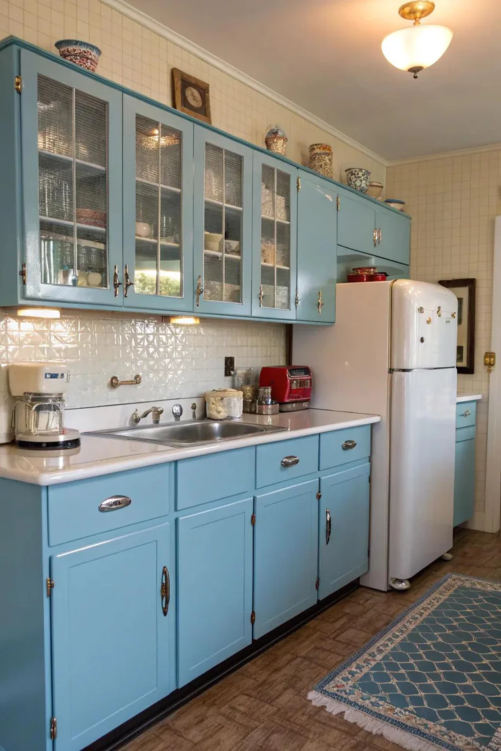
Vintage-inspired blue cabinets use muted, slightly desaturated blue shades — Robin’s egg, powder blue, or Wedgwood blue — that reference the pastel palette of 1940s and 1950s American kitchens. These heritage blues feel nostalgic and warm rather than contemporary, and they pair naturally with retro-styled appliances (Big Chill, SMEG, AGA), chrome hardware, and checkered or hex-tile flooring.
Benjamin Moore’s Gossamer Blue (2123-40) and Sherwin-Williams’ Languid Blue (SW 6226) capture the dusty, soft quality of mid-century kitchen blues. Pair vintage blue cabinets with a white laminate or butcher block countertop (both period-appropriate materials), chrome cup pulls, and glass-front upper cabinets to complete the retro look. The vintage blue kitchen works best when the retro references are selective — a full 1950s reproduction feels like a theme park, but a vintage blue cabinet color paired with modern stainless steel appliances and a contemporary light fixture feels like a kitchen with personality and history.
9. Contemporary Blue and Black
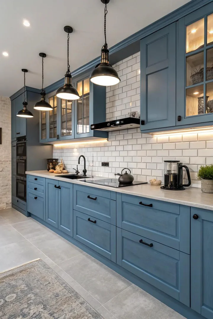
Blue cabinets with matte black accents — black hardware, a black faucet, black-framed pendant lights, or a black range — create a high-contrast, decisively modern kitchen that reads as sharp, graphic, and intentional. The combination works because dark blue and black are adjacent on the value scale (both are dark colors), so they harmonize without clashing, but the blue provides enough color to prevent the room from looking like an all-black kitchen.
Deep navy or midnight blue cabinets (Benjamin Moore’s Midnight Navy, 2067-10, or Sherwin-Williams’ Charcoal Blue, SW 2739) pair best with matte black accents because the dark blue is close enough in value to black that the transition feels smooth rather than jarring. Use matte black hardware throughout (Emtek’s Select line or Amerock’s Blackrock collection) and a black faucet (Moen Align or Delta Trinsic in matte black) to tie the black accents together. A white or light-grey countertop and a white backsplash provide the necessary brightness to keep the dark palette from feeling oppressive.
10. Marble Accents on Blue
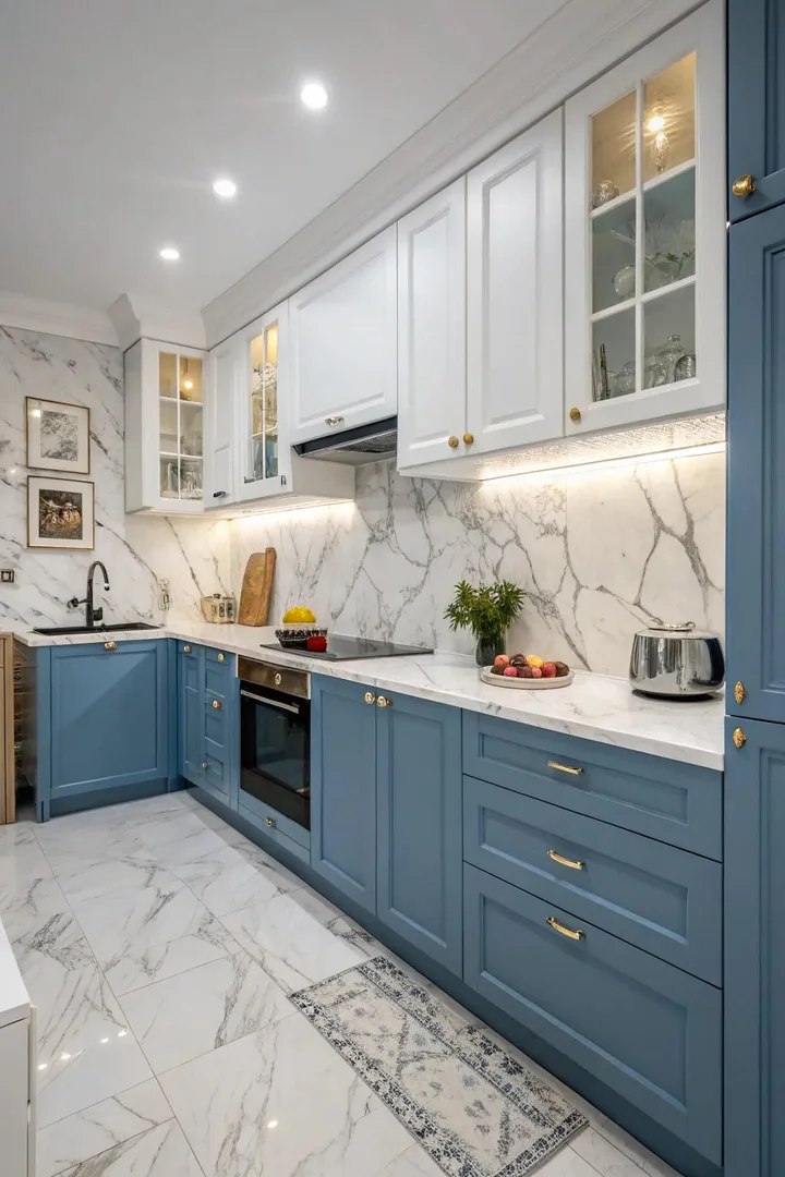
Blue cabinets paired with white marble — Calacatta, Statuario, or Carrara — create one of the most luxurious kitchen palettes because the grey veining in the marble echoes the cool tones of the blue, and the white marble surface provides a bright, high-contrast counterpoint to the dark or medium-blue cabinets. The combination suits both traditional (raised-panel blue cabinets with a polished marble countertop) and modern (flat-panel blue cabinets with a honed marble waterfall edge).
If the maintenance demands of natural marble (periodic sealing, susceptibility to acid etching from lemon juice and tomato sauce) are a concern, choose a marble-look quartz (Caesarstone Calacatta Nuvo, Cambria Brittanicca, or Silestone Calacatta Gold) that provides the visual effect with none of the sealing or staining issues. The quartz surface is non-porous, never needs sealing, and resists stains and scratches that would damage natural marble. For more on pairing premium surfaces with blue cabinets, see our luxury marble kitchen guide.
11. Whimsical Soft Blues
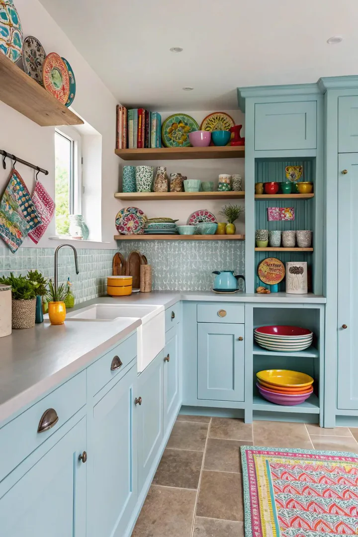
Pastel blue cabinets — baby blue, periwinkle, or lavender-blue — create a cheerful, lighthearted kitchen that feels fresh and youthful. These high-key, low-saturation blues work in small kitchens where a darker blue would feel heavy, and in family kitchens where a bright, inviting atmosphere matters more than formal elegance. Benjamin Moore’s Blue Ice (821) and Sherwin-Williams’ Blissful Blue (SW 6527) are two pastel blues that read as crisp and clean rather than saccharine.
Pair pastel blue cabinets with white countertops, white subway tile, and polished nickel hardware for a fresh, Scandinavian-inspired palette. Avoid pairing pastels with aged brass or oil-rubbed bronze — the warm, heavy metal finishes can make the light blue look washed out by comparison. Polished chrome or polished nickel hardware matches the cool brightness of pastel blue. Use the pastel blue on all cabinets for a consistent, enveloping effect, or limit it to the island for a pop of color in an otherwise white kitchen.
12. Chic Industrial Blue
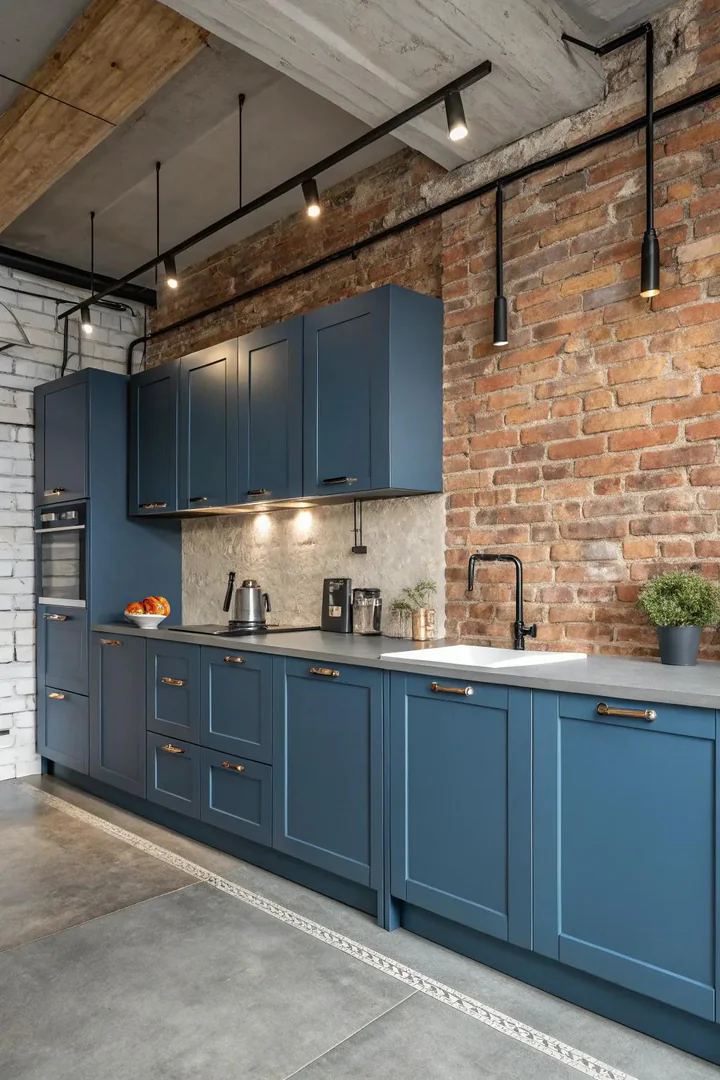
Industrial blue — a dark, smoky blue with grey undertones, referencing the painted steel of factory equipment and shipping containers — pairs naturally with industrial design elements like exposed ductwork, concrete countertops, steel-framed shelving, and Edison-bulb pendant lights. Benjamin Moore’s Newburyport Blue (HC-155) and Sherwin-Williams’ Smoky Blue (SW 7604) both capture this dusty, utilitarian blue.
Use flat-panel (slab-front) or Shaker-style cabinet doors in the industrial blue — ornate profiles undermine the utilitarian aesthetic. Pair the blue cabinets with a concrete or honed soapstone countertop, matte black or gunmetal hardware, and pipe-bracket open shelving in black iron. The combination creates a kitchen that reads as a converted workshop — hard-edged and functional with the blue providing enough color to prevent the room from feeling purely grey and monochrome.
13. Influenced by Art Deco
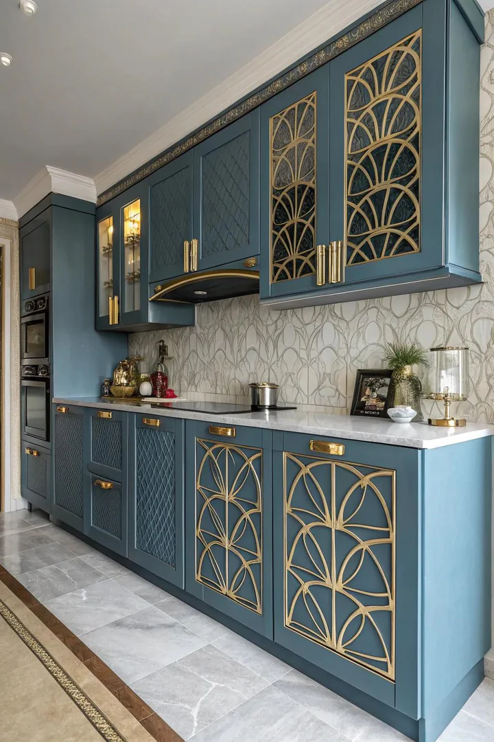
Art Deco blue kitchens combine deep, jewel-toned blue cabinets (sapphire, teal, or midnight) with geometric hardware, stepped profiles, and metallic gold or chrome accents that reference the glamorous architecture of the 1920s and 1930s. The key is the combination of rich color and geometric precision — every line is straight, every angle is sharp, and every metallic accent is polished to a high gloss.
Choose a deep blue with a slightly teal or green undertone — Benjamin Moore’s Dark Harbor (2053-20) or Farrow & Ball’s Hague Blue (No. 30) — for an Art Deco blue that references the deep waters and night skies of the era’s decorative motifs. Pair the blue cabinets with polished gold or chrome hardware in geometric shapes (hexagonal knobs, stepped bar pulls) and a glossy white or mirror backsplash that reflects the metallic accents. A lacquered finish (sprayed by a professional cabinet finisher) provides the high-gloss, glass-like surface that defines Art Deco furniture.
14. Subtle Blue Highlights
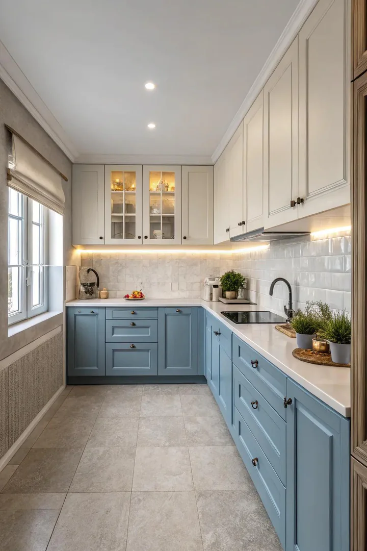
For homeowners who want blue in the kitchen but are not ready to commit to blue cabinets on every wall, blue accent elements — a blue island in a white kitchen, a blue range (BlueStar or La Cornue), a blue tile backsplash behind the stove, or blue-painted cabinet interiors visible through glass doors — introduce the color without overwhelming the room. The accent approach lets you test blue in the kitchen before a full commitment and gives you a single visual focal point rather than an all-over color.
A blue island is the most popular accent approach because the island stands alone as a separate piece of furniture, making the color change look intentional and designed rather than like a cabinet painting mistake. Paint the island in a medium-to-dark blue (navy, slate, or teal) and keep the perimeter cabinets white or light grey for maximum contrast. The blue island becomes the room’s anchor — a grounded, solid element that the lighter perimeter cabinets orbit.
15. Blue Farmhouse
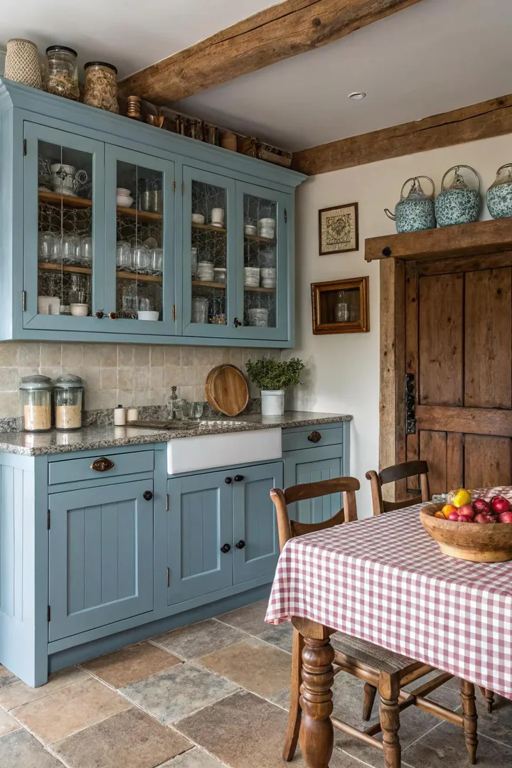
Blue farmhouse cabinets use muted, heritage blues — milk-paint blue, Swedish blue, or slate blue — that reference the painted furniture and cabinet colors of 18th- and 19th-century American and Scandinavian country kitchens. These historical blues are softer and dustier than modern paint-chip blues because they were originally mixed from natural pigments (indigo, cobalt, and Prussian blue) in a lime or milk-paint base.
To replicate the historical blue, use General Finishes Milk Paint in Coastal Blue or Federal Blue, or Benjamin Moore’s Buxton Blue (HC-149) — all muted, grey-toned blues that look period-appropriate on Shaker-style cabinet doors. Pair blue farmhouse kitchen cabinets with a butcher block countertop, iron bin-pull hardware in a dark finish, an apron-front sink, and open wood shelving. The blue adds color to the farmhouse palette without departing from the style’s emphasis on warmth, natural materials, and unpretentious function.
16. Stainless Steel and Blue
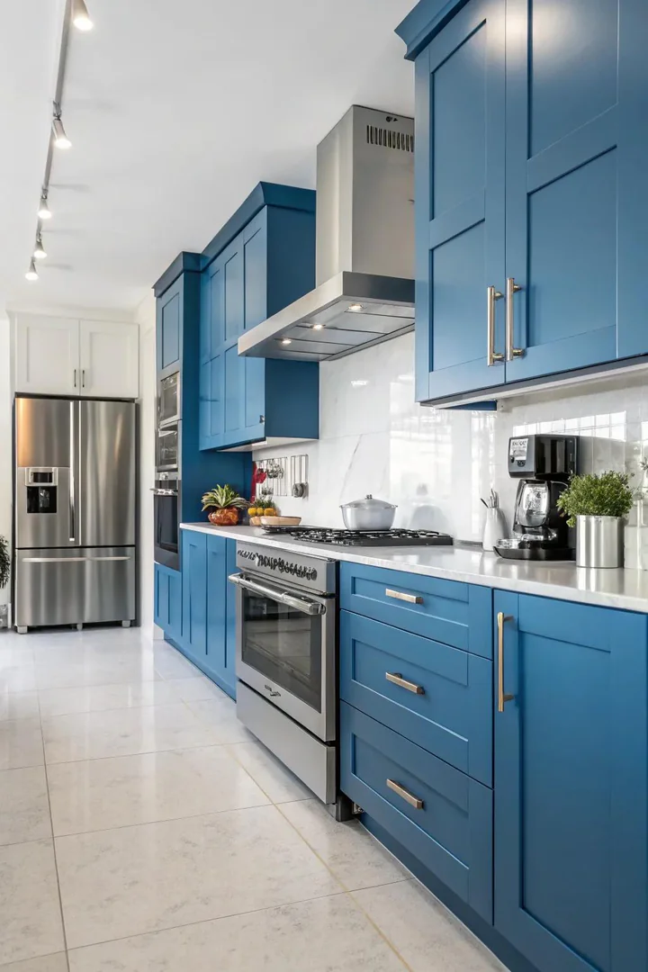
Blue cabinets with stainless steel appliances, a stainless steel countertop, or stainless steel open shelving create a professional, chef-inspired kitchen that feels polished and functional. The cool silver of stainless steel and the cool tones of blue share the same temperature family, so the combination is naturally harmonious — stainless steel appliances do not clash with blue cabinets the way they sometimes clash with warm-toned wood or yellow-based colors.
In a professional-style blue kitchen, use a commercial-grade stainless steel range (BlueStar, Thermador, or Viking), a stainless steel range hood, and stainless steel countertops (16-gauge or 14-gauge, custom-fabricated by a local sheet metal shop or from companies like John Boos or Just Manufacturing). The total stainless steel investment creates a kitchen that looks like a restaurant back-of-house — clean, industrial, and serious about cooking — with the blue cabinets providing the warmth and color that all-stainless-steel kitchens lack.
17. Diverse Blue Blend
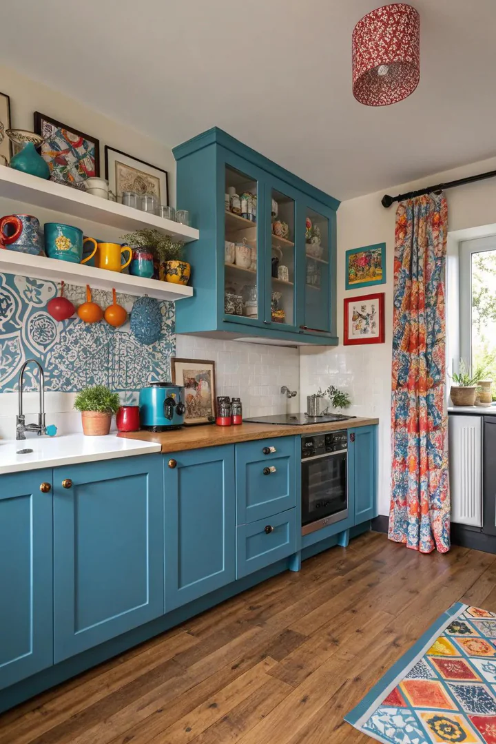
An eclectic blue kitchen uses multiple shades of blue across different cabinet zones — navy on the island, powder blue on the upper cabinets, and teal on a hutch or accent cabinet — creating a collected, one-of-a-kind look that feels personal and curated. The multiple blues reference the way kitchens in older homes accumulate different furniture pieces over decades, each painted a slightly different shade.
Keep the multiple blues within the same undertone family (all cool-toned or all warm-toned) and vary only the darkness and saturation. A navy island, a medium slate-blue perimeter, and pale blue glass-front uppers all share a cool, grey undertone and create a cohesive tonal progression from dark to light. Avoid mixing warm blues (teal, turquoise) with cool blues (navy, steel) in the same kitchen — the undertone clash makes the colors look uncoordinated rather than eclectic.
18. Metallic Accents on Blue
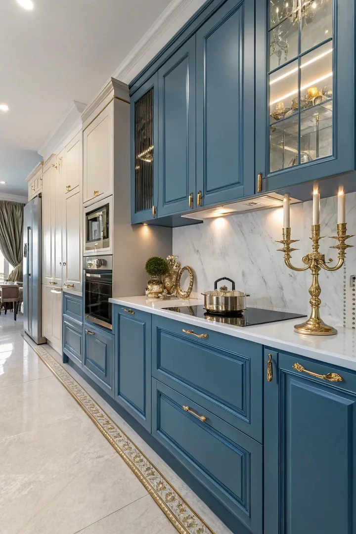
Blue cabinets with metallic accents — gold, brass, copper, or chrome hardware, light fixtures, and decorative trim — create a luxurious kitchen where the metal provides warmth and sparkle against the cool blue surface. The metal finish choice determines the kitchen’s personality: brass reads as traditional and warm, polished chrome reads as modern and cool, copper reads as rustic and artisanal, and gold reads as glamorous and formal.
For a navy kitchen, aged brass hardware (Rejuvenation’s Massey collection or Schoolhouse Electric’s utility line) creates the most classic and widely appealing combination — the warm brass and cool navy create a complementary contrast that has been a design staple since the Georgian era. For a light blue kitchen, polished nickel or chrome hardware maintains the cool palette. For a teal kitchen, copper or rose gold hardware picks up the warm undertone in the teal and creates a jewel-toned palette. Match all visible metal finishes (hardware, faucet, light fixtures, range hood trim) for the most polished result.
19. Simple Blue
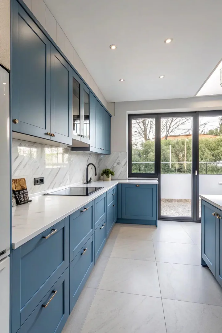
Minimalist blue cabinets — flat-panel (slab) doors with no frame, no raised panel, and no visible hardware (integrated edge pulls or push-to-open latches) — reduce the blue kitchen to its most essential form: color and surface, nothing else. The absence of hardware and molding detail makes the cabinet face a pure plane of color that reads as architectural rather than decorative.
Minimalist blue works best in medium-to-dark shades (midnight, navy, or blue-grey) where the flat panel has enough depth to read as substantial rather than cheap. Light blues on flat-panel doors can look insubstantial without the shadow lines that framed panels provide. Use a matte or ultra-matte finish (IKEA’s AXSTAD line in blue or a custom spray in Benjamin Moore’s Deep Royal, 2061-10) for the cleanest minimalist effect. Pair minimalist blue cabinets with a thin-edge countertop (3/4-inch-thick quartz or porcelain slab) and concealed appliances (panel-ready refrigerator and dishwasher) for a kitchen that looks like a built-in sculpture.
20. Natural and Blue Light
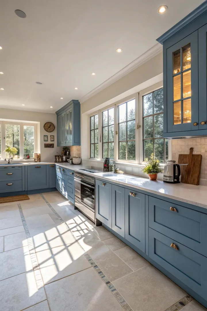
Natural light and blue cabinets have a unique relationship: sunlight activates the blue pigment and makes the color appear richer, deeper, and more vibrant than it looks under artificial lighting. A north-facing kitchen with cool, diffused light makes blue cabinets look greyer and more muted; a south- or west-facing kitchen with warm, direct sunlight makes the same blue look more saturated and warmer. Test blue paint samples under your kitchen’s specific natural light at different times of day before choosing.
Maximize natural light in a blue kitchen by keeping window treatments minimal (no heavy curtains or valances that block light), using a reflective countertop material (polished marble or glossy white quartz) that bounces light back into the room, and painting the ceiling and walls white to reflect ambient light onto the blue cabinet surfaces. The more natural light a blue kitchen receives, the more the blue comes alive — which is why blue cabinets are especially stunning in kitchens with large windows, skylights, or glass doors that flood the room with daylight. For ideas on choosing kitchen colors that work with your kitchen’s light conditions, our guide covers how natural light affects paint color choices.
How to Choose the Right Blue for Your Kitchen
Understanding Blue Undertones
Every blue paint color has an undertone — a secondary color that shifts the blue toward green (teal), purple (periwinkle), grey (slate), or black (navy). The undertone determines which materials and metals the blue pairs well with. Warm-undertone blues (green-leaning teals and turquoises) pair with warm metals (brass, copper, gold) and warm materials (butcher block, travertine). Cool-undertone blues (grey-leaning slates and navies) pair with cool metals (chrome, nickel, gunmetal) and cool materials (white marble, grey quartz).
Testing Blue Paint in Your Kitchen
Never choose a blue paint color from a small paint chip — blue is especially sensitive to lighting, and a 2×2-inch chip in the store looks dramatically different from a full cabinet door in your kitchen. Buy three to four sample-size cans of your top blue choices and paint a 12×12-inch section of the actual cabinet door (or a piece of the same material). View the samples at 9am, noon, and 8pm to see how the blue shifts under different light conditions. The blue that looks best at all three times is the right choice.
Matching Blue Cabinets to Your Kitchen’s Style
Light blues (sky, powder, robin’s egg) suit coastal, Scandinavian, and cottage styles. Medium blues (slate, blue-grey, Wedgwood) suit transitional and traditional styles. Dark blues (navy, midnight, charcoal blue) suit modern, Art Deco, and formal traditional styles. Bold blues (cobalt, electric, royal) suit contemporary and eclectic styles. Match the blue’s intensity to the kitchen’s formality — muted blues feel relaxed, saturated blues feel energetic, and dark blues feel dignified.
Blue Cabinet Paint Colors Comparison
| Paint Color | Brand | Undertone | Best Style |
|---|---|---|---|
| Hale Navy HC-154 | Benjamin Moore | Cool grey | Traditional, transitional |
| Naval SW 6244 | Sherwin-Williams | Pure blue-black | Modern, formal |
| Sea Salt SW 6204 | Sherwin-Williams | Green-grey | Coastal, Scandinavian |
| Newburyport Blue HC-155 | Benjamin Moore | Warm grey | Farmhouse, rustic |
| Stiffkey Blue No. 281 | Farrow & Ball | Green-blue | Traditional English |
| Smoky Blue SW 7604 | Sherwin-Williams | Grey-blue | Industrial, modern |
Common Blue Cabinet Mistakes to Avoid
Choosing a blue that fights the kitchen’s natural light. A bright cobalt blue in a north-facing kitchen with limited natural light will look grey and washed out. A pale sky blue in a south-facing kitchen with intense sun will look almost white. Match the blue’s value (darkness) to the kitchen’s light level — darker blues tolerate low light better; lighter blues need more natural light to read as blue rather than grey.
Mixing warm and cool metal finishes. Brass hardware with a chrome faucet and a nickel light fixture creates a disjointed metal palette that undermines the blue cabinets’ ability to anchor the room. Choose one metal finish family and use it consistently across hardware, faucets, light fixtures, and range hood trim.
Painting the blue too glossy. High-gloss blue cabinets show every fingerprint, every scratch, and every surface imperfection. Unless you are intentionally going for a lacquered Art Deco look with professionally sprayed cabinets, use a satin or semi-gloss sheen — both are durable and washable without the mirror-like finish that magnifies flaws.
Forgetting the backsplash. Blue cabinets need a backsplash that either complements or contrasts — a blank painted wall behind blue cabinets looks unfinished. White subway tile, marble slab, or a patterned cement tile backsplash gives the blue cabinets a background that frames them and completes the design.
Frequently Asked Questions
Will blue kitchen cabinets go out of style?
Navy and slate blue have been popular cabinet colors for over a decade and show no signs of declining — blue is too versatile and too broadly appealing to be a trend. Brighter blues (cobalt, electric) are more trend-sensitive and may feel dated sooner. If you are concerned about longevity, choose a dark, muted blue (navy or blue-grey) over a bright, saturated blue.
Do blue cabinets make a kitchen look smaller?
Dark blue cabinets (navy, midnight) can make a small kitchen feel more enclosed, just as any dark color would. Light blue cabinets (sky, powder, seafoam) can make a small kitchen feel larger by reflecting more light. In small kitchens, use dark blue only on lower cabinets or the island, and keep upper cabinets white or light to maintain visual openness.
What countertop color looks best with blue cabinets?
White (marble, quartz, or Corian) is the safest and most popular countertop color with blue cabinets because the high contrast makes both the blue and the white look their best. Natural wood (butcher block) adds warmth to cool-toned blues. Grey quartz complements blue-grey cabinets. Avoid black countertops with dark blue cabinets — the dark-on-dark combination absorbs too much light.
Can I paint existing cabinets blue myself?
Yes, with proper preparation. Sand the existing finish with 220-grit sandpaper (or use a liquid deglosser), apply two coats of a bonding primer (Zinsser B-I-N), then apply two coats of a high-quality cabinet paint (Benjamin Moore Advance or Sherwin-Williams Emerald Urethane) in your chosen blue. Allow 72 hours of cure time before rehanging doors. Professional spraying produces a smoother finish than brush or roller application.
What hardware finish works best with navy blue cabinets?
Aged brass and brushed gold are the most classic and popular hardware finishes with navy blue, creating a warm-cool complementary contrast. Matte black hardware with navy creates a modern, high-contrast look. Polished nickel or chrome with navy creates a cooler, more formal pairing. Choose one metal finish and use it consistently. Visit The Designers Company for more kitchen cabinet color guides, hardware recommendations, and remodeling inspiration.
Is blue or green better for kitchen cabinets?
Both work well. Blue reads as cooler and more formal; green reads as warmer and more organic. Blue pairs best with white and grey countertops; green pairs best with warm wood and brass. Choose blue for modern, coastal, or traditional kitchens and green for farmhouse, cottage, or nature-inspired kitchens. Many popular cabinet colors (teal, blue-green, sage) sit at the boundary between blue and green — test samples in your light to see which way they lean.
Conclusion
Blue kitchen cabinets work across every design style because the color is inherently versatile — it darkens into navy for formal kitchens, lightens into sky blue for airy coastal kitchens, desaturates into slate for industrial kitchens, and saturates into cobalt for bold modern kitchens. The shade you choose determines the kitchen’s personality, and the hardware and countertop you pair with it determine whether the blue reads as warm or cool, traditional or contemporary.
Start by identifying your kitchen’s natural light (north-facing versus south-facing makes a significant difference in how blue reads), then narrow the blue options to two or three shades and test large samples on the actual cabinet doors at different times of day. The right blue is the one that looks good in your kitchen’s worst lighting — if it works at 8pm under incandescent bulbs, it will look even better at noon under natural light.